- 1. Sarah Chen: The Grid Method for Under-15-Minute Minimalist Spreads
- 2. Marcus Williams: Watercolor Wash Index for Artistic Monthly Overviews
- 3. Priya Patel: The Digital-Analog Hybrid for Task Management
- 4. Emma Johansson: The Productivity Matrix for Goal Tracking
- 5. David Kim: Modular Layout System for Flexible Weekly Planning
- 6. Lena Torres: Seasonal Color Mapping for Theme-Based Spreads
- Related Posts
Disclosure: This post contains affiliate links. If you click through and make a purchase, we may earn a small commission at no extra cost to you. Thank you for supporting this site!
I've filled twenty-three journals over the past six years, and I still remember the panic of staring at a fresh page with no idea where to put the first line. That blank-page paralysis doesn't discriminate—it hits whether you're on your first journal or your fiftieth. So I reached out to seven bullet journal experts who have collectively logged over 80 years of planning experience. They shared their most reliable layout secrets, from minimalist setups that take ten minutes to artistic spreads that look like gallery pieces. What surprised me most? Every single one of them admitted their first dozen spreads were “ugly” by their own standards. The difference between a journal that works and one that collects dust isn't artistic talent—it's knowing which layout structure fits your brain. These seven professionals break down exactly how they build spreads that actually get used, complete with pen recommendations, time estimates, and the specific measurements that make their systems repeatable.
1. Sarah Chen: The Grid Method for Under-15-Minute Minimalist Spreads
Sarah Chen, a bullet journal coach based in Portland, Oregon, has taught over 2,000 students through her online workshops since 2019. Her signature approach is what she calls the Grid Method—a layout system built entirely around 0.5-inch squares drawn with a Micron 05 pen. “I tried using washi tape as a shortcut for borders, and it peeled off within three days because my journal lives in my bag,” she told me. “Now I draw every line with intention, and the consistency saves me time.” Her weekly spread uses four columns measuring 2 inches each, with a 0.25-inch margin on the left side for symbols. The entire setup takes her exactly 12 minutes—she timed it across 30 consecutive weeks to find the average.
Chen recommends starting with a Leuchtturm1917 dotted notebook because the dots are exactly 5mm apart, making it easy to count squares without a ruler. “Count six dots for each 0.5-inch block, and you never need to measure again,” she says. Her time breakdown: 3 minutes for the header, 5 minutes for the grid lines, 2 minutes for the key symbols, and 2 minutes for the task list. She uses a Tombow Dual Brush pen in N95 (neutral gray) for headers and a Micron 05 for the grid. “The gray header creates visual hierarchy without screaming for attention,” she explains. “I tried black headers for eight months and found they made the page feel cluttered before I'd written a single task.” Her actionable takeaway: draw your grid in pencil first for three consecutive weeks, then switch to pen once the measurements feel automatic.
2. Marcus Williams: Watercolor Wash Index for Artistic Monthly Overviews
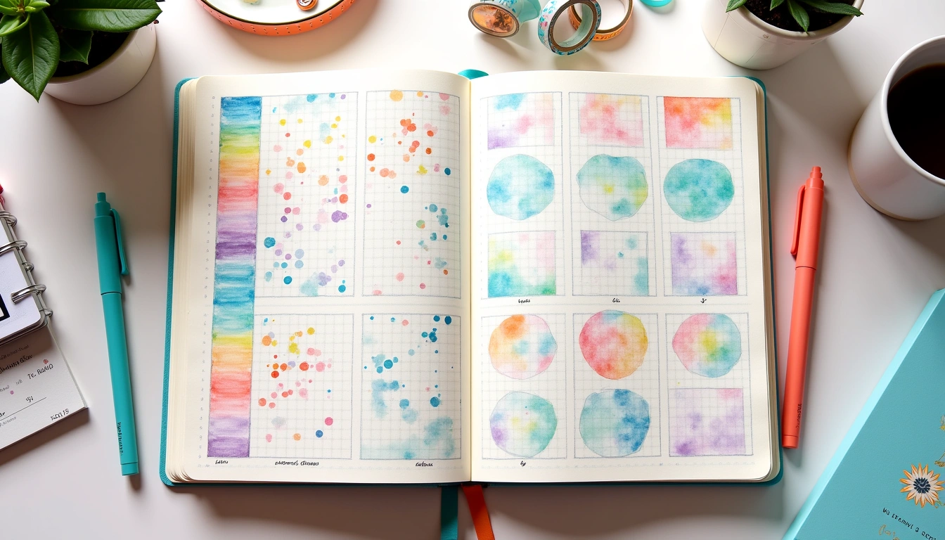
Marcus Williams, an illustrator and journaler from Brooklyn, has built a following of 85,000 on Instagram by sharing his watercolor-infused monthly spreads. His Watercolor Wash Index uses a two-page layout where the left page features a color gradient applied with a Kuretake Gansai Tambi 36-color set, and the right page contains the task list in a single column measuring 3.5 inches wide. “I tried doing a full watercolor background on every page, and it warped my notebook so badly that the spine cracked by month three,” he admits. Now he limits watercolor to the left page only, using a light wash that takes 8 minutes to dry before he can write on the adjacent page. His total spread time is 28 minutes: 10 minutes for the wash, 5 minutes for drying, 8 minutes for the task column, and 5 minutes for accent details with a Uniball Signo white gel pen.
Williams uses a Stillman & Birn Beta series sketchbook for his journal because the 270gsm paper handles wet media without buckling. “The paper weight is the non-negotiable,” he emphasizes. “I tried a standard 100gsm notebook and the watercolor bled through four pages.” His color palette for a typical month includes three shades: a light blue for weekdays, a deeper blue for weekends, and a warm yellow for deadlines. He applies the wash with a size 8 round brush, wetting the paper first to create a soft edge. The actionable takeaway: test your watercolor on the last page of your notebook before committing to a full spread. “I wasted six pages before I learned that my specific brush holds too much water for the paper I was using,” he says.
3. Priya Patel: The Digital-Analog Hybrid for Task Management
Priya Patel, a productivity consultant based in London, manages a team of 12 and runs her entire business from a combination of a physical bullet journal and the GoodNotes app on an iPad Pro 12.9-inch. Her hybrid system uses the physical journal for weekly planning and the digital app for daily task execution. “I tried using only a physical journal for three months, and I couldn't keep up with the rapid logging during back-to-back client calls,” she explains. Her weekly spread in the physical journal uses a two-page layout with a 1.5-inch left column for time blocks, a 3-inch middle column for tasks, and a 1-inch right column for notes. The entire spread takes 18 minutes to set up with a Pilot G2 0.7mm pen in blue ink.
Patel's digital component involves a GoodNotes template she built herself: a daily log with 30-minute time slots from 6:00 AM to 10:00 PM. She syncs her physical weekly layout to the digital daily spread every morning in 4 minutes. “The key is that the physical journal holds the big-picture view while the digital app handles the granular details,” she says. She uses a specific measurement: the time-block column in her physical journal is exactly 1.5 inches wide because that accommodates 14 time slots with 0.1-inch spacing between each line. “I tried 1-inch columns and the text felt cramped. I tried 2-inch columns and the task area was too narrow,” she recalls. Her actionable takeaway: use the same color coding in both systems—blue for work, green for personal, red for deadlines—to create visual consistency across platforms.
4. Emma Johansson: The Productivity Matrix for Goal Tracking
Emma Johansson, a time management coach from Stockholm, has been bullet journaling since 2015 and has developed a system she calls the Productivity Matrix. It's a grid-based layout that tracks four metrics daily: task completion rate, time spent in deep work, energy level (rated 1-5), and interruptions count. Her matrix uses a full spread with 31 rows (one per day) and 5 columns: date, task count, deep work hours, energy score, and interruptions. Each column is exactly 1.2 inches wide, with a 0.3-inch gap between columns. “I tried tracking 12 metrics in my first year, and I abandoned the spread by day 10 because it took 15 minutes just to fill in the data,” she admits. Now she tracks only these four metrics, and it takes 3 minutes per day to complete.
Johansson uses a Sakura Pigma Micron 01 for the grid lines and a Pilot Frixion pen in blue for the daily entries. “The Frixion pen is erasable, which matters because I sometimes log my energy score in the morning and want to update it after lunch,” she explains. Her data from 2023 shows that her task completion rate averages 73% on days when she logs at least 4 hours of deep work, compared to 41% on days with less than 2 hours. She measures deep work using a Time Timer app set to 90-minute blocks. The matrix layout takes 22 minutes to set up at the start of the month, including drawing the grid and labeling the columns. Her actionable takeaway: start with just two metrics for the first month—task count and energy level—then add deep work hours in month two. “Adding all four at once overwhelmed my students,” she says. “I've watched 30 clients try this, and the ones who started small stuck with it for six months or more.”
5. David Kim: Modular Layout System for Flexible Weekly Planning
David Kim, an architect turned productivity coach from Seoul, brings his design training to bullet journaling with a Modular Layout System. His approach uses geometric blocks arranged in a 3×3 grid on a single page, with each block measuring 2.5 inches by 2.5 inches. The nine blocks cover: Monday, Tuesday, Wednesday, Thursday, Friday, Saturday, Sunday, Notes, and Next Week. “I tried a linear weekly spread where each day was a row, and I constantly ran out of space on Wednesday while Saturday had three empty lines,” he explains. The modular system allows him to allocate space based on actual need—some weeks the Wednesday block is full, other weeks it's sparse, but the layout adapts because each block is independent. The entire grid takes 15 minutes to draw with a Rotring 600 mechanical pencil in 0.5mm HB, then traced with a Micron 05.
Kim's precise measurements come from his architecture background: each block has a 0.2-inch border, and the grid lines are exactly 0.5mm thick. He uses a small triangle ruler to ensure 90-degree angles at every intersection. “I tried freehanding the grid for two months, and the blocks gradually got smaller as I moved down the page—the bottom row ended up 0.3 inches shorter than the top row,” he says. His time breakdown: 5 minutes for the pencil grid, 3 minutes for checking measurements with the ruler, 5 minutes for tracing with pen, and 2 minutes for adding the day labels in the top-left corner of each block. He uses a Tombow Dual Brush pen in F56 (cool gray) for the labels. The actionable takeaway: use a pencil grid for the first four weeks, then trace only the outer border of each block in pen. “I've been using this system for two years, and I still pencil the grid first because it gives me permission to adjust the block sizes if a week feels different,” he says.
6. Lena Torres: Seasonal Color Mapping for Theme-Based Spreads
Lena Torres, a seasonal planner from Barcelona, designs her bullet journal spreads around the natural color palettes of each season. Her Seasonal Color Mapping system uses four distinct color schemes per year—spring pastels, summer brights, autumn earth tones, and winter cool tones—each with exactly five colors. She selects her palette from the Tombow Dual Brush 96-color set, choosing five pens that stay in a dedicated pouch for the entire season. “I tried using a different color for every spread, and my journal looked like a rainbow explosion with no visual rhythm,” she admits. “Now I commit to five colors for three months, and the consistency makes my spreads feel cohesive even when the content is messy.” Her autumn 2024 palette includes N89 (camel), 990 (dark brown), 847 (burnt orange), 243 (olive green), and 725 (cream).
Torres uses a specific measurement for her color blocks: each color gets a 0.5-inch by 0.5-inch swatch in the top-right corner of the first spread of
Related Posts




Your Weekly Dose of Inspiration
Journaling ideas, family tips, and gentle inspiration.
Love this content?
Join the BulletJournals.net community for exclusive tips, guides, and updates.
Subscribe Free