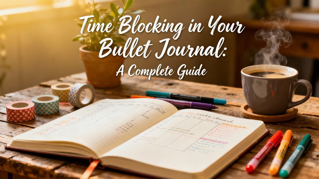
Why Lettering Transforms Your Bullet Journal
56171 Dual Brush Pen Art Markers, Grayscale, 10-Pack. Blenda
$22.36
50 Bullet Journal Templates Pack
Ready-to-print spreads for habit tracking, weekly planning, mood logs, and creative layouts.
★ 4.7
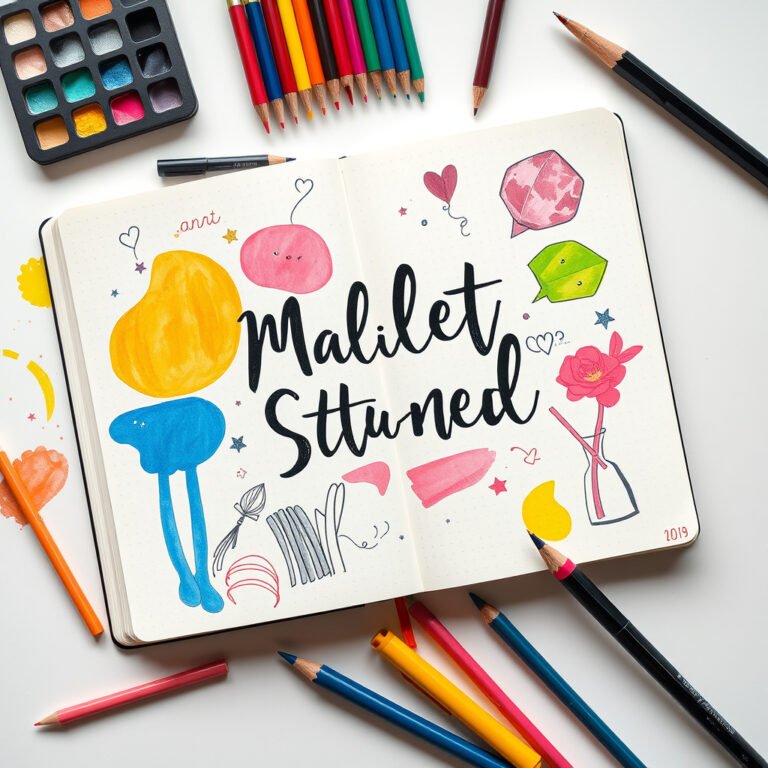
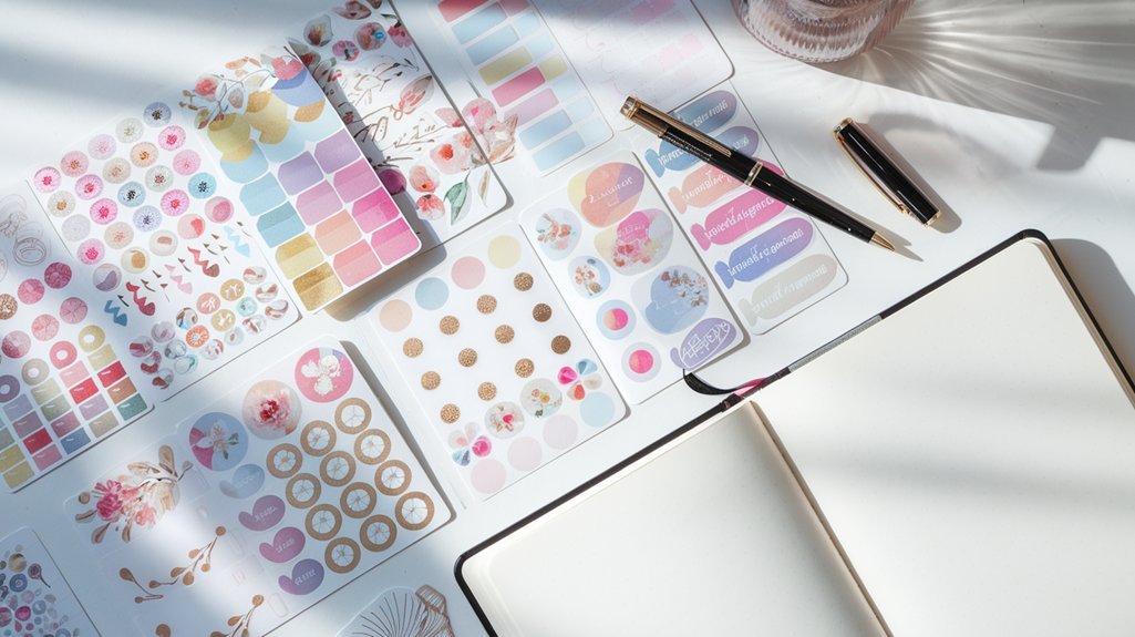
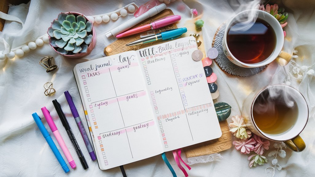
Beautiful headers and lettering can turn a simple bullet journal into a work of art. But here is the good news: you do not need to be an artist to create stunning lettering. With a few simple techniques, anyone can add personality and visual appeal to their spreads.
In this guide, we will walk through 20 beginner-friendly lettering styles that you can start using today. No fancy supplies required—just your regular bullet journal pens and a willingness to practice.
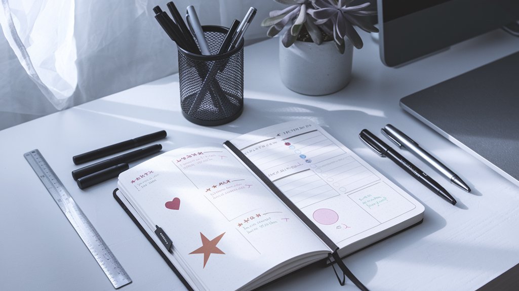
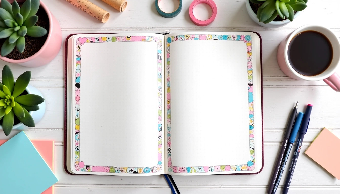
What You Will Need
- A bullet journal or notebook – Any dotted or blank notebook works
- Fine-tip pens – Your everyday journaling pens are perfect
- Optional: Brush pens – For faux calligraphy effects
- A pencil – For sketching before committing to ink
Not sure what supplies to get? Check out our Complete Supplies Guide for recommendations.
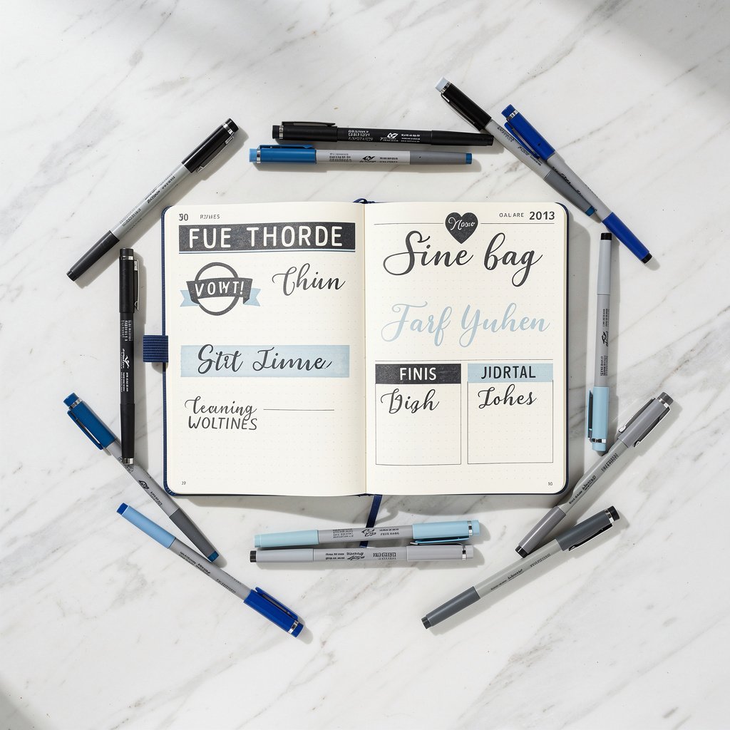
10 Simple Header Styles for Beginners


1. Block Letters
The simplest starting point. Write your letters in all caps with thick, bold strokes. Add a second line on one side to create depth.
2. Banner Headers
Draw a simple ribbon or banner shape, then write your text inside. Add small triangular folds at the ends for a classic look.
3. Bubble Letters
Write your letters normally, then draw rounded outlines around each one. Fill them in or leave them hollow.
4. Underline Flourish
Write your header in your normal handwriting, then add a decorative underline with curls or waves.
5. Box Frame
Draw a rectangle around your header text. Add double lines or decorative corners for extra style.
6. Shadow Letters
Write your text, then add a shadow on one side of each letter using a gray pen or pencil.
7. Mixed Case
Alternate between uppercase and lowercase letters within the same word for a playful look.
8. Serif Accent
Add small lines (serifs) to the ends of your letters for an elegant, professional appearance.
9. Highlight Background
Write your text first, then add a colored highlight behind it using a marker or highlighter.
10. Stacked Words
Break your header into two or three lines with different sizes and styles for visual interest.
10 Creative Lettering Techniques


11. Faux Calligraphy
Write in cursive with a regular pen, then go back and thicken all the downstrokes. This mimics brush lettering without special tools.
12. Dotted Letters
Instead of solid lines, create your letters using small dots. Great for a whimsical, dotted-grid aesthetic.
13. Gradient Fill
Draw outline letters, then fill them with a color gradient using markers or colored pencils.
14. Doodle Letters
Fill your block letters with small doodles, patterns, or dots for a decorative effect.
15. Leaf Accents
Add small leaves, vines, or floral elements around your headers for a natural, botanical look.
16. Split Letters
Draw block letters with a horizontal line through the middle, coloring the top and bottom halves differently.
17. 3D Effect
Write your letters, then add lines extending from each corner at the same angle to create a 3D box effect.
18. Constellation Style
Create letters using dots connected by thin lines, like star constellations.
19. Washi Tape Base
Apply washi tape as a background strip, then write your header on top in contrasting color.
20. Negative Space
Color a rectangle, then leave the letters uncolored so they appear in the paper color against the background.
Tips for Improving Your Lettering

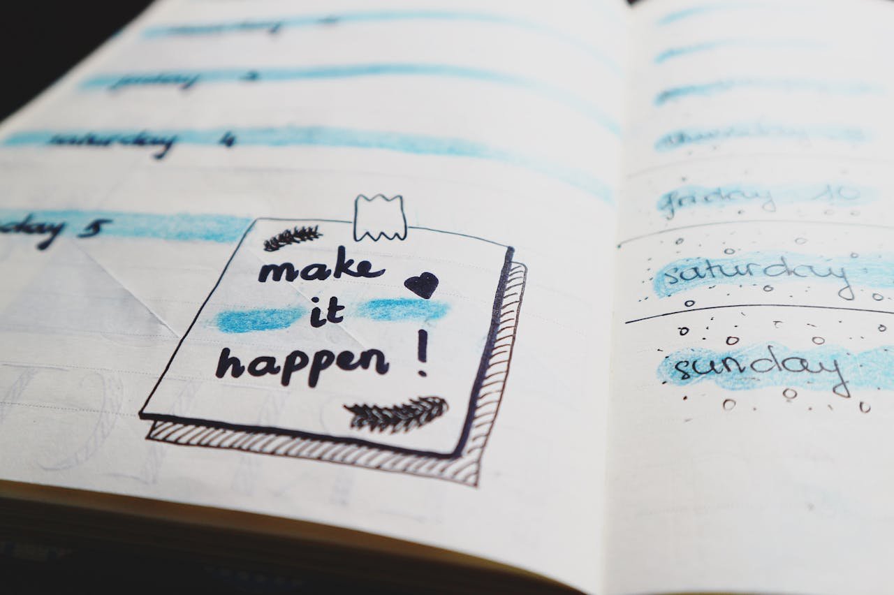
Start with Pencil
Sketch your headers in pencil first, especially for important spreads like your monthly layouts. Once you are happy with the placement, trace over with pen.
Practice Consistency
The key to good lettering is consistency. Keep your letter heights, spacing, and angles uniform throughout.
Use Guidelines
Use the dots in your bullet journal as guides for consistent letter heights. Or lightly pencil in guidelines before you start.
Embrace Imperfection
Handmade lettering should look handmade. Small imperfections add character and charm to your spreads.
Copy What You Like
Found a header style you love? Practice copying it until you can make it your own. This is how all lettering artists learn.
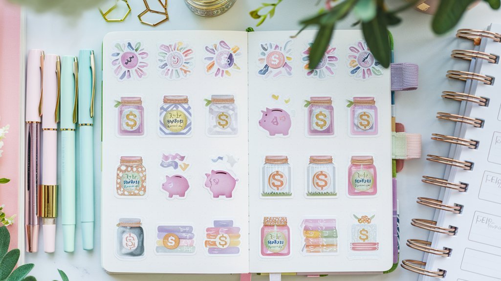
Where to Use These Lettering Styles
Now that you have 20 techniques to try, here are the best places to use them:
- Monthly headers – Make each month feel special with a unique style
- Weekly spread titles – Quick headers that set the tone
- Collection titles – Reading lists, travel plans, project pages
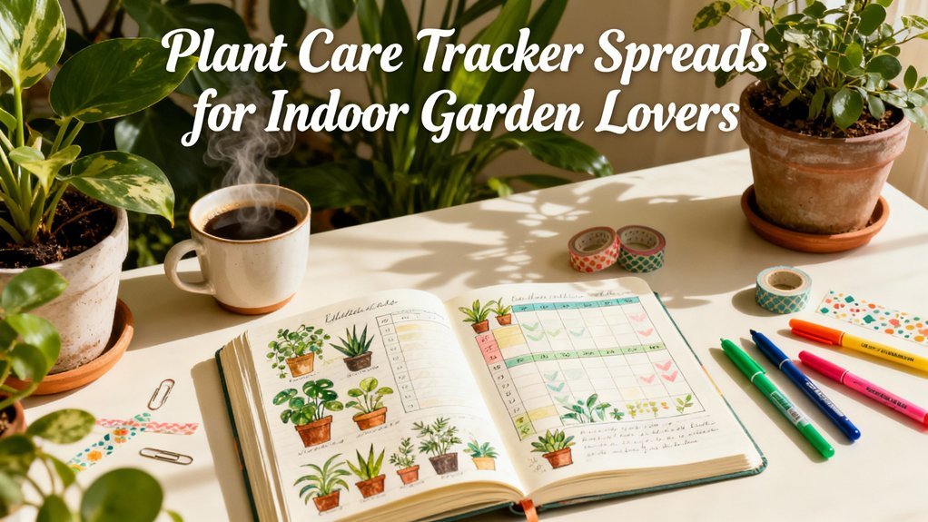
- Tracker labels – Habit trackers, mood logs, and more
- Quote pages – Let beautiful words shine with beautiful lettering
Common Mistakes to Avoid
- Rushing – Good lettering takes time. Slow down and be intentional.
- Pressing too hard – A light touch gives you more control.
- Skipping pencil drafts – For important pages, always sketch first.
- Comparing to professionals – Instagram artists have years of practice. Focus on your progress, not perfection.
Take Your Lettering Further
Ready to expand your skills? Here are some next steps:
- Explore different pen types and see how they affect your lettering
- Create a practice page in your journal dedicated to trying new styles
- Add lettering to your existing spreads to give them a refresh
- Check out our Start Here guide if you are new to bullet journaling
Your Turn
The best way to improve is to practice. Pick one or two styles from this list and try them in your next spread. Remember, your bullet journal is for you—there are no rules, only possibilities.
Which lettering style are you excited to try first? Save this guide and come back to it whenever you need header inspiration.
Related Posts
Best Supplies for Lettering
Disclosure: Affiliate links below. We earn from qualifying purchases.
These tools will help you create beautiful lettering:
noopener sponsored nofollownoopener sponsored nofollownoopener sponsored nofollownoopener sponsored nofollownoopener sponsored nofollowTombow Fudenosuke Brush
noopener sponsored nofollownoopener sponsored nofollownoopener sponsored nofollownoopener sponsored nofollownoopener sponsored nofollowView
noopener sponsored nofollownoopener sponsored nofollownoopener sponsored nofollownoopener sponsored nofollownoopener sponsored nofollowTombow Dual Brush (10-Pack)
noopener sponsored nofollownoopener sponsored nofollownoopener sponsored nofollownoopener sponsored nofollownoopener sponsored nofollowView
noopener sponsored nofollownoopener sponsored nofollownoopener sponsored nofollownoopener sponsored nofollownoopener sponsored nofollowPentel Arts Sign Pen
noopener sponsored nofollownoopener sponsored nofollownoopener sponsored nofollownoopener sponsored nofollownoopener sponsored nofollowView
noopener sponsored nofollownoopener sponsored nofollownoopener sponsored nofollownoopener sponsored nofollownoopener sponsored nofollowSakura Pigma Micron Set
noopener sponsored nofollownoopener sponsored nofollownoopener sponsored nofollownoopener sponsored nofollownoopener sponsored nofollowView
Our Top Picks
noopener sponsored nofollownoopener sponsored nofollownoopener sponsored nofollownoopener sponsored nofollownoopener sponsored nofollowTombow Fudenosuke Brush
4.8 (21K+)
- Hard & soft tips
- Best for lettering
- Fine control
noopener sponsored nofollownoopener sponsored nofollownoopener sponsored nofollownoopener sponsored nofollownoopener sponsored nofollowCheck Price
noopener sponsored nofollownoopener sponsored nofollownoopener sponsored nofollownoopener sponsored nofollownoopener sponsored nofollowTombow Dual Brush (10-Pack)
4.8 (28K+)
- Brush + fine tip
- Blendable
- 108 colors available
noopener sponsored nofollownoopener sponsored nofollownoopener sponsored nofollownoopener sponsored nofollownoopener sponsored nofollowCheck Price
Related Posts
Related Resources
- Best Supplies Buying Guide
- Beginner's Guide to Bullet Journaling
- Browse All Spreads
- Browse All Trackers
- Free Templates