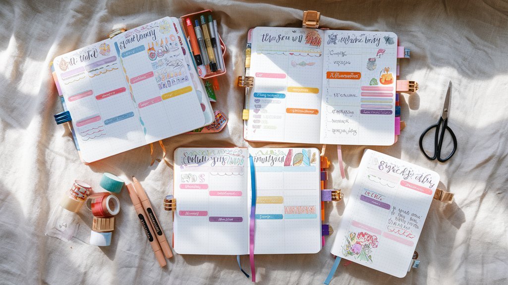
Staring at Instagram-perfect bullet journal spreads that took three hours to create?
I get it. Been there too. Drowning in washi tape, spending Sunday evenings crafting elaborate weekly layouts instead of actually planning my week.
After seven years of bullet journaling, I've learned something crucial: the most beautiful spread means nothing if you don't have time to use it.
That's where weekly spread minimalist comes in. It's not about creating boring, stark pages (trust me on this). It's about intentional design that puts function first while still looking clean and satisfying. Think Marie Kondo approach to planning – keeping only what serves you.
The benefits? You'll cut setup time from hours to minutes. Decision fatigue vanishes when you're not choosing between twelve different pen colors. Plus, your focus sharpens because there's nothing competing for attention on the page.
By the end of this guide, you'll know exactly how to design minimalist weekly spreads that work for your life, not against it. We'll cover design principles, step-by-step layouts, essential tools, and tryation strategies that'll improve your planning game.
Understanding Minimalist Weekly Planning Principles
Core Philosophy of Minimalist Planning
Minimalist planning isn't about depriving yourself of color or creativity. It's about making every element on your page earn its place.
If something doesn't help you plan better? It doesn't belong.
I learned this the hard way during my second year of bullet journaling. I spent so much time decorating spreads that I barely had time to fill them out. The elaborate headers and doodles that looked amazing in photos became barriers to actually using my journal.
Function over form doesn't mean ugly. It means purposeful.
Every line, every section, every design choice should make your planning easier or more effective. Period.
Essential vs. Decorative Elements
Let's break down what actually matters in a weekly spread:
Essential elements:
- Clear date headers
- Adequate writing space for tasks and events
- Visual separation between days
- Quick reference for priorities
Nice to have (if they serve a purpose):
- Simple habit tracker dots
- Weather symbols for outfit planning
- Mood indicators for pattern recognition
Decorative elements to question:
- Multiple fonts just for variety
- Complex borders and frames
- Seasonal doodles that don't add function
- Color coding beyond 2-3 categories
Ask yourself: “Does this help me plan better, or does it just look pretty?”
Pretty is nice. But useful is better.
The Psychology of Clean Layouts
There's actual science behind why minimalist spreads work so well. Visual clutter creates mental clutter. When your page is busy, your brain has to work harder to process information and make decisions.
Clean layouts with plenty of white space give your eyes places to rest. They make it easier to scan for important information quickly.
During stressful weeks (and aren't they all?), this visual calm can be genuinely soothing.
In my experience, anxiety drops when I open to a clean, organized spread versus a chaotic, over-decorated one. It's like the difference between walking into a tidy room versus one with stuff everywhere.
Essential Components of a Weekly Spread Minimalist Layout
Must-Have Elements
After testing dozens of layouts over the years, these elements prove essential every single time:
Date and day headers – Sounds obvious, but make them prominent enough to find at a glance. I use simple, consistent formatting: “MON 15” or “Monday 15” depending on space.
Balanced daily sections – Each day needs enough space for your typical load. Monday might need more room than Sunday, so adjust accordingly.
Worth it? Absolutely.
Priority area – Whether it's a “Top 3” box or a “This Week” section, you need somewhere to capture what actually matters most.
Task capture space – Simple lines or dots work perfectly. No need for elaborate checkbox designs.
Optional Additions That Maintain Simplicity
Some additions enhance function without adding clutter:
Simple habit tracker – Three small circles for “water, exercise, read” beats a complex grid any day.
Weather icons – Just basic symbols if you need outfit planning help.
Gratitude line – One simple line at the bottom for daily appreciation.
The key? Limit yourself to 1-2 optional elements max. Otherwise, you're back in complexity land.
What to Eliminate for Maximum Impact
These common elements often hurt more than they help:
- Multiple font styles within the same spread
- Complex symbol systems that require a legend
- Excessive color coding (stick to 2-3 colors maximum)
- Decorative borders that eat up writing space
- Inspirational quotes that take up valuable real estate
Remember: every inch of decoration is an inch you can't use for actual planning.
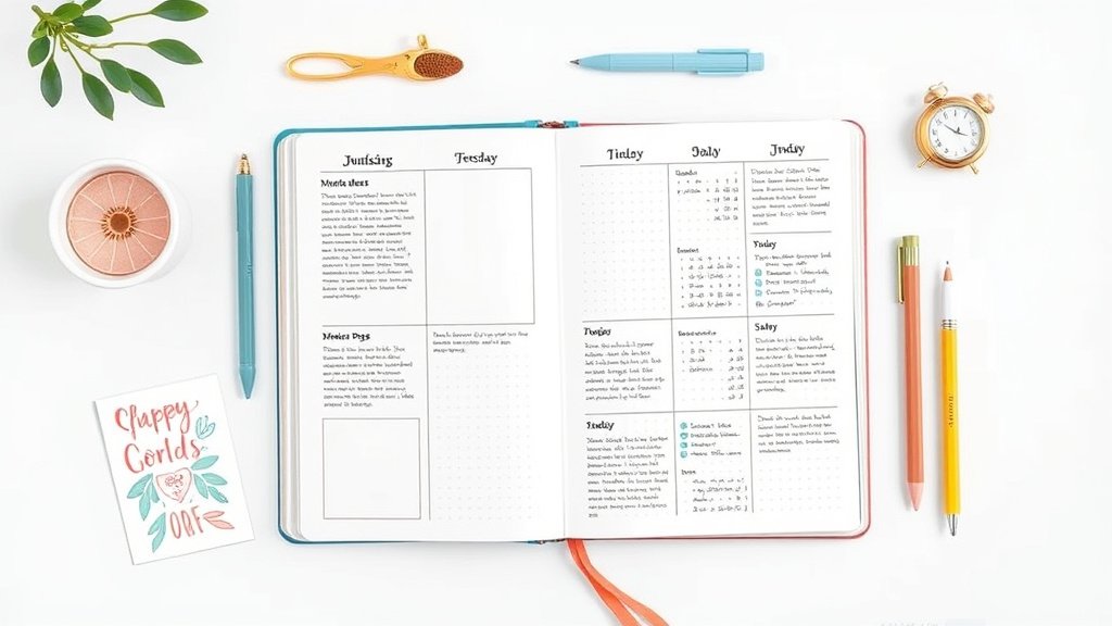
Design Layouts and Templates for Weekly Minimalist Spreads
Horizontal Weekly Layout
This is my go-to for busy weeks. Here's how:
“
Week of [Date] Top 3:
 □ ________
MON | TUE | WED | THU | FRI | SAT | SUN
____|_____|_____|_____|_____|_____|____
 | | | | | |
 | | | | | |
 | | | | | |
Steps:
This layout gives you a bird's eye view of your entire week while maintaining clean lines and plenty of space.
Vertical Weekly Layout
Perfect for detail-oriented planners who need more writing space:
`
WEEK OF [DATE]
MONDAY 15
□ Morning task
□ Afternoon meeting
□ Evening plans
TUESDAY 16
□
□
□
[Continue for each day]
“
I love this layout for weeks when I have a lot of appointments or detailed tasks to track. Each day gets substantial space, but the consistent formatting keeps it clean.
Grid-Based Designs
Using your dot grid effectively creates natural minimalism:
- Each day gets exactly 4×6 dots of space
- Use dots as natural alignment guides
- Create subtle separations without drawing heavy lines
- The grid provides structure without added visual weight
Simple. Effective. Clean.
Hybrid Layouts
Sometimes you need the best of both worlds:
- Top half: horizontal overview for appointments and deadlines
- Bottom half: vertical daily detail sections for the 3 busiest days
- Side margin: habit tracker or priority list
Experiment with combinations, but keep the same basic structure week to week for consistency.
Tools and Materials for Minimalist Weekly Spreads
Essential Supplies
Notebook choice matters. Dot grid journals work best for minimalist spreads. The dots provide subtle guidance without being visually overwhelming. My favorites? Leuchtturm1917 and Rhodia – both have dots that fade into the background.
One good black pen. That's it.
I use a Pilot G2 0.7mm for headers and a 0.5mm for everything else. Consistent line weights create visual harmony.
A ruler. Clean lines make all the difference in minimalist layouts. Wobbly freehand lines destroy the calm aesthetic you're going for.
Optional: One accent color. If you want some visual interest, choose one muted color for headers or priority items. Stick with it for at least a month to see if it actually helps your planning.
Digital Tools and Apps
Going digital? These maintain minimalist principles:
GoodNotes or Notability on iPad – Import simple templates and handwrite on them
Notion – Create clean, text-based weekly templates
Google Docs – Simple tables work perfectly for minimalist weekly planning
The key with digital tools? Resisting the temptation to use every feature available. Just because you can add seventeen colors doesn't mean you should.
Budget-Friendly Options
You don't need expensive supplies for effective minimalist planning:
- Composition notebooks with simple line additions work fine
- Basic black pens from any drugstore
- A regular ruler or even a credit card for straight lines
- Phone apps like Apple Notes or Google Keep for digital versions
I started my bullet journal practice with a $2 composition notebook and a Bic pen. The tools don't make the system – consistency does.
tryation Strategies and Best Practices
Setting Up Your First Minimalist Weekly Spread
Sunday setup ritual (5-10 minutes max):
That's it. Resist the urge to add “just one more element.” Start simple and add only what proves necessary over time.
Monday morning review (2-3 minutes):
- Scan the week ahead
- Move priorities around if needed
- Add any new tasks that came up over the weekend
Time-Saving Techniques
Batch creation saves massive amounts of time. On the first Sunday of each month, set up all four weekly spreads in one session. Use the same template every time – no decisions needed.
Shorthand systems keep writing minimal:
- Use arrows (→) instead of writing “moved to”
- Simple dots (•) for tasks, no elaborate checkboxes
- Abbreviations for common activities (gym, groceries, meeting)
Template creation eliminates setup decisions. Once you find a layout that works, trace it lightly in pencil for future weeks, or create a digital template you can reuse.
really helpful? Absolutely.
Maintaining Consistency
The secret to minimalist planning success? Boring consistency beats exciting inconsistency every time.
Recommended for You
🛒 Dotted Journal Notebook
As an Amazon Associate we earn from qualifying purchases.
Use the same:
- Day header format
- Task notation system
- Priority area placement
- Basic layout structure
Change these elements only if they're not working, not because you're bored. Boredom in planning systems is actually a feature, not a bug. It means your brain isn't wasting energy on format decisions.
Customization Ideas While Maintaining Minimalist Principles
Personal Style Variations
You can add personality without adding clutter:
Typography variation: Choose one simple font style for headers, stick with it
Minimal color coding: Use one color for work tasks, regular black for personal
Subtle patterns: Simple geometric shapes as section dividers
Personal symbols: One unique symbol for your most important category
The key? Choosing 1-2 personal touches maximum and using them consistently.
Functional Add-Ons
These additions earn their space by improving functionality:
Time blocking: Simple horizontal lines to show appointment times
Energy tracking: Small dot to note morning energy levels for pattern recognition
Meal planning section: Just a small box labeled “meals” with 7 lines
Weekly reflection: Three lines at the bottom for “went well/could improve/next week”
Each add-on should solve a specific planning problem you actually have. Not just look interesting.
Seasonal Adaptations
Minimalism doesn't mean your spreads can't acknowledge the season:
Color shifts: Warmer black ink in fall/winter, cooler blue-black in spring/summer
Seasonal priorities: “Holiday prep” section in December, “Garden planning” in spring
Weather consideration: Small weather notation if it affects your planning
Keep seasonal elements functional. A small snowflake symbol to remind you to check weather before going out? Useful. Elaborate winter doodles? Pretty, but probably not helpful.
Common Mistakes and How to Avoid Them
Overcomplicating Simple Designs
I see this constantly in bullet journal communities. Someone starts with a beautiful, simple spread, then gradually adds elements until it's as complex as what they were trying to escape.
The creep happens gradually:
- Week 1: Simple 7-day layout
- Week 2: “Just a small habit tracker”
- Week 3: “Color coding would be helpful”
- Week 4: “Maybe some decorative headers”
- Week 8: Back to spending an hour on setup
Sound familiar?
Solution: Set a complexity budget. Decide on your maximum number of elements upfront and stick to it. When you want to add something new, you have to remove something else.
Inconsistent tryation
Minimalist spreads only work if you actually use them. The biggest mistake? Creating a perfect system and then not maintaining it.
Common consistency killers:
- Making setup too complicated
- Perfectionism preventing daily use
- Not adapting the system when life changes
- Comparing your real spreads to styled photos online
Solution: Prioritize function over form every single time. A messy, used spread beats a perfect, empty one.
Functionality Issues
Beautiful minimalist spreads that don't actually work for your life are just pretty pictures.
Watch out for:
- Not enough writing space for your actual task load
- Daily sections that don't match your schedule patterns
- Priority systems that don't reflect your real decision-making
- Time estimates that don't match reality
Solution: Track what's not working for 2-3 weeks before making changes. Real data beats assumptions every time.
Success Stories and Real-World Examples
Student Applications
Sarah, a grad student, simplified her planning from elaborate daily spreads to minimalist weekly overviews. Her setup time dropped from 45 minutes to 5 minutes per week.
More importantly? She actually started using her journal consistently instead of abandoning it during busy periods.
Her layout: Simple 7-column format with class abbreviations, assignment due dates, and a small “this week's focus” box. No decorations, no colors, just black ink on cream paper.
The kicker? Her grades improved because she was actually tracking deadlines instead of decorating pages.
Professional Use Cases
Mark, a project manager, needed to balance multiple deadlines across different clients. His minimalist approach:
- Client abbreviations instead of full names
- Simple priority coding (! for urgent, * for important)
- Clean horizontal layout fitting in his small notebook
- 5-minute Friday review, 3-minute Monday setup
Results: Missed fewer deadlines, reduced stress, more time for actual work instead of planning overhead.
Personal Life Management
Jennifer, a working mom of two, simplified from complex color-coded family calendars to a simplifyd weekly spread:
- Family members get initials, not full names
- Activities use simple abbreviations (SC = soccer, DN = dinner)
- One shared family priority per week
- Minimal habit tracking for herself (just water and exercise)
The simplification gave her mental space to focus on what mattered instead of maintaining a complex system. And her family communication improved because the shared spread was easy to read at a glance.
Making Minimalist Weekly Planning Work for You
Remember why we started this journey: to make planning serve your life, not consume it. The best weekly spread minimalist system is the one you'll actually use consistently.
Start with the absolute basics this week. Draw seven columns, add day headers, and use it for seven days. Notice what you need more space for and what feels unnecessary.
Let your real usage patterns guide your design choices, not what looks good in photos.
Your planning system should fade into the background of your life. Quietly supporting your goals without demanding attention. When someone asks how you stay so organized, you should be able to point to a simple, clean spread that takes minutes to maintain.
The magic isn't in the perfect layout – it's in the consistent practice of showing up, writing things down, and following through. Minimalist weekly spreads just make that practice easier to sustain.
Ready to reclaim your Sunday evenings? Start simple, stay consistent, and trust the process.
Your future, more organized self will thank you for choosing function over decoration.
What will your first minimalist weekly spread look like? Sometimes the simplest question leads to the most powerful changes.
Related Posts


Related Posts
Related Posts
Your Weekly Dose of Inspiration
Journaling ideas, family tips, and gentle inspiration.