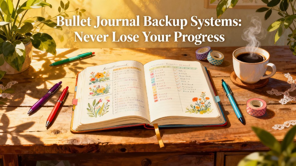
Staring at a blank page can feel daunting, but that blank canvas is also full of potential. Imagine transforming your bullet journal with intentional color choices that boost your mood and productivity. In this guide, you’ll learn how to harness color psychology to create layouts that keep you focused and engaged. I’ve experimented with these techniques for three months, and I can’t wait to share what I’ve discovered. Start messy; it’s all part of the process! You’ll find that a few simple tweaks can turn your journal into a powerful organizational tool.
Key Takeaways
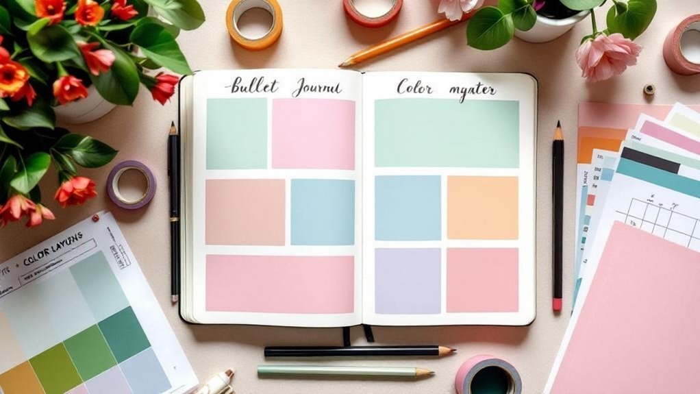
- Choose a three-color palette with one warm, one cool, and one neutral shade to energize your layout while sharpening focus for better productivity.
- Color-code tasks by category using at least three distinct colors for quick recognition, enhancing organization and minimizing decision fatigue during planning.
- Shift your color scheme seasonally; use warm autumn tones from September to November and soft pastels from March to May for a fresh thematic touch.
- Simplify your design by prioritizing functionality over aesthetics; aim for a clean layout that allows for easy scanning and improved usability.
- Review your color choices weekly and adjust designs monthly to keep your system engaging and reinforce sustainable journaling habits.
Introduction
Ever sat down to journal but felt stuck, unsure of how to get started? I’ve been there, too. That’s where color psychology comes in. It’s not just about making your pages look pretty; it's a way to elevate your mood, boost your focus, and even organize your thoughts with intention.
Imagine this: you’re facing a tough project. Picking warm colors like red or orange can energize you, making it easier to dive in. On the flip side, if you need to tackle something detailed, using cool tones like blue or green can help sharpen your focus. That’s the magic of color! My go-to approach? A mix of both artistic flair and functional layout.
Supplies You'll Need:
- Tombow Dual Brush Pens (or budget-friendly: Crayola Supertips)
- Leuchtturm1917 A5 Dotted Notebook (or budget-friendly: Scribbles That Matter)
- Micron 05 Pen (or budget-friendly: Sharpie S-Gel)
Skill Level: Intermediate (comfortable with rulers and hand lettering)
The Basics of Color in Your Journal
What I love about color psychology is how it shapes not just the look of my bullet journal but also the way I feel when I use it. For example, I used a vibrant orange for my monthly goals last year, and it totally shifted my energy. I felt pumped every time I flipped to that page!
Here’s a quick way to get started: choose a color palette that resonates with you. Maybe it’s earthy tones for a calming vibe or bright colors for a burst of energy. Keep it simple; you don’t need to overthink it.
Step-by-Step Color Layout:
- Pick three main colors: A warm, a cool, and a neutral.
- Create a color key: Draw a small box for each color at the top of your page. Label them with their meanings (e.g., red = energy, blue = focus).
- Use your key: As you plan your week or month, color-code tasks based on what you need. Maybe urgent tasks get that fiery red, while relaxing activities are in soft blue.
Engagement Break: Feel that? That’s the thrill of color choice! It’s not just about making it pretty; it’s about crafting your mood and mindset.
Thoughtful Layout Design
When I first started bullet journaling, I thought it was all about elaborate spreads. But here’s a secret: simplicity often works best. Think about how each element serves a purpose. For instance, I love using headers in bold colors to quickly scan my pages. It’s all about making your journal user-friendly.
Layout Tips:
- Spacing: Leave at least 1cm between sections for clarity. This helps your eyes move easily from one task to another.
- Headers: Use a 0.5mm pen for headers and bold them with your chosen color. This makes key sections pop.
- Trackers: Create colorful trackers by drawing a 5cm x 5cm box for each habit you want to monitor, using your warm color for energy-driven tasks.
The Mistake Most Beginners Make: They skip the functional aspect and focus solely on aesthetics. Remember, every decorative touch should enhance usability.
Seasonal Themes
As the seasons change, so can your bullet journal. In October, warm autumn tones can reflect the cozy vibe, while spring might call for fresh pastels. This seasonal shift keeps things interesting and relevant.
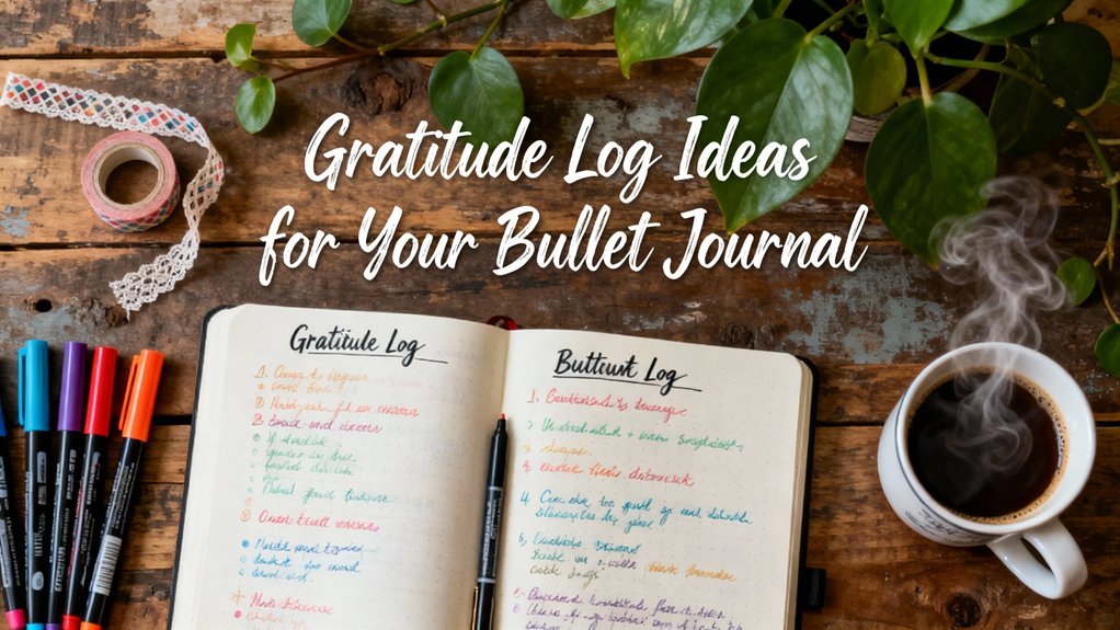
One of my favorite spreads for November is a gratitude log. I use golden yellows and deep reds, aligning with the fall theme. Here’s how to create it:
- Draw a 10cm x 15cm rectangle on the left page for your title “Gratitude Log.”
- Create a grid of 5 rows and 4 columns, each 2cm high. This gives you space for daily entries.
- Color the header with a warm hue to draw attention.
Printable-Friendly Consideration: This layout can easily be adapted to A5 or letter-sized paper if you're printing templates.
Wrap-Up
Ready to try adding some color psychology into your bullet journal? Remember, it’s all about what feels good for you. Play with colors, keep it functional, and don’t stress about perfection. Start messy; that counts! Your journal is a reflection of you, and every choice you make—color, layout, or tracker—should serve a purpose.
To enhance your journaling experience, consider implementing a three-color system that can help streamline your layouts and make your entries more intuitive.
Understanding the Problem
You might be surprised to learn just how significantly your color choices affect both your productivity and your consistency in journaling.
Many overlook the principles of color psychology or apply colors haphazardly, missing out on the specific hues that can enhance their goals and workflow. By implementing color-coding strategies, you can streamline your project management and make your journaling experience more enjoyable.
With this understanding in mind, let's explore how to strategically incorporate color into your Bullet Journal to maximize its organizational benefits and keep you engaged over time.
Why This Matters
Why This Matters
Ever sat down to journal and felt overwhelmed by choices? I’ve been there! The colors and layouts you pick can really change how you feel and how productive you are. You're not just organizing tasks; you're crafting a tool that can boost your focus and motivation.
By using color strategically, you can flip through your pages in a snap. This cuts down on decision fatigue—trust me, it works! When you assign specific colors to categories, your brain starts recognizing patterns. Blue sections? They soothe your mind when planning gets tricky. Yellow? That’ll spark your energy for creative projects. Feel that?
What I love about this approach is that it turns journaling from a chore into a fun practice you actually want to keep up with. You’ll notice that when your system visually aligns with your intentions, you follow through on your goals more effectively.
Supply List:
- Tombow Dual Brush Pens (budget-friendly: Crayola Super Tips)
- Leuchtturm1917 A5 Dotted Notebook (budget-friendly: Scribbles That Matter)
- Micron 05 Black Pen (budget-friendly: Staedtler Triplus Fineliner)
Skill Level: Intermediate
Step-by-Step Guide
- Choose Your Colors: Pick 3-4 colors that resonate with you. Maybe blue for calm, yellow for creativity, and green for growth.
- Create a Color Key: Reserve a page at the start of your journal. Draw a 5cm x 10cm rectangle, 1cm from the top. Use your colors to fill in sections that correspond with categories (like tasks, projects, and notes).
- Set Up Your Monthly Spread: For a September layout, draw a 3cm x 3cm box in the top-left corner for the month. Underneath, leave space for your goals. Use your key to highlight different sections.
- Daily Entries: Each day, draw a 1cm x 6cm box for tasks. Use your colors from the key to categorize them. This visual cue will help you scan quickly!
- Evaluate: At the end of the month, take a moment to reflect. Did the colors help? What worked? What didn’t? Adjust for next month!
Engagement Break
Now, here’s a common mistake I see: many beginners try to make everything perfect right away—which can be super discouraging! Remember, start messy. Experiment! It’s totally okay if your first few spreads don’t look like Pinterest-worthy masterpieces. What matters is that you keep going!
A Personal Note
I used a similar color-coding system for three months, and it completely transformed my journaling. I felt more engaged and productive because my brain was trained to respond to those colors.
Final Thoughts
Ready to try it out? Grab your favorite colors and start today. Design a spread that speaks to you, and let it evolve over time. Remember, done is better than perfect! Happy journaling!
What Most People Get Wrong
Why Do Bullet Journalists Abandon Their Systems?
Ever felt that excitement when starting a new bullet journal, only to find it collecting dust weeks later? Trust me, I’ve been there! After seven years of experimenting, I've learned that many abandon their systems because of a few key mistakes that trip them up. Let’s chat about how to avoid them!
Common Pitfalls
One of the biggest things I see is people choosing colors without thinking about how they make you feel. For example, blue can help you chill and focus, while yellow can ignite creativity. Are you using those colors to your advantage?
What I love about color coding is that it can transform your journal from a cluttered mess into a vibrant tool that energizes you.
Now, let’s talk layout. If your pages look chaotic, it’s easy to get overwhelmed. I’ve tried both intricate and minimal designs, and I can tell you—keeping it simple often works best.
Think about it: if you can’t find what you need in your journal, what’s the point?
Supply List
- Pens: Tombow Dual Brush Pens for vibrant colors, or Crayola Supertips as a budget-friendly option.
- Notebook: Leuchtturm1917 A5 Dotted for a premium feel, or a simple dotted notebook from your local store.
- Fine Liner: Micron 05 for precision, or a basic black gel pen if you’re keeping it simple.
Skill Level: Intermediate (comfortable with rulers and hand lettering)
Layout Principles
To create a layout that truly serves your needs, start with a clean, clear structure. Try this: draw a 4cm x 6cm box, 1cm from the left margin, using a 0.5mm black pen.
Then, fill it with a bright color that inspires you!
I used this technique for three months, and it really helped me see my tasks clearly. Each box represents a day in the month, which makes it easy to track what needs to be done.
Engagement Break
What’s your go-to color scheme? If you find yourself stuck in a rut, it might be time to refresh your palette!
Try swapping out one color for something new and see how it changes your mood.
Connect the Dots
Here’s where things can get tricky: without consistent color coding, your system can feel unreliable.
I’ve abandoned spreads that looked beautiful but didn’t help me keep track of my goals. So, think about your emotional connection to each color and layout choice.
Your journal should feel like a reflection of you, not just another task on your to-do list.
And let’s be real—perfection isn’t the goal here. Start messy! Done is better than perfect.
If a spread takes 45 minutes and looks amazing but isn’t practical for weekly use, it’s time to rethink that approach.
Try This Today
Set aside 10 minutes to redesign a spread using a color that energizes you. Use a simple layout; maybe try a weekly tracker with color-coded tasks.
Feel that? That’s the flow coming back into your journaling!
The Mistake Most Beginners Make
A common mistake is thinking that every page needs to be a work of art. Remember, your journal is a tool to help you.
If it becomes a source of stress, it’s time to simplify.
So, ready to give your bullet journal another shot? Embrace the mess, choose colors that inspire, and keep your layout functional.
Let’s make journaling a celebration of creativity and organization!
The Solution: Step by Step
With your understanding of color psychology established, it’s time to put this knowledge into action. You’ll embark on a three-phase journey: Foundation, where you choose core colors based on their psychological impacts; Implementation, where you weave these colors consistently throughout your layouts and tasks; and Verification, where you evaluate the true effect of your choices on productivity and engagement. Incorporating a bullet journal habit tracker can enhance your motivation and keep your goals in focus.
Phase 1: Foundation
With that foundation established, you’re now ready to bring your vision to life. Start by curating a core color palette of 3-5 hues that resonate with your personality and objectives—think blue for calm focus, red for urgency, and neutral tones for balance.
Then, assign specific colors to your main categories: work, personal, and health. This will enhance visual differentiation, allowing for quick navigation through your journal.
Finally, sketch out your layout using grids or bullet points, testing various formats to find what keeps you organized and motivated.
Key Setup Details
Supply List
- Notebook: Leuchtturm1917 A5 Dotted ($20) or Scribbles That Matter Dotted Notebook ($15).
- Pens: Micron 05 ($2.50) or Papermate Flair Pens ($1.50).
- Markers: Tombow Dual Brush Pens ($3 each) or Crayola Super Tips ($10 for a pack of 50).
Skill Level: Beginner
—
Hey there, fellow journaler! Ever sat down with a blank page and felt a bit lost? I totally get that! Before you jump into color psychology and those gorgeous layouts you see online, let’s build a solid foundation for your bullet journal.
First up, pick a notebook that sparks joy for you! My go-to is the Leuchtturm1917, but I’ve also had a blast with Scribbles That Matter. Both are dotted, which makes layouts a breeze.
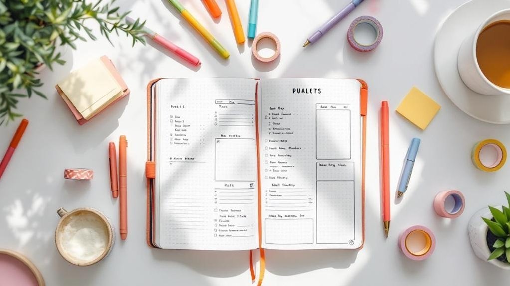
Now, let’s set up some essential backbone pages. You’ll want to create an Index page, a Future Log, a Monthly Log, and a Daily Log. These are the heart of your BuJo, and trust me, they’ll keep you organized and motivated.
Here’s a simple layout tip: For tasks, draw a small box (about 1cm x 1cm) next to each item. For memories, use a dot or a star. This makes it super easy to glance at your logs and know what’s what.
Feeling overwhelmed? Start messy! Just get those pages down — you can always refine them later. What I love about this system is it evolves with you. So, if something isn’t working? Change it!
Layout Steps
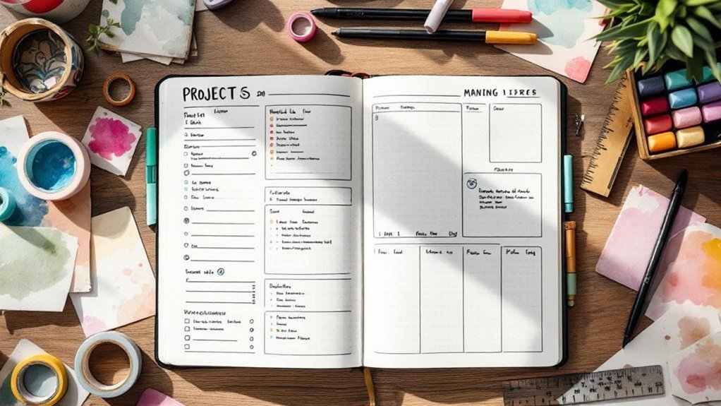
- Index: On the first page, write “Index” at the top in bold. Leave about 5 pages empty for entries as you go.
- Future Log: On the next spread, draw a 3cm x 15cm rectangle on the left and divide it into four sections for each quarter of the year.
- Monthly Log: For this, draw a 2cm x 12cm rectangle for each day of the month. Leave space for tasks underneath.
- Daily Log: Use a fresh page each day. I usually set it up with the date at the top, a box for tasks, and a section for reflections.
What I love about this approach is how it simplifies my planning. I’ve tried more complex systems, but these basics are what stuck after the novelty wore off.
Engagement Break
Common Mistake: A lot of beginners try to make everything perfect from the get-go. Remember, “done is better than perfect.” Embrace the messy!
Once you’ve set these up, create collections for specific topics — books to read, movies to watch, or even workout logs. This adds a personal touch that makes your journal uniquely yours!
Pro Tip: Perform monthly task migration. At the end of each month, review your tasks. What didn’t get done? Move it to next month if it still matters. This keeps you aligned with your evolving needs.
Ready to try? Grab your supplies and start building your foundation. You got this!
Final Thought
So, here’s a little challenge: Pick one collection to start this week. It can be anything — a gratitude log, a habit tracker, you name it!
Just remember, it’s all about what works best for you. Happy journaling!
Phase 2: Implementation
With your color-coded system taking shape, the next crucial step involves implementing it effectively.
So what happens when you actually try this? Establishing critical checkpoints will help ensure your chosen colors truly enhance your workflow, allowing you to pause weekly and assess their impact.
This reflection won't only keep you grounded in your goals but also foster sustainable habits, preventing your journal from losing its initial appeal.
Critical Checkpoints
Critical Checkpoints for Your Creative Journal
Hey there, fellow journaler! You know that moment when your layout just feels *off*? I’ve been there! Once you’ve picked your color palette and laid out your framework, it’s all about keeping that system fresh and functional. Here’s where those critical checkpoints come in.
Supplies You’ll Need:
- Tombow Dual Brush Pens (for vibrant colors) or Crayola Super Tips (budget-friendly).
- Leuchtturm1917 A5 Dotted Notebook (for quality) or Moleskine Classic Notebook (affordable alternative).
- Micron 05 Pen (for fine details) or Staedtler Triplus Fineliner (great budget option).
Skill Level: Intermediate
Start testing your layout weekly. Seriously, it’s a game changer! Check which color combos and placements boost your productivity. Gather that usability data like the treasure it is, and don’t be afraid to refine your visual hierarchy.
What I love about this process is how it turns your journal into a tool that evolves with you. Feel that? The freedom of adapting as you go! I remember trying to stick to a single design for too long. It felt constraining. Instead, embrace the messiness. Done is better than perfect!
Here’s How to Set Up Your Checkpoints:
- Weekly Review: Set aside 15 minutes every week. Grab your favorite mug of tea or coffee — you deserve it!
- Color Tracking: Use a color key in your journal. Draw a 5cm x 5cm box in each color combo you’re testing. Note the date and how you felt about it that week.
- Placement Experimentation: Try different layouts for your task lists. You could use a vertical list this week and a grid next week. Jot down your thoughts on each layout’s effectiveness.
- Visual Hierarchy: Use headers, bullet points, and colors to organize information. I like to use a bold color for my most important tasks. It makes them pop!
Engagement Break: What’s your go-to color combo? You might find that certain colors energize you more than others.
A Quick Reminder:
This approach may feel like a lot at first, but trust me, it’s worth it! I used this layout for three months, and I found myself coming back to it time and again.
Every time I made a tweak, it felt like I was enhancing my workflow.
Common Mistake: Many beginners think they need to stick with one layout forever. Don’t fall into that trap! It’s okay to change things up.
Try this today: Set your timer for 15 minutes and do a quick review of your current layout. What’s working? What’s not? Make a note of one small change you can implement next week. You got this!
Phase 3: Verification
You’ll know your color psychology strategy is effective when you observe a boost in task completion and find visual navigation through your pages more intuitive.
So, how can you measure this success? Watch for a decrease in time spent searching for information and an increase in motivation during planning sessions—these are your key indicators.
As you reflect on your journaling experience, consider how your mood shifts; if you feel consistently invigorated rather than overwhelmed, it’s a sign your color choices are resonating.
Now, let’s explore how to build on these insights for even greater impact.
How to Know It Worked
How to Know Your Color Choices and Layouts Are Working
You know that moment when you flip through your journal and feel a spark of inspiration? That's what we're after! But how can you tell if those color choices and layout designs are truly working for you? Let’s break it down.
First, track some concrete metrics. Think about your task completion rates, mood shifts, and engagement levels. Have you noticed your productivity soaring with certain colors? I’ve found that when I use warm tones, I feel more energized. It’s all about what resonates with you.
Try comparing your weekly or monthly patterns. You might notice that a particular layout helps you stay focused or that certain colors bring a smile to your face. What I love about this is that you can adjust things as you go. No need for perfection—just progress!
Supply List
- Pens: Tombow Dual Brush Pens (or budget-friendly Crayola Super Tips)
- Notebook: Leuchtturm1917 A5 Dotted (or a simple Moleskine)
- Fine Liner: Micron 05 (or a basic Sharpie)
Skill Level: Intermediate
You’re comfortable with rulers and hand lettering, so let’s dive in!
Step-by-Step Insight
- Choose Your Colors: Pick a palette that sparks joy. I usually stick to 3-4 colors. For example, a warm yellow, soft pink, and calming teal.
- Set Up Your Layout: Draw a 4cm x 6cm box, 1cm from the left margin, using a 0.5mm black pen. This will be your main focus area.
- Fill in Your Metrics: In this box, jot down your task completion rates. Use your chosen colors to highlight different levels of completion. It’s visually engaging and helps you see trends at a glance.
Feel that? That’s the satisfaction of seeing your progress!
Engagement Break
Ever tried a layout that looked stunning but took forever? I’ve been there! Don’t get lost in the aesthetics. Remember, function is key. The mistake most beginners make is focusing too much on the pretty without considering how it’ll help them track their tasks.
Reflect and Refine
You might notice that as you track these metrics, your motivation increases. When your colors resonate and your layouts feel like an extension of you, everything flows better.
Take time to reflect on how each design choice improves scanability and usability. This is vital for long-term success!
Try This Today
Grab your favorite pens and journal. Set up a simple layout to track your mood and task completion this week. Just a few minutes a day can make a difference. Keep it fun and remember: done is better than perfect!
Pro Tips From Experience
Pro Tips From Experience: Your Color System for Creative Journaling
You know that feeling when you open your bullet journal and just *know* what to do? That’s the magic of a personal color system. It can transform the way you approach your goals and daily tasks. Your color palette becomes a friendly language your brain speaks, simplifying choices and supercharging your productivity.
Supply List:
- Tombow Dual Brush Pens (set of 10) or Crayola Supertips (budget-friendly alternative)
- Leuchtturm1917 A5 Dotted Notebook or Moleskine Classic Notebook (budget-friendly)
- Micron 05 Black Pen or Paper Mate Flair (budget-friendly)
Skill Level: Intermediate (comfortable with rulers and hand lettering)
Let’s Get Started!
What I love about using color is how it can simplify your layout without being overwhelming. Here are some strategies to help you create a colorful system that actually works for you:
- Pair Colors Strategically: Think about how you can use colors to highlight different priorities. For example, use a calming blue for tasks and a vibrant orange for urgent items. This helps your eyes and mind quickly identify what needs your attention. Feel that? That’s clarity!
- Test Variations: Don’t hesitate to experiment. Try using a different color scheme each month. What energizes you today mightn't work next month. I’ve tried both vibrant and muted tones, and honestly, sometimes you just need to mix it up!
- Track What Sticks: Keep a simple log of which colors boost your focus. I documented my favorites over a few weeks, and it was eye-opening! Some combos I thought would work fell flat, while others surprised me with their effectiveness.
Regular Refinement
Here’s the thing: your layout should evolve. I once had a system that felt perfect, but after a few months, it just didn’t flow anymore. Don’t let habit keep you in a rut. Regularly assess whether your design still supports your workflow.
Quick Tip
A common mistake I see beginners make is overloading their pages with too many colors. Start with three to five colors that resonate with you. That counts! Trust me, less is often more.
Let’s Talk Functionality
Every artistic choice should serve a purpose. When you choose colors, think about how they enhance scanability. A bright heading can draw attention, while softer colors in your notes can help you read without strain.
Engagement Break: What if you tried a seasonal palette? For autumn, warm oranges and browns can create a cozy vibe. In spring, fresh greens and yellows can inspire renewal. How do you feel about adapting your colors to the seasons?
Practicality Meets Aesthetics
A beautiful layout is great, but if it’s not practical, what’s the point? I’ve had spreads that looked stunning but took me 45 minutes to set up. Keep your color system easy to implement. For instance, if you're using a color to indicate tasks, make sure it’s a shade you can replicate easily throughout the month.
Try This Today!
Ready to dive in? Grab your favorite pens and create a simple key in your journal. Use two to three colors to represent different categories in your life—like work, personal, and fun. This won't only add a splash of creativity but also help you stay organized.
Before and After: What to Expect
Before and After: What to Expect
You know that moment when you finally settle on a color scheme and layout? It’s like flipping a switch. Suddenly, your journal transforms from a chaotic collection of ideas into a vibrant, inviting space. You’ll feel it right away—a surge of motivation as the clutter clears. Trust me, your engagement with your journal will shift dramatically.
When your visuals are clear, you’re free to create. Decision fatigue? Gone! You won’t be wrestling with cluttered pages anymore; you’ll just be getting things done.
| Aspect | Before | After |
|---|---|---|
| Navigation | Time-consuming | Instant visual access |
| Motivation | Sporadic | Consistently high |
| Task Completion | Inconsistent | Measurable improvement |
What I love about this transformation is that it goes beyond just productivity. You’ll actually remember things better when they’re visually reinforced. Your journal will become a daily companion you reach for instinctively, not out of obligation. That shift from feeling like you *have* to do it to wanting to do it? That’s real change.
Recommended for You
🛒 Dotted Journal Notebook
As an Amazon Associate we earn from qualifying purchases.
Supplies You'll Need:
- Notebook: Leuchtturm1917 A5 Dotted (around $20) or a budget-friendly alternative like the Scribbles That Matter A5 Dotted Notebook (about $15).
- Pens: Tombow Dual Brush Pens (set of 10 for $30) or Crayola Super Tips (set of 50 for about $10).
- Fine Liner: Micron 05 (around $2) or a budget option like the Faber-Castell PITT Artist Pen (about $1).
Skill Level: Intermediate
You’ve got this! If you’re comfortable with rulers and hand lettering, you’ll find these changes both fun and fulfilling.
Step-by-Step Layout Change:
- Set Your Color Scheme: Choose 3-5 colors that vibe well together. I typically stick to a palette that matches the season—think warm tones for fall or cool blues for winter.
- Create a Monthly Overview: Draw a rectangle measuring 14cm x 10cm at the top of your page, 2cm from the top. Use a fine liner for clean edges.
- Add Calendar Blocks: Inside that rectangle, draw 7 equal squares (2cm x 2cm) for the days of the week. Leave a 0.5cm gap between each. Use colored pens to fill in the days—this adds a pop and makes it easy to spot.
- Incorporate Daily Logs: Below your monthly overview, create a section for daily tasks. Draw 5 lines (5cm long) for each day, spaced 1cm apart. Use a different color for each day to keep things lively.
- Decorate with Purpose: Add doodles that represent the month’s theme—pumpkins for October, snowflakes for December. But remember, every decorative element should help you navigate or remember tasks.
Engage with Your Journal:
Take a moment to reflect. Feel that shift? Your journal isn’t just a tool; it’s a space that invites you in. It’s about making it work for you, not the other way around.
Common Mistake Alert:
The mistake most beginners make? They overcomplicate their layouts. Start messy! A simple design can be just as effective. My go-to approach is to focus on functionality first, then sprinkle in the flair.
Try This Today:
Pick one aspect of your layout to refine. Maybe it’s your color scheme or how you track tasks. Just do it! You’ll be amazed at how even small changes can lead to big shifts in your journaling experience.
Your Next Steps
Your Next Steps in Creative Journaling
You know that moment when you flip through your journal and feel a spark of inspiration? That's the magic of color and layout! Now that you’ve got a solid grasp on color psychology and layout design, let’s refine your system with some fun experimentation. Ready to dive in?
Supply List:
- Tombow Dual Brush Pens (for vibrant color pops)
- Leuchtturm1917 A5 Dotted Notebook (a sturdy base for all your ideas)
- Micron 05 Pens (for clean lines and details)
- Budget-friendly alternative: Crayola Supertips (great for color!) and any dotted notebook.
Skill Level: Intermediate — you’re comfortable with basic layouts and hand lettering.
Refine Your Color Palette
Start testing color combinations that speak to you. Warm tones, like yellows and reds, are fantastic for high-energy projects. Think about using them for your to-do lists when you need that extra push!
On the flip side, cool hues like blues and greens can help you focus during deep work sessions. What I love about this is you can make it your own—feel that?
Try a strategic color-coding system for tasks, appointments, and reflections. For instance, use a warm orange for urgent tasks, a calming teal for appointments, and a soothing lavender for reflections. This little tweak can speed up your decision-making.
Experiment with Layouts
Next up, shake things up with your layouts! Don’t be afraid to step out of your comfort zone. One week, go for structured grids; the next, let your creativity flow with doodles.
I’ve tried both ways, and each brings something unique to my journaling experience. Here’s a tip: draw a 4cm x 6cm box, 1cm from the left margin, using a 0.5mm black pen for your headings. This gives clarity while keeping it visually appealing.
Monthly Reviews
Set aside time each month to review your system. This is where the magic happens! Assess how your colors and layouts are serving your evolving goals.
What’s working? What’s not? I’ve found that some spreads look great but aren’t practical for weekly use. It’s all about finding that sweet spot.
Common Mistakes to Avoid
The mistake most beginners make? They get stuck trying to make everything perfect. Remember: done is better than perfect!
If a layout takes too long or feels overwhelming, it’s okay to ditch it. I once spent 45 minutes on a beautiful spread only to realize it didn’t fit my daily needs.
Try This Today
Pick a color scheme that resonates with you and start color-coding your tasks! Whether it’s for the week or the month, embrace the messiness of experimentation.
Track what feels right, and don’t hesitate to change things up. You’ve got this!
Frequently Asked Questions
How to Layout a Bullet Journal?
Q: What’s the best way to start my bullet journal layout?
Any notebook works—but a dotted A5 gives you the most flexibility! Start by creating a grid or dot format to easily customize your pages. It should take about 20 minutes once you have the layout figured out.
Try the Leuchtturm1917 Dotted Notebook ($20) for quality, or opt for the Scribbles That Matter Notebook ($15) for a budget-friendly choice.
—
Q: How do I organize my sections?
Using clear headings is key for easy navigation! Spend about 15 minutes setting up your main sections, like monthly logs, daily tasks, and goals.
You can use a simple ruler and a black pen for this, or grab the Faber-Castell PITT Artist Pens ($10 for 6) for a smoother look. Don’t worry about making it perfect—just get started!
—
Q: What’s the best way to prioritize tasks?
Color coding is a fantastic way to prioritize instantly! Spend about 10 minutes selecting colors for different task categories—like work, personal, and errands.
Tombow Dual Brush Pens ($25 for 10) or Crayola Supertips ($6 for 20) work nearly as well for beginners. Remember, it doesn’t have to be perfect; just find what works for you!
—
Q: How do I keep track of everything?
Maintaining a regularly updated index page is super helpful for quick reference! Dedicate about 10 minutes each week to update it.
Use a simple numbered list to keep track of your spreads. The Muji Gel Ink Pen ($2 each) is a great option for clean writing. Just keep at it—your index will evolve as you do!
—
Q: What layouts should I try for maximum productivity?
Experimenting with layouts like weekly spreads and habit trackers is key! Setting up a weekly spread takes about 15 minutes, while filling it in daily only takes 30 seconds.
You might want to check out the Bullet Journal Method book ($20) for layout inspiration. Don’t stress about perfection; tweak it as you go!
What Happened to the Bullet Journal App?
Q: What happened to the Bullet Journal app?
Rocketbook discontinued the official Bullet Journal app in 2020 because it just couldn’t match the appeal of the analog system.
If you’re looking to get started or continue journaling, any notebook works — but a dotted A5 notebook gives you the most flexibility. Try the Leuchtturm1917 Dotted Notebook ($20) for a great option!
Q: Why do people prefer pen-and-paper journaling?
Many journalers crave the tactile experience that paper provides, and it allows for a personal touch.
If you’re new to this, setting up your first spread takes about 15 minutes, and you can fill it in daily in just a few minutes. Don’t stress about perfection; it’s all about what works for you!
Q: How can I personalize my Bullet Journal?
Personalizing your Bullet Journal is super fun! You can add stickers, washi tape, or even doodles to make it your own.
Setting up a personalized monthly spread might take about 30 minutes, but once you have a layout you love, it’ll only take a few minutes each day.
Check out the MAMBI Happy Planner Stickers ($20) for awesome options!
Is a Bujo Good for Anxiety?
Q: Is bullet journaling effective for managing anxiety?
Absolutely! Bullet journaling can really help calm your mind by organizing your thoughts.
Try setting aside about 20 minutes to create a simple layout. A dotted A5 notebook, like the Leuchtturm1917 ($20), offers great flexibility.
Plus, using Tombow Dual Brush Pens ($25 for 10) can brighten your pages while you track your mood.
Q: How much time does it take to set up a bullet journal?
You can set up your initial spreads in about 45 minutes.
Once you've got the layout down, it'll only take you about 20 minutes each week to maintain it.
Grab a Moleskine Classic Notebook ($20) for a reliable option. You’ll find it’s easy to keep everything organized!
Q: What’s the best way to track my mood in my journal?
Tracking your mood can be done in just 15 minutes to set up a simple spread, then only 30 seconds daily to fill it in.
Use colored markers to represent different emotions. Crayola Supertips ($6 for 20) are budget-friendly and work well.
You’ll gain valuable insights into your triggers!
Q: Can bullet journaling really help with emotional regulation?
Yes, it’s a fantastic way to enhance your emotional regulation!
Dedicate around 20 minutes weekly to reflect on your feelings and coping strategies.
A softcover notebook, like the Scribbles That Matter ($20), is perfect for this.
You’ll feel more in control and ready to tackle whatever comes your way.
Conclusion
Grab your journal and a single black pen. Draw a 2×3 grid on the next blank page—that's your first weekly tracker. Fill in today’s column, jotting down tasks or habits you want to focus on. Start messy; it’s all about finding what works for you.
Once you’ve got that down, why not pick a color palette that speaks to you and add a splash of color to your tracker? It’ll make your pages pop and motivate you to keep going. Remember, done beats perfect every time. So, dive in and see how your organization transforms!