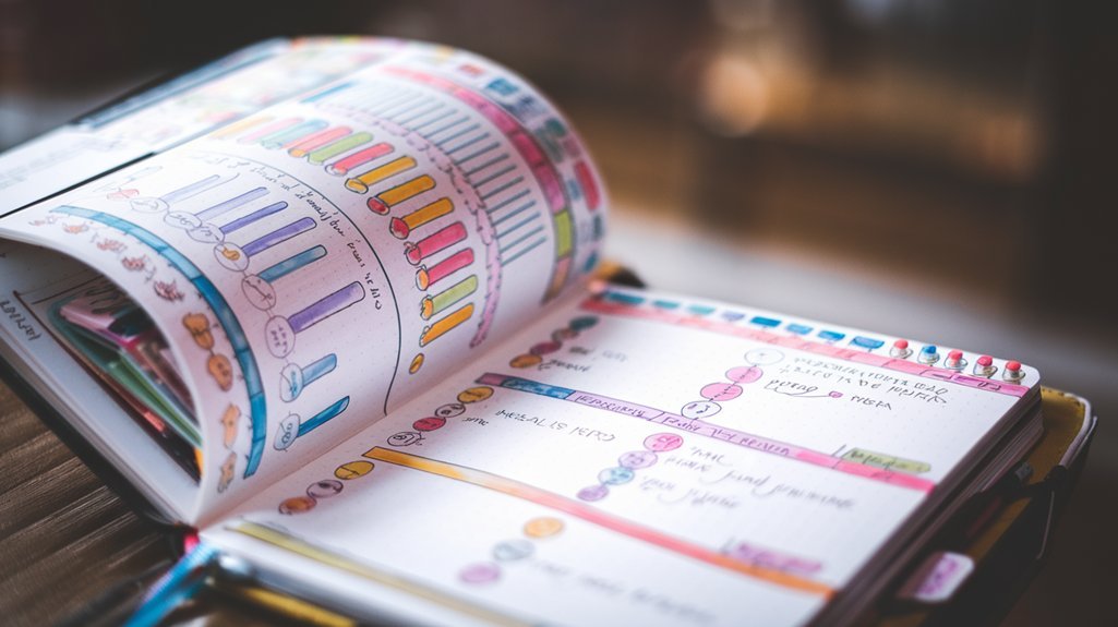
Three years ago, I opened my first bullet journal and stared at that intimidating blank page for twenty minutes. My mind went completely blank. How do people make these gorgeous spreads I see on Instagram? Fast-forward to today, and I've filled twelve journals with techniques that transformed my planning from boring black ink to vibrant, creative masterpieces.
Here's what I've learned: creativity isn't about being naturally artistic. It's about having the right techniques in your toolkit. After experimenting with hundreds of different methods (and making plenty of messy mistakes), I've discovered seven game-changing creative techniques that anyone can master.
Hand Lettering That Actually Looks Professional
Hand lettering intimidated me for months. I thought you needed perfect penmanship or years of practice. Turns out, that's completely wrong. The secret lies in understanding basic letter anatomy and practicing deliberate techniques.
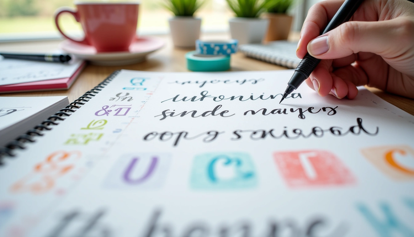
Start with faux calligraphy – this technique changed everything for me. Write your letters normally with a regular pen, then add thickness to the downstrokes. I use my trusty Sakura Pigma Micron pens for the initial letters, then thicken the lines going down. It creates the illusion of brush lettering without the learning curve.
For headers, try block lettering. Draw your letters as outlines, then fill them in. This technique works brilliantly for monthly spreads and habit trackers. I personally love creating shadow effects by drawing the same letters slightly offset in a darker color.
Practice consistency by focusing on letter spacing rather than perfection. Uneven spacing makes even beautiful letters look amateur, while consistent spacing makes simple letters look professional. Use guide dots or light pencil lines to keep your baseline straight.
Simple Doodles That Pack Maximum Impact
Doodling doesn't require artistic talent. It requires knowing which simple shapes create the biggest visual impact. After filling twelve journals with various doodle experiments, I've identified the most effective techniques that anyone can master in minutes.
Start with basic geometric shapes. Circles, triangles, and lines can create stunning borders, dividers, and decorative elements. I use tiny triangles to create mountain ranges across my page headers. Simple circles become flowers, suns, or decorative dots.
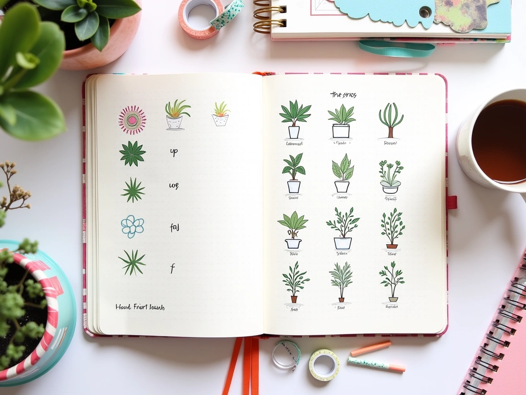
Plant doodles transformed my spreads completely. Here's my go-to technique: draw a simple stem with tiny oval leaves branching off. Add small dots for berries or tiny circles for flowers. These work perfectly as border decorations or corner embellishments. I've used variations of this basic plant doodle in dozens of spreads.
Weather doodles add personality to daily logs. Clouds are just puffy connected circles. Raindrops are teardrops (narrow at top, rounded at bottom). Lightning bolts are zigzag lines with slightly thicker tops. These tiny additions make habit tracking and mood logging much more engaging.
Banner doodles solve the “what do I do with this empty space” problem. Draw a rectangle, add triangular flag ends, then fill with text or patterns. I use banners constantly for section headers, important reminders, and milestone celebrations.
Sakura Pigma Micron Fine Line Pens
Perfect for detailed doodling with consistent ink flow and multiple tip sizes.
- Archival quality ink that won't bleed
- Available in 6 different tip sizes
- Works beautifully with watercolors and markers
Seasonal doodles keep your journal feeling fresh year-round. Spring gets tiny flowers and leaves. Summer features suns and waves. Fall brings acorns and simple leaf shapes. Winter uses snowflakes (six-pointed stars with tiny lines) and pine trees (triangles stacked with small trunks).
Color Techniques That Create Visual Harmony
Color intimidated me more than anything else when I started bullet journaling. I'd either use too many colors (rainbow chaos) or stick to black ink (boring). Learning proper color techniques completely transformed my spreads from amateur to polished.
The three-color rule changed everything. Pick one main color, one accent color, and keep black for text. This creates visual cohesion without overwhelming the page. I typically use one color for headers, another for highlights or decorative elements, and black for all writing.
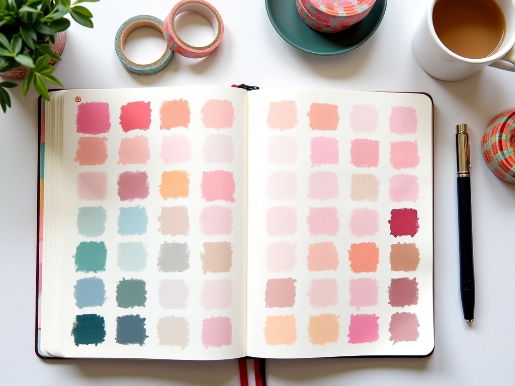
Gradient effects add sophistication with minimal effort. Start with your darker shade, then blend toward white space using lighter pressure or diluted color. This works beautifully with colored pencils or watercolor pencils. I use gradients for header backgrounds and habit tracker squares.
Color coding systems boost functionality while adding visual appeal. Assign specific colors to life categories: blue for work, green for health, purple for personal projects. Consistency across your entire journal creates a cohesive system that's both beautiful and practical.
Watercolor techniques don't require expensive supplies. Watercolor pencils give you control while creating soft, blended effects. Wet your brush lightly, then brush over your pencil marks. The color will dissolve and spread beautifully. I use this technique for background washes and decorative elements.
Highlighting techniques go beyond basic yellow markers. Try using colored pencils to underline important text with soft color. Use gel pens for subtle highlighting that won't overpower your writing. Pastel highlighters create gentle emphasis without the harsh neon effect.
Washi Tape Magic for Instant Professional Look
Washi tape was my gateway drug into bullet journal creativity. It's impossible to mess up, instantly adds visual interest, and fixes mistakes beautifully. After collecting (okay, hoarding) dozens of different patterns, I've discovered the most effective techniques for maximum impact.
Border techniques create instant polish. Run tape along page edges, around important sections, or as dividers between different areas. I prefer 15mm width for main borders and 5mm for subtle accents. The key is keeping lines straight – use your journal's dots as guides.
YUBBAEX Washi Tape Set
240 pieces of quality washi tape in coordinated colors and patterns at an unbeatable price point.
Layering techniques add depth and visual complexity. Start with wider tape as your base layer, then add narrower patterns on top. I love combining solid colors with delicate patterns – it creates sophisticated looks without overwhelming the page content.
Functional applications make washi tape more than just decoration. Use it to create pockets by taping three sides of a small piece of paper to your page. Create tabs by folding tape over page edges. Make mistake cover-ups look intentional by creating geometric patterns over errors.
Seasonal collections keep your journal feeling current. I rotate my tape selections quarterly – pastels for spring, bright colors for summer, warm oranges and browns for fall, cool blues and silvers for winter. This creates natural cohesion within each journal section.
Corner techniques solve the “what goes in empty corners” problem. Create small triangular flags by folding tape at 45-degree angles. Make geometric corner decorations by layering different width tapes. These tiny details make spreads look intentionally designed rather than just functional.
Strategic Sticker Placement for Maximum Impact
Stickers get dismissed as “too juvenile” by many bullet journalists, but strategic sticker use creates professional-looking spreads with zero artistic skill required. The secret lies in choosing quality stickers and using them purposefully rather than randomly.
Functional stickers serve dual purposes. Weather stickers for mood tracking, small dots for habit completion, arrows for important reminders. I use tiny star stickers to mark completed goals – it's much more satisfying than simple checkmarks. Priority stickers (small colored dots) help categorize tasks at a glance.
Accent stickers add polish without overwhelming content. Small geometric shapes, delicate florals, or minimal icons work best. I place one or two accent stickers per spread maximum – usually in corners or as divider elements between sections.
Erin Condren Metallic Dot Stickers
Luxurious gold and rose gold foil stickers that add elegant accents without childish appearance.
Theme coordination keeps sticker use looking intentional. Choose stickers that match your monthly theme or color palette. For my productivity-focused months, I use simple geometric shapes in my accent colors. For creative months, I might include small artistic elements or inspirational quotes.
Size variation creates visual hierarchy. Use larger stickers for major milestones or month markers, medium stickers for weekly goals, and tiny stickers for daily habits. This creates natural visual organization that guides the eye through your content.
Quality matters significantly with stickers. Cheap stickers fade, peel, or leave residue over time. Invest in acid-free, archival quality options if you want your journals to last. I've learned this lesson the hard way with early journals where cheap stickers now look terrible.
Seasonal sticker rotation keeps your aesthetic fresh. I change my sticker collection every three months to match seasonal themes and color palettes. This creates natural variety without requiring constant supply shopping.
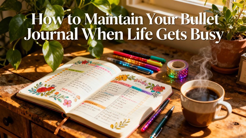
Bringing It All Together: Your Creative Action Plan
Implementing all these techniques at once will overwhelm you (trust me, I tried). Instead, choose one technique per month to focus on and master. Start with whichever technique excites you most – enthusiasm beats perfect order every time.
Create a technique testing page in your journal. Dedicate one spread to experimenting with new methods before committing them to your actual layouts. This prevents disasters and builds confidence. I still use testing pages for complex techniques or new supplies.
Document what works for your lifestyle. Not every technique will fit your personal style or schedule. I love intricate doodling but rarely have time for it during busy work periods. Knowing your realistic limitations prevents frustration and abandoned journals.
Build your supply collection gradually. You don't need everything immediately. Start with basic pens and add one new supply type per month. This spreads the cost and prevents supply overwhelm. Quality basics beat mediocre variety every time.
🎯 Our Top Recommendation
After extensive testing, we recommend the Tombow Dual Brush Pen Set for most readers because it combines lettering, coloring, and detail work in one versatile tool that grows with your skills.
Remember, creativity develops through practice, not perfection. My early attempts looked nothing like my current spreads. Every “mistake” taught me something valuable about what works and what doesn't. Embrace the learning process and celebrate small improvements.
Your bullet journal should reflect your personality and support your goals. These techniques are tools, not rules. Adapt them to fit your style, schedule, and preferences. The best creative technique is the one you'll actually use consistently.
Frequently Asked Questions
What's the best way to start with creative bullet journal techniques if I have no artistic experience?
Begin with simple geometric shapes and basic color coding. These techniques require no artistic skill but create immediate visual impact. Practice faux calligraphy for lettering – it looks professional but only requires thickening downward pen strokes. Focus on one technique per month until it becomes natural.
How do I choose colors that work well together in my bullet journal?
Use the three-color rule: select one main color, one accent color, and keep black for text. Choose colors that appear together in nature or use online color palette generators. Cooler colors (blues, greens, purples) create calming effects while warmer colors (reds, oranges, yellows) energize your spreads.
What supplies do I really need to get started with creative techniques?
Start with quality fine-tip pens (like Sakura Pigma Microns), one set of colored pencils or markers, and basic washi tape. Add supplies gradually as you discover which techniques you enjoy most. Quality basics create better results than many mediocre supplies.
How can I make my bullet journal creative without spending hours on each page?
Focus on high-impact, low-effort techniques like washi tape borders, simple geometric doodles, and strategic color coding. Prepare elements in advance during free time – pre-draw doodles, cut tape strips, or practice lettering. Even 5-10 minutes of creative elements transforms basic spreads.
Should I plan my creative layouts in advance or create them spontaneously?
Combine both approaches. Plan monthly themes and color palettes in advance for consistency, but leave room for spontaneous creative additions. Keep a “testing page” in your journal for experimenting with new techniques before committing them to your actual spreads.
How do I fix mistakes when using creative techniques in my bullet journal?
Embrace mistakes as creative opportunities. Cover errors with washi tape geometric patterns, turn ink blobs into decorative elements, or use correction tape as a design element. Many of my favorite layout features started as “mistake cover-ups” that looked so good I use them intentionally now.
What's the difference between functional and decorative creative techniques?
Functional techniques serve dual purposes – they look good and improve usability. Examples include color-coded categories, icon systems for tasks, or stickers for habit tracking. Decorative techniques focus purely on visual appeal like border doodles or accent lettering. The best spreads combine both effectively.