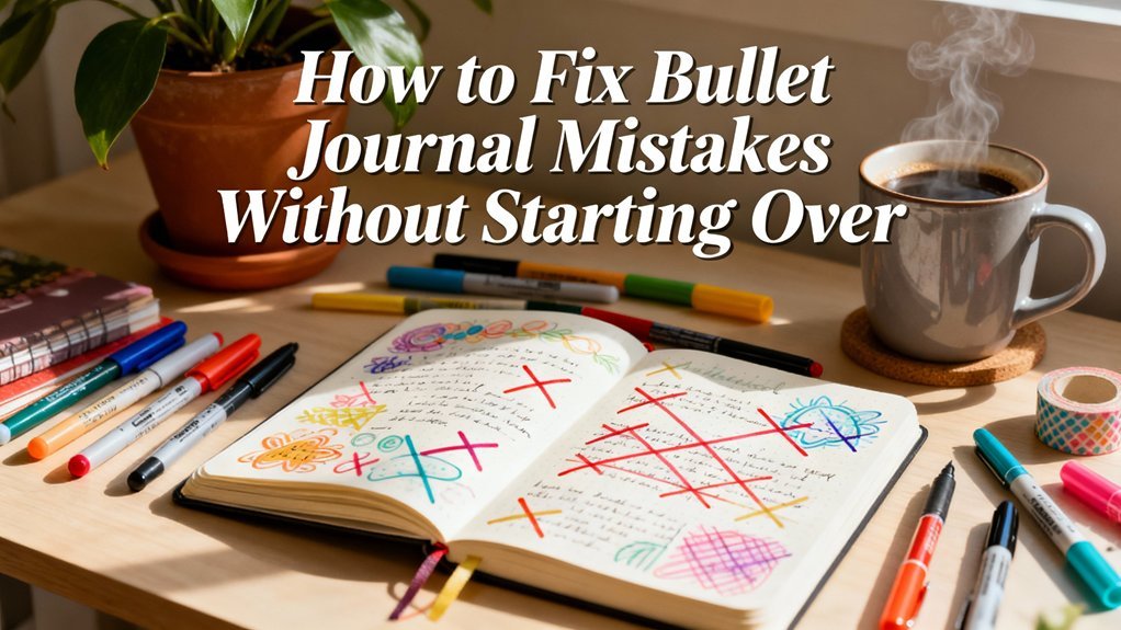
Last Tuesday, I stared at my blank bullet journal page for a solid ten minutes. The cursor on my brain seemed frozen – you know that feeling when you want to create something beautiful but don't know where to start? Then I remembered something my art teacher said years ago: “Creativity isn't about being perfect; it's about being brave enough to make the first mark.”
That simple shift changed everything. Instead of overthinking, I grabbed my favorite pen and started doodling tiny leaves in the margins. Within an hour, I'd created one of my most beloved spreads yet. Here's the thing about creative bullet journaling – it's not about having advanced artistic skills. It's about knowing a few key techniques that can transform any ordinary page into something that makes you smile every time you see it.
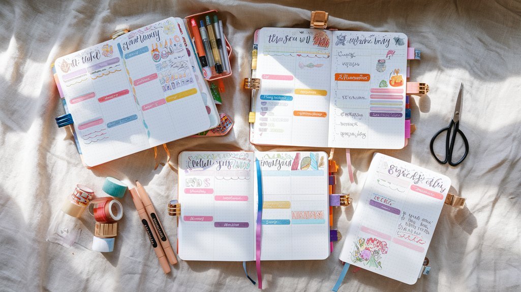
After three years of bullet journaling and countless experiments with different creative approaches, I've discovered that mastering just five core techniques can elevate any spread from basic to breathtaking. Whether you're working with minimal supplies or have a full craft arsenal, these methods will help you create pages that are uniquely yours.
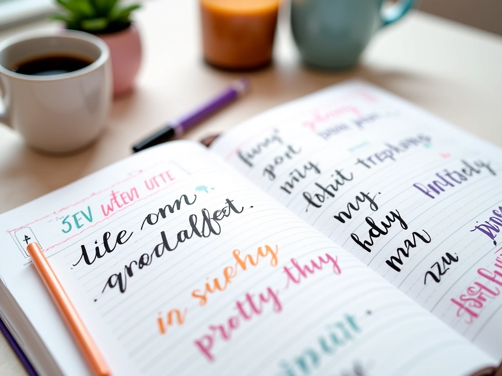
Mastering Hand Lettering for Beautiful Headers
Hand lettering intimidated me for months. I kept thinking I needed perfect penmanship to create beautiful headers, but honestly? Some of my favorite lettering pieces have wonky baselines and inconsistent letter heights. The charm lies in the imperfection.
Start with basic block letters – they're forgiving and look intentionally bold even when they're slightly uneven. I use a simple method: write your word lightly in pencil first, then trace over it with your pen, making each letter about twice as thick as normal handwriting. For my monthly headers, I typically make letters about 1/2 inch tall, which feels substantial without overwhelming the page.
Brush lettering offers a different vibe entirely. You don't need a fancy brush pen to start – I practiced for weeks using a regular marker, pressing harder on downstrokes and lighter on upstrokes. The key is consistent pressure variation. Practice writing “minimum” and “aluminum” repeatedly; these words contain most of the letter combinations you'll encounter.
For faux calligraphy, write your word normally, then add thickness to the downstrokes by drawing a parallel line next to each one and filling in the space. This technique gives you elegant-looking script without needing to master actual calligraphy pressure control.
Mixing Lettering Styles
The magic happens when you combine different lettering styles in one header. I often pair bold block letters with delicate script, or mix uppercase and lowercase in unexpected ways. For “December Goals,” I might write “DECEMBER” in chunky block letters and “goals” in flowing script underneath. The contrast creates visual interest without looking chaotic.
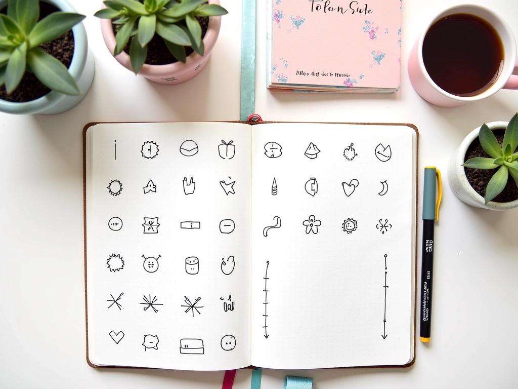
Simple Doodles That Add Personality
I used to think doodling meant elaborate illustrations, but some of my most effective doodles are embarrassingly simple. A tiny coffee cup next to my morning routine tracker. Small stars scattered around important dates. Geometric shapes that frame quotes or important notes.
Start with basic shapes and build from there. Circles become flowers, suns, or planets. Triangles turn into mountains, trees, or geometric patterns. I keep a mental catalog of about twelve simple doodles that I can draw confidently: leaves, hearts, stars, arrows, banners, speech bubbles, lightbulbs, books, envelopes, keys, flowers, and simple faces.
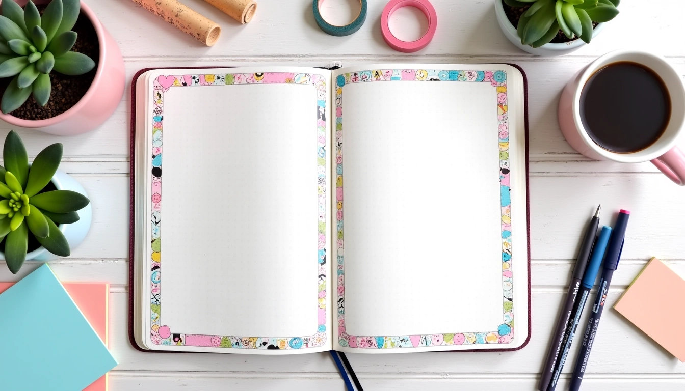
Border Doodles
Corner doodles and border elements transform any page instantly. I love creating simple vine borders by drawing a curved line and adding small leaves every inch or so. For geometric borders, I alternate between circles and triangles, or create a pattern of interlocking squares.
Seasonal doodles keep things fresh throughout the year. December calls for snowflakes, holly leaves, and gift boxes. Spring brings flowers, rain clouds, and butterflies. Summer means suns, waves, and ice cream cones. These don't need to be artistic masterpieces – recognition is more important than perfection.
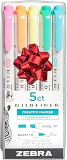
Zebra Mildliner Highlighter Set
Perfect dual-tip markers for both highlighting and creating soft, muted doodles that won't overpower your spreads.
- 25 soft, pastel colors
- Chisel tip and fine bullet tip
- Water-based ink won't bleed through most papers
Icon Development
Creating a personal icon system makes your bullet journal more functional and visually cohesive. I use a tiny house for home tasks, a simplified computer screen for work items, and a dumbbell shape for fitness goals. The trick is keeping them simple enough to draw quickly but distinctive enough to recognize at a glance.
Practice drawing your icons the same way each time. Consistency matters more than complexity. I spent two weeks refining my “book” icon until I could draw it identically every time – it's just a rectangle with a line down the middle, but it looks intentional because it's always the same.
Color Techniques That Wow
Color intimidated me initially because I thought I needed to understand color theory to use it effectively. Turns out, you just need to understand a few basic principles and trust your instincts.
Analogous colors (neighbors on the color wheel) create harmony. Think blues and greens, or oranges and reds. I use this for monthly themes – October gets warm oranges and deep reds, while January feels fresh with blues and teals. Monochromatic schemes use different shades of the same color family. A navy, sky blue, and pale blue combination feels cohesive and sophisticated.
The Three-Color Rule
Limiting yourself to three colors per spread prevents visual chaos. I typically choose one dominant color (about 60% of the colored elements), one secondary color (30%), and one accent color (10%) for emphasis. For my habit tracker last month, I used sage green as the dominant color, dusty rose as secondary, and golden yellow for highlighting streaks.
Gradients add sophistication without requiring advanced skills. Start with your lightest color and gradually press harder or layer additional colors. Colored pencils work beautifully for this – I can create sunset effects by layering yellow, orange, and pink in overlapping strokes.
Watercolor Effects
You can create watercolor effects with regular markers and a water brush. Color a small area with your marker, then blend it out with a damp brush. I love this technique for creating soft backgrounds behind quotes or important deadlines. The key is working quickly before the ink dries completely.
Color blocking works when you want bold, graphic effects. Instead of coloring entire sections, I create geometric shapes in solid colors and layer text or doodles on top. A bright yellow triangle behind my weekly goals makes them impossible to miss.
Crayola Super Tips Washable Markers
These affordable markers blend beautifully and offer excellent color variety for beginners exploring color techniques.
Washi Tape Magic
Washi tape felt like cheating when I first started using it. How could something so simple make such a dramatic difference? But honestly, it's one of the most versatile tools in my bullet journal arsenal.
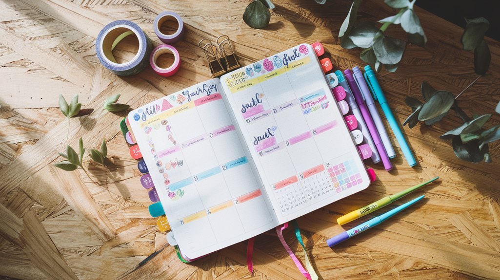
Basic applications include creating borders, dividing sections, and highlighting important areas. I use thin strips along the edges of my monthly calendar to define the space, and wider tape to create headers or separate different tracking sections. The repositionable nature means you can adjust placement until it feels right.
Layering different patterns and widths creates depth and visual interest. I might use a narrow solid color tape as a base, then layer a wider patterned tape over it, slightly offset. The peek of color underneath adds sophistication to the design.
Creative Applications
Washi tape flags mark important pages or sections. I tear small triangular pieces and attach them to page edges, creating colorful tabs that make navigation easier. Different colors can represent different categories – blue for monthly overviews, green for habit trackers, pink for creative projects.
Creating geometric shapes with tape adds structure to spreads. I love making diamond or hexagon shapes by carefully placing strips at angles, then filling the center with text or small illustrations. This technique works especially well for highlighting goals or important quotes.
For texture variety, try tearing tape edges instead of cutting them cleanly. The organic edge adds a handmade feel that contrasts beautifully with precise lettering or geometric elements.
Seasonal Tape Strategies
I rotate my tape collection seasonally to keep spreads feeling fresh. Winter calls for blues, silvers, and whites. Spring brings pastels and floral patterns. Summer means bright colors and tropical motifs. Fall embraces warm oranges, deep reds, and gold accents.
Building a tape collection doesn't require buying dozens of rolls at once. I add 2-3 new rolls each month, focusing on patterns or colors that complement my existing collection. This gradual approach prevents overwhelming choices while ensuring I always have fresh options.
Strategic Sticker Placement
Stickers scared me for the longest time because I worried they'd make my journal look childish. Then I realized it's all about selection and placement. The right stickers in the right spots can add whimsy and personality without compromising the sophisticated aesthetic I was going for.
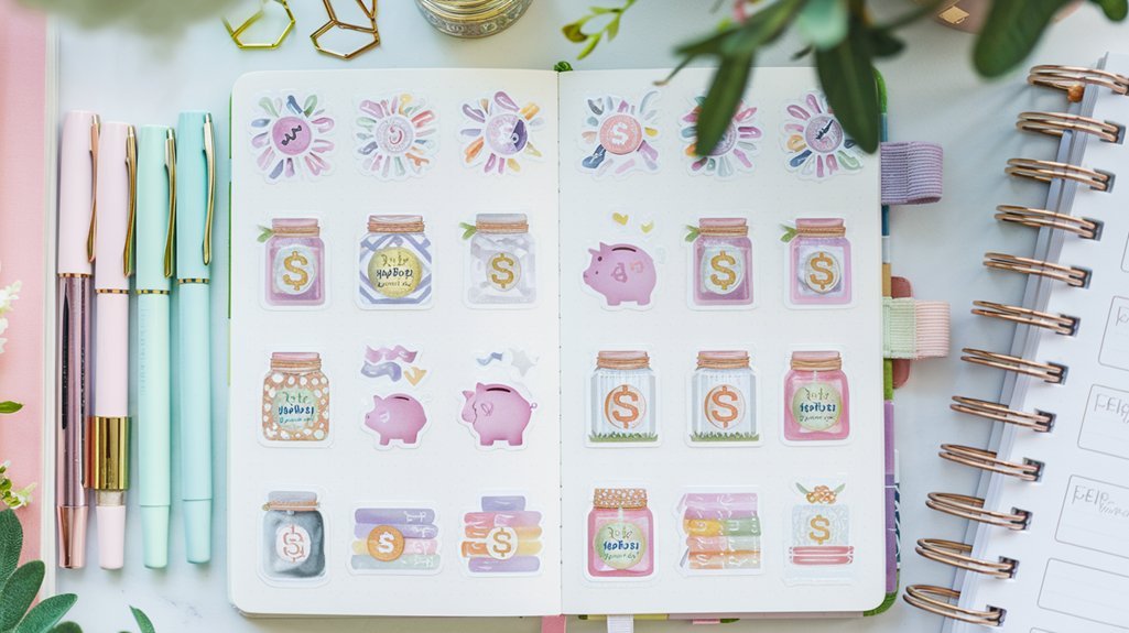
Functional stickers serve double duty as decoration and information. I use small dot stickers to mark completed habits – green for done, yellow for partially completed, red for missed. Star stickers highlight particularly successful days or important accomplishments. The visual feedback is immediate and motivating.
Paper House Sticker Value Pack
High-quality stickers with sophisticated designs perfect for adult planners and journals.
Theme-Based Collections
Building themed sticker collections helps maintain cohesion across spreads. I have separate collections for different moods: minimalist black and white geometric shapes, vintage botanical illustrations, and modern gradient circles. Sticking within a theme for each monthly spread creates visual harmony.
Seasonal stickers keep things interesting year-round. December brings snowflakes and winter trees. March calls for flowers and rain clouds. July needs suns, waves, and summer motifs. I buy seasonal stickers at the end of each season when they're heavily discounted, building my collection gradually.
Placement Principles
Strategic placement makes stickers look intentional rather than random. I use the rule of odds – placing stickers in groups of three or five feels more natural than even numbers. Triangle arrangements work particularly well for creating visual interest without overwhelming the page.
Balance is crucial. If I place a sticker in the upper right corner, I might add a smaller element in the lower left to create visual equilibrium. This doesn't mean perfect symmetry – it's more about weight distribution across the page.
White space matters as much as decorated areas. Cramming stickers into every available space creates visual chaos. I aim for about 70% content and 30% breathing room. The empty spaces help the decorated areas stand out more effectively.
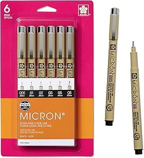
🎯 Our Top Recommendation
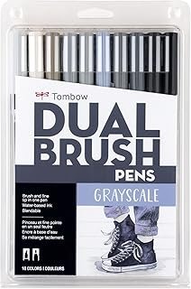
After extensive testing, we recommend the Sakura Pigma Micron Pen Set for most readers because it provides the consistent, precise lines that make all these creative techniques possible.
Frequently Asked Questions
What creative techniques work best for bullet journal beginners?
Start with simple hand lettering and basic doodles like stars, hearts, and leaves. These creative bullet journal techniques require minimal supplies and build confidence quickly. Add one new technique every few weeks rather than trying everything at once.
How do I choose colors that work well together in my bullet journal?
Use the three-color rule: pick one dominant color, one secondary color, and one accent color per spread. Analogous colors (neighbors on the color wheel) like blues and greens create natural harmony and are nearly impossible to mess up.
Can I use creative techniques if I'm not artistic?
Absolutely! Most effective bullet journal creative techniques rely on consistency rather than artistic skill. Simple block letters, basic geometric doodles, and strategic washi tape placement can transform any spread regardless of your drawing ability.
What supplies do I need to start using creative techniques?
Begin with basic black pens, 2-3 colored markers or pencils, a few rolls of washi tape, and simple stickers. You can create beautiful spreads with minimal supplies – expensive materials don't guarantee better results.
How do I keep my creative bullet journal techniques from looking childish?
Focus on restraint and intentional placement. Use sophisticated color palettes, limit yourself to 2-3 techniques per spread, and maintain plenty of white space. Quality over quantity creates mature, elegant results.
Should I practice creative techniques separately before using them in my journal?
Practice lettering alphabets and basic doodles in the back pages of your journal or on scrap paper first. This builds muscle memory and confidence before incorporating techniques into your actual spreads.
How often should I change up my creative techniques?
Rotate techniques monthly or seasonally to prevent burnout and keep things interesting. Master 2-3 core techniques first, then gradually add new elements. Consistency within each spread is more important than constant variety.
Related Posts

Supplies for Creative Spreads
Disclosure: Affiliate links below. We earn from qualifying purchases.
Related Posts
Related Resources
- Best Supplies Buying Guide
- Beginner's Guide to Bullet Journaling
- Browse All Spreads
- Browse All Trackers
- Free Templates