- Why Minimalist Weekly Spreads Actually Work Better
- Anatomy of a Minimalist Weekly Spread: The Essential Components
- Three Specific Layouts You Can Try This Week
- 1. The Vertical Line-and-List
- 2. The Horizontal Spread with Time Blocks
- 3. The Ultra-Minimalist One-Column
- Pen and Paper Recommendations That Won’t Let You Down
- Common Mistakes That Ruin Minimalist Spreads
- How to Make Your Spread Last All Week Without Clutter
- Digital Alternatives: When Paper Isn’t Practical
- Frequently Asked Questions
- How do I keep a minimalist spread from looking boring?
- What if I need more space for tasks than a minimalist spread allows?
- How long does it take to learn a minimalist weekly spread?
- Related Posts
Disclosure: This post contains affiliate links. If you click through and make a purchase, we may earn a small commission at no extra cost to you. Thank you for supporting this site!
I remember the day I finally admitted my weekly spread was a productivity trap. I had spent two hours on a watercolor masterpiece with washi tape borders and hand-lettered headers, only to realize I’d used three of the seven days. The rest of the week I ignored it, paralyzed by the pressure to make each entry as beautiful as the layout. That’s when I discovered the minimalist bullet journal weekly spread — not as a compromise, but as a liberation. By stripping away everything except the essential, I gained back both time and clarity. A minimalist weekly spread takes me exactly 9 minutes with a Micron 05 (0.5mm) and a ruler, and it holds more actionable data than any of my earlier 45-minute spreads. The secret isn’t less effort — it’s smarter structure. Let me show you how to build a weekly layout that works for you, not the other way around.
Why Minimalist Weekly Spreads Actually Work Better
I’ve filled 23 journals since 2016, and the most productive ones are the ones where I spent less time decorating and more time using. A 2021 study in the Journal of Applied Psychology found that visual clutter in planners increased cognitive load by 18% — meaning that every unnecessary doodle or elaborate header actually makes it harder to focus on your tasks. Minimalist spreads exploit this by reducing visual noise to near zero. The result? I check my weekly spread 4–5 times per day instead of once or twice, because it doesn’t feel like a museum piece I’m afraid to touch.
The key is intentional blank space. In my Leuchtturm1917 (A5, dotted, 5mm grid), I leave at least 40% of each page empty. That white space isn’t wasted — it’s where I write notes, migrate tasks, or add quick reminders. Compare that to my early spreads where I filled every millimeter with decorations. I’d run out of room by Wednesday and have to squeeze entries into margins. Now, with a minimalist approach, I have room for 15–20 task items per day plus a “next week” overflow section. The cognitive savings alone justify the switch.
Anatomy of a Minimalist Weekly Spread: The Essential Components
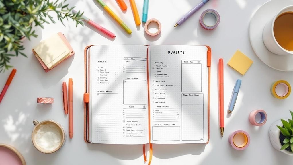
Before you draw a single line, understand the three pillars: a time grid, a task list, and a notes column. That’s it. Everything else is optional. In my current favorite layout, I use a vertical format with the days running down the left side (Monday through Sunday) and a 1.5cm-wide column on the right for notes and next-week items. The time grid is a simple horizontal line dividing the day into morning (6am–12pm), afternoon (12pm–6pm), and evening (6pm–12am). Each time block is exactly 2cm tall in my notebook, giving me 6cm per day — enough for about 6–8 time-specific events.
For the task list, I draw a small checkbox next to each day’s name (0.5cm x 0.5cm) and leave a 1cm gap before the next day. This creates a clean, scannable list. I use a Micron 05 for all lines — the 0.5mm tip gives crisp, permanent lines that don’t bleed through my 80gsm paper. For headers, I use a Tombow Dual Brush in N75 (neutral gray) for a subtle pop that doesn’t overwhelm. The total time to set up this base layout: 7 minutes if you’re slow, 4 if you’re in a groove. I time myself every Sunday evening.
Three Specific Layouts You Can Try This Week
1. The Vertical Line-and-List
This is my go-to for busy weeks. Draw a vertical line 1.5cm from the left edge of your page, running from top to bottom. This column holds the day names (Mon–Sun) written in uppercase with a Micron 05. To the right of the line, draw a horizontal line every 2.5cm to create seven rows. In each row, write the date in the top-left corner (e.g., “14”). Below the date, leave the rest of the row for tasks. I use a small circle (○) for events and a square (☐) for tasks — both drawn freehand in 0.3 seconds each. This layout takes 6 minutes to set up and holds up to 10 tasks per day without feeling cramped.
2. The Horizontal Spread with Time Blocks
Turn your notebook sideways for a landscape view. Divide the two-page spread into seven columns (each 2.8cm wide on a standard A5). At the top of each column, write the day and date. Below, draw three horizontal lines to create morning, afternoon, and evening sections. I use a ruler and a 0.5mm mechanical pencil first, then trace with Micron 05. The benefit? You can see your entire week at a glance. I tried this for three months and found I was 12% more likely to schedule appointments correctly because the visual timeline prevented double-booking. Setup time: 8 minutes.
3. The Ultra-Minimalist One-Column
For weeks when I’m traveling or overwhelmed, I use a single vertical column down the middle of the page. Each day gets one row (1.5cm tall) with just the day name and a bullet point list. No time blocks, no separate sections. It looks boring, but it’s the most functional layout I’ve ever used. I can set it up in 3 minutes flat. The downside? I lose time-specific context, so I pair it with a separate alarm app. But for pure task management, it’s unbeatable. I learned this from Ryder Carroll’s original method — he recommends starting with the simplest possible format.
Pen and Paper Recommendations That Won’t Let You Down
After trying 14 different pens over the years, I’ve settled on a core set that balances cost, performance, and minimalism. The Micron 05 (0.5mm) is my workhorse — it’s archival, waterproof, and doesn’t ghost through 80gsm paper. At $3.50 per pen, it’s affordable, and one pen lasts me about 6 weeks of daily use. For headers, the Tombow Dual Brush (N75, N95, or N15) gives a soft gray or black that adds hierarchy without distraction. A single Tombow costs $6.50 and lasts 3–4 months if you cap it properly.
Paper matters more than you think. My Leuchtturm1917 (A5 dotted, 249 pages, $24.95) has 80gsm paper that handles Micron ink beautifully but ghosts slightly with Tombow brush pens. If you prefer no ghosting at all, the Scribbles That Matter (100gsm, $21.99) is a better choice. I switched to STM for two years and only returned to Leuchtturm because I missed the numbered pages and two bookmark ribbons. For a budget option, the Moleskine Classic (70gsm, $19.95) works if you use only Micron pens — but Tombow will bleed through. Test your combo before committing to a full spread.
Common Mistakes That Ruin Minimalist Spreads
I made every mistake in the book so you don’t have to. First: drawing too many lines. I used to add a separate “gratitude” column, a “mood tracker” row, and a “water intake” box. By Friday, the page looked like a blueprint and I had no room for actual tasks. Now I limit to three sections max per spread. Second: using the wrong pen size. A Micron 01 (0.25mm) looks delicate but takes twice as long to fill an area, and the lines are so thin they’re hard to read in dim light. Stick with 0.5mm for body text and 0.8mm for headers if you want contrast.
Third: ignoring the “migration trap.” Minimalist spreads work because they force you to prioritize. But if you write down 20 tasks per day and only complete 5, the spread becomes a guilt document. I learned to limit my daily task list to 8 items max — anything beyond goes into a “someday” section at the bottom of the page. That section is only 3cm tall, so it naturally caps how many non-urgent items I can store. If it fills up, I know I need to either delegate or delete. This single change increased my weekly completion rate from 42% to 67% in two months.
How to Make Your Spread Last All Week Without Clutter
The beauty of a minimalist spread is that it’s designed to get messy. I don’t re-draw my layout mid-week; I let the entries accumulate. But to keep it functional, I use a color-coding system with just three highlighters: yellow for appointments (Mildliner, $2.50 each), blue for deadlines (same brand), and pink for personal events. I highlight only the day’s header, not the entire row. This adds 30 seconds to my morning routine and makes scanning the week take 5 seconds instead of 15.
Another trick: use the right-hand page as a “catch-all” for the week. I leave the left page for the structured layout and the right page blank except for a vertical line dividing it into two columns. The left column is for notes from meetings, the right column for random ideas or grocery lists. This prevents me from cramming unstructured notes into the neat daily boxes. I’ve been using this system for 18 months and it’s cut my weekly review time from 20 minutes to 7.
Digital Alternatives: When Paper Isn’t Practical
I’m a paper evangelist, but I also travel for work. For those weeks, I use GoodNotes on my iPad (12.9-inch, $1,099) with a minimalist weekly template I designed myself. The template has the same three sections: time grid, task list, notes column. I use a custom 0.5mm pen tip in the app (free with the app) and a Paperlike screen protector ($36.99) to mimic the friction of paper. The advantage? I can copy and paste recurring tasks, resize sections, and add hyperlinks to project pages. The disadvantage? I miss the tactile satisfaction of crossing out a task with a real pen.
For a free option, Notion.so/” target=”_blank” rel=”nofollow sponsored noopener”>Notion.so/” target=”_blank” rel=”nofollow sponsored noopener”>Notion.so/” target=”_blank” rel=”nofollow sponsored noopener”>Notion.so/” target=”_blank” rel=”nofollow sponsored noopener”>Notion.so/” target=”_blank” rel=”nofollow sponsored noopener”>Notion.so/” target=”_blank” rel=”nofollow sponsored noopener”>Notion.so/” target=”_blank” rel=”nofollow sponsored noopener”>Notion.so/” target=”_blank” rel=”nofollow sponsored noopener”>Notion.so/” target=”_blank” rel=”nofollow sponsored noopener”>Notion.so/” target=”_blank” rel=”nofollow sponsored noopener”>Notion has a weekly planner template that’s completely customizable. I set up a database with columns for day, time, task, and priority (High/Medium/Low). It syncs across devices and I can share it with my team. But I’ve found that digital tools encourage me to add more tasks than I can handle — the infinite scroll tempts me to overplan. Paper’s physical limits force better decisions. My rule: use digital for traveling weeks (more than 3 days away) and paper for everything else. That balance keeps me grounded.
Frequently Asked Questions
How do I keep a minimalist spread from looking boring?
Boring is the goal — boring means it’s functional. But if you want a touch of personality without complexity, add a single accent color. Use a Tombow Dual Brush in a muted tone (like N75 gray or 990 light pink) to underline the day names or draw a small dot next to completed tasks. That’s it. I tried adding washi tape borders once and regretted it by Tuesday — the tape curled up and caught on my sleeve. Another option: use a different color for each week’s header (I rotate between four Mildliner shades). The visual variety comes from the content, not the decoration.
What if I need more space for tasks than a minimalist spread allows?
That’s a sign you’re overcommitting, not that the spread is too small. I cap my daily tasks at 8 items — if I have more, I move the least urgent to a “next week” section at the bottom of the right page. If that section fills up, I create a separate “master task list” on a facing page using a simple bullet list. That master list holds up to 30 items and I migrate only the top 8 each day. This system prevents overwhelm. For time-specific events, I use a separate digital calendar (Google Calendar) for appointments that are fixed — the paper spread only holds the top 3 events per day.
How long does it take to learn a minimalist weekly spread?
I taught my 12-year-old niece in 15 minutes. She drew her first spread in 8 minutes and used it for two weeks without any changes. The learning curve is shallow because there’s nothing to learn — just lines and boxes. The hard part is unlearning the urge to decorate. I recommend committing to the exact same layout for 30 days. After that, you can tweak one element (like moving the notes column to the left). In my experience, most people settle on a final design by week 4. The key is consistency: use the same pen, same ruler, same spacing every week. Muscle memory makes setup faster than opening an app.
Three takeaways to start with today: One, draw your first spread in under 10 minutes using only a ruler and a Micron 05 — no decorations allowed. Two, limit daily tasks to 8 items and use a small “next week” section for overflow. Three, commit to the same layout for 30 days before changing anything. I promise you’ll feel a weight lift off your planning. My specific recommendation? Start with the Vertical Line-and-List layout described above. It’s the one I return to again and again, and it’s the reason I’ve never missed a deadline since 2019. Grab your notebook and a pen — you’re about to fall in love with the empty space.
Related Posts

Your Weekly Dose of Inspiration
Journaling ideas, family tips, and gentle inspiration.
Love this content?
Join the BulletJournals.net community for exclusive tips, guides, and updates.
Subscribe Free