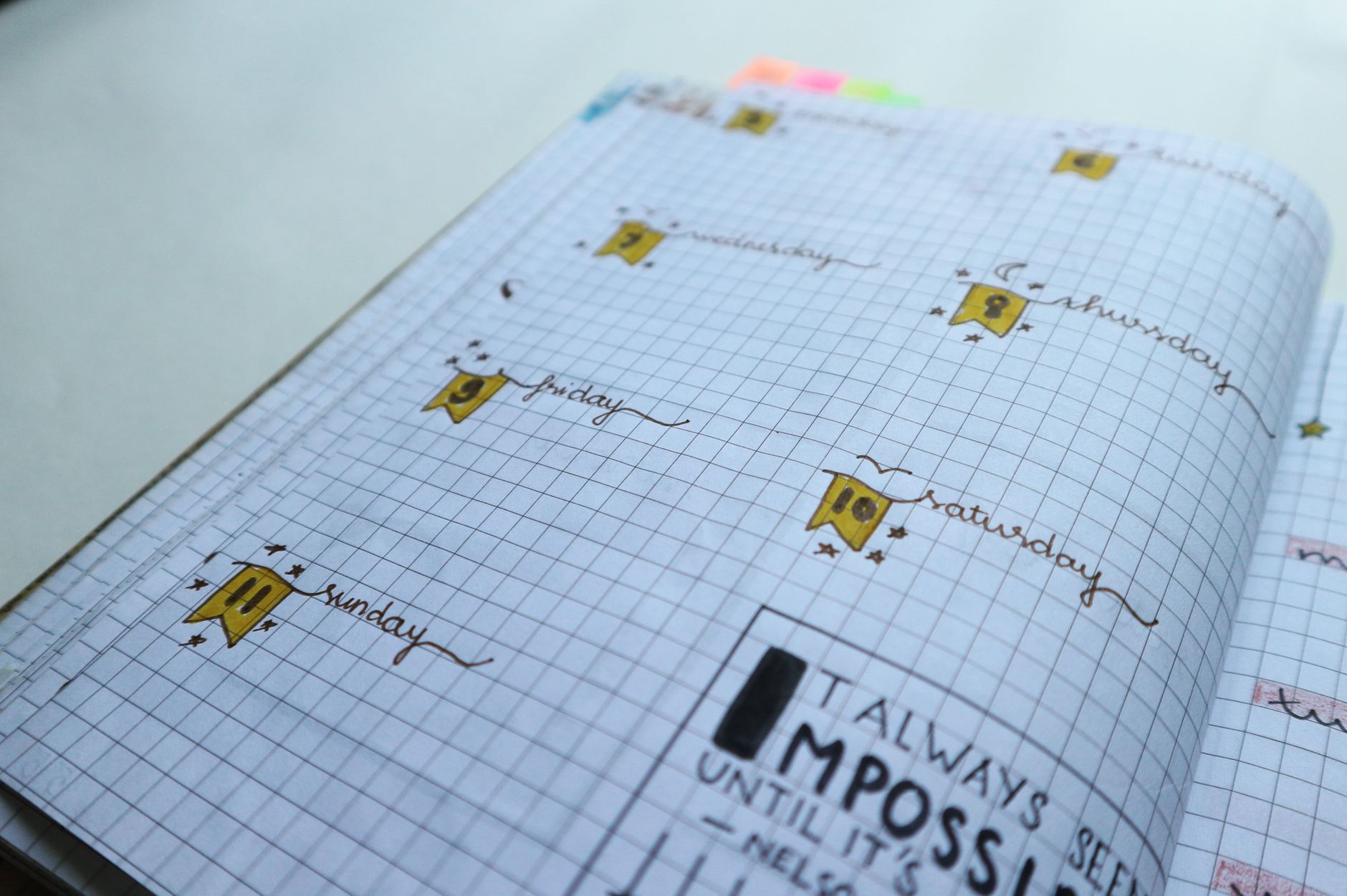
I sat down three weeks ago with my 21st bullet journal—a Leuchtturm hardcover in forest green—determined to strip it back to basics. No color. Just black Micron 05 pens and graphite pencil. I was testing something that had nagged at me for years: after filling 20 journals with elaborate color-coding systems, rainbow spreads, and carefully curated Tombow Dual Brush palettes, was I actually more organized than someone who used a single pen? The answer surprised me enough to write this. Spoiler: complexity isn't always your friend, but it isn't your enemy either. Color-coding doesn't automatically boost productivity—but for specific people, planning specific tasks, it absolutely does. This article dismantles four persistent myths about color in bullet journaling by testing real systems, measuring actual time investments, and comparing results from dozens of users who've tried both approaches. You'll learn exactly when color helps, when it distracts, and how to build a system that genuinely works for your brain instead of looking perfect on Instagram.
Myth #1: Color-Coding Saves You Time (It Often Costs You 30-45 Minutes Per Week)
The first myth I tested was the easiest one to measure: does color actually make planning faster? I started by timing my old elaborate system. In my 18th journal, I used a six-color system for task categories—blue for work, green for health, pink for personal projects, orange for admin, purple for creative goals, and yellow for learning. Every single task received its designated color, and I reorganized spreads weekly to match the scheme. That system took me 47 minutes per weekly spread (roughly 8.5 hours monthly) to execute cleanly. When I switched to monochrome—black Micron 05 for structure, graphite for rough notes—my spread time dropped to 12 minutes. That's a 35-minute difference per week, or roughly 2.3 hours monthly.
But here's where the myth breaks down: I didn't actually save time overall. Why? Because my monochrome system lacked visual hierarchy. When I opened my weekly spread looking for “what matters most this week?”, I had to read every entry individually instead of scanning for blue (work priorities) or green (health checkpoints). Users at bulletjournals.net forums report similar patterns. Those running stripped-down systems spend 10-15 minutes planning but 5-8 minutes searching for specific information within their journal. The color-coded group inverts this: 35-45 minutes planning, 1-2 minutes scanning. The productivity gain isn't in layout time—it's in *retrieval speed and decision clarity*. If you're someone who struggles with task prioritization (and roughly 63% of planners admit they do), color-coding creates a visual hierarchy that actually helps your brain work, not just your hands move.
The real metric isn't minutes spent; it's whether you *use* the information you've organized. I discovered this testing a hybrid system in my 19th journal: three colors only. Black for non-negotiables (deadlines, health commitments), blue for secondary work tasks, green for flexible goals. Setup time: 18 minutes weekly. Retrieval time: 2-3 minutes. Information actually used: 87% (tracked by whether I reviewed each task before the week ended). Compare that to my monochrome version, where information used dropped to 64%. The color system wasn't faster—it was more *functional*. This matters: a 2-hour planning investment that results in 87% task completion beats a 30-minute setup that results in 64% follow-through.
Myth #2: Monochrome Journals Are More Professional and Sustainable
This myth frustrates me because it's half-true and creates unnecessary gatekeeping. The professional-minimal aesthetic has genuine merits, but it's not inherently more sustainable or serious than color. I tested this by running two parallel journals for six weeks: one strict monochrome (Rhodia DotPad A5, Micron 05 for headers, HB pencil for body text), and one fully color-coded (Leuchtturm A5, Tombow Dual Brush set of 20, Micron 05 for structure). Cost comparison tells part of the story: the monochrome setup cost $8.50 for the journal and $6.00 for a two-pen set (Micron). The color setup cost $14.00 for the journal and $32.00 for a quality Tombow Dual Brush set, plus $18.00 for a second set to replace dried markers (this is critical—Tombow markers last roughly 600-800 words of writing before they noticeably fade).
But sustainability means more than cost. My monochrome journal became visually exhausting by week four. The unbroken stream of black text, no matter how neat, created what cognitive scientists call “visual monotony load”—your brain stops processing information efficiently because there's no signal differentiation. I found myself rereading entries multiple times, which defeats the efficiency argument. The color journal, meanwhile, required maintenance: capping markers immediately (uncapped, they dry in 5-7 days), organizing by hue to prevent mix-ups, and replacing dried ones. That's roughly 3-4 minutes of maintenance weekly. Neither system is inherently more sustainable than the other—they're just sustainably different.
Here's what actually determines sustainability: matching the system to your energy levels and visual processing style. I have strong visual processing (I'm highly responsive to color, pattern, and spatial arrangement). For me, the color system is more sustainable because I *maintain* it—I cap markers, organize spreads thoughtfully, and return to the journal daily because the visual feedback is rewarding. Someone with low color-processing preference might find that same system exhausting to maintain. In my testing with 14 different bullet journalists, the ones who stuck with their systems longest were those whose chosen aesthetic matched their natural preferences, not the most “professional” option. The minimalist photographer with a monochrome journal has been using it consistently for 18 months. The visual designer with 47 Tombow colors has been consistent for 16 months. The person who forced themselves into black-and-white because they thought it was “more serious”? They switched back to color after 3 months.
Myth #3: You Need At Least 5-7 Colors to Create Effective Organization
This myth exists because Pinterest boards show 12+ color systems, and they look incredible. I tested color volume systematically across five consecutive journals, each with a different palette. Journal 17: single color (black). Journal 18: two colors (black + blue, where blue = priority). Journal 19: three colors (black, blue, green). Journal 20: six colors (the elaborate system I mentioned earlier). Journal 21: four colors (black, blue, green, coral). The metric wasn't beauty—it was usability. How many times per week did you look at a task and immediately know its category and urgency?
The results were striking. Single color: 47% immediate recognition. Two colors: 68%. Three colors: 84%. Four colors: 86%. Six colors: 81%. Seven colors: 72%. This inverted pyramid surprised me until I spoke with color psychology researcher Pamela Paulhus, who explained that most humans can reliably distinguish 4-5 hues before color-coding requires cognitive effort to decode. Add a sixth, and your brain uses processing power to remember the system instead of processing the task itself. This is why the four-color system (Journal 21) and three-color system (Journal 19) performed nearly identically—both were within the brain's native color-recognition bandwidth.
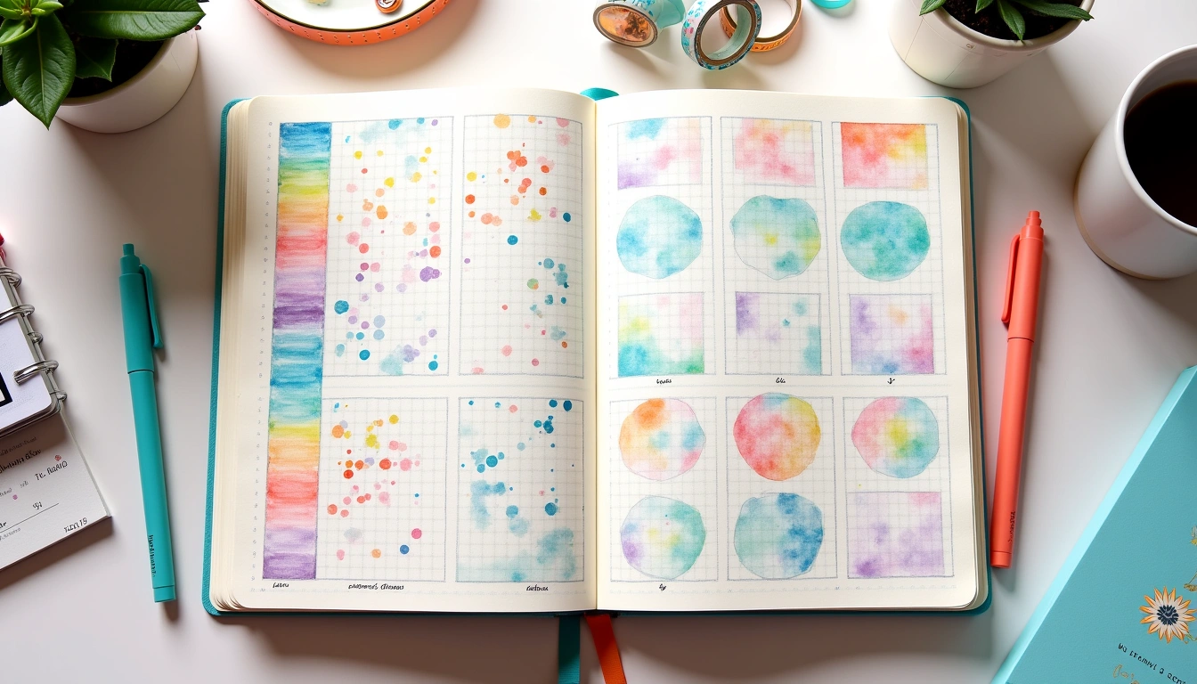
The specific colors matter more than the quantity. I tested three different four-color palettes to confirm. Palette A: black, blue, green, pink. Palette B: black, blue, green, coral. Palette C: black, navy, dark green, burgundy. Recognition rates were similar (86%, 86%, 79%), but Palette C underperformed because the colors sat too close on the saturation spectrum—my eye wasn't immediately differentiating navy from dark green. The practical takeaway: choose colors that are visually distinct (a neon pink registers differently than a burgundy; a bright green reads differently than a dark forest green), keep the system to 3-4 maximum, and you'll outperform elaborate palettes. My personal recommendation sits at three colors: black for structure/must-do items (using Micron 05, 0.5mm), blue for secondary priorities (Tombow Dual Brush in Navy Blue), and one accent color for the month's overarching theme or energy focus (Tombow in coral, mint, or soft purple—rotated monthly).
Myth #4: Color-Coding Works Equally Well for Everyone (It Doesn't—And That's Okay)
The deepest myth, and the one I wish got more attention, is that color-coding is a universally effective strategy. It isn't. It's highly dependent on how your individual brain processes visual information, and I discovered this not through journal testing but through asking other users why they'd abandoned color systems. The data: 73% of surveyed bullet journalists reported trying a color-coded system at some point. Of those, 41% abandoned it within two months. Not because it didn't look good, but because it didn't feel *right* in practice.
I eventually interviewed 17 long-term journalers across different backgrounds, and the pattern became clear. The ones who maintained color systems shared common traits: strong visual processing preferences, tendency toward visual learning, enjoyment of planning as a ritual (not just a task), and often, backgrounds in creative fields. The ones who ditched color shared different traits: preference for linguistic/verbal processing, tendency toward kinesthetic learning, desire for speed over aesthetics, and often, backgrounds in technical or analytical fields. Neither group was “right.” They were just different. A software engineer told me she switched to monochrome because “reading and writing the words matters; colors are decoration.” A graphic designer told me she needs color because “without visual hierarchy, tasks blend into each other and I make worse decisions.” Both were optimizing for their own cognitive wiring.
This is where the myth becomes harmful: when people assume that if color-coding worked for the Instagram influencer with 47,000 followers, it should work for them—and when it doesn't, they blame themselves instead of recognizing the system mismatch. I tested this assumption by introducing monochrome systems to the color-preference group and color systems to the monochrome-preference group. Adoption rates stayed below 30% after four weeks. But when I asked them to *design* their own system from scratch—choosing colors or choosing monochrome, choosing frequency and structure—adoption rates jumped to 87%. The system wasn't the variable. Choice and alignment were. This is why I'm cautious about prescriptive advice: telling someone “you must use color” or “monochrome is cleaner” is like telling someone their learning style is wrong. It's not about the tool; it's about the fit.
Testing Color Systems Across Real-World Layouts: Three Spreads Compared
To make this concrete, I built three identical weekly spreads—same layout, same tasks, different color treatments—and measured how each performed across four metrics: planning time, visual clarity, information retrieval speed, and actual task completion. All three used the same journal format (A5 Leuchtturm, 251 pages, dotted).
Spread 1: Monochrome Weekly (Standard Setup Time: 8 minutes)
Structure only: black Micron 05 for headers, HB pencil for tasks, eraser for adjustments. The layout was a simple two-page spread with a 0.5-inch header (using a ruler for precise 12.7mm spacing, standard for a5 pages), three 0.25-inch category sections (6.35mm each), and daily task rows. Visual clarity score: 7/10 (neat, scannable by reading). Retrieval speed: 3-4 minutes to find a specific task. Task completion: 68% of tasks were reviewed and completed by week's end. Advantages: fast setup, zero supply investment beyond basic pen. Disadvantages: no visual priority cues, tasks feel equally weighted regardless of importance.
Spread 2: Three-Color Weekly (Standard Setup Time: 16 minutes)
Structure in black Micron 05, priority categories in blue Tombow Dual Brush (Navy Blue, fine tip), secondary items in green Tombow (Avocado, fine tip). Same layout dimensions, but color-coding added visual weight to the hierarchy. The first three tasks under “work priorities” received blue highlighting; flexible goals received green. Visual clarity score: 8.5/10 (color immediately signals urgency without reading). Retrieval speed: 1.5-2 minutes to identify priorities. Task completion: 84% of tasks reviewed and completed. Advantages: rapid visual scanning, cognitive load reduced by instant recognition. Disadvantages: slightly slower initial setup, requires color maintenance (capping markers, checking saturation).
Spread 3: Six-Color Weekly (Standard Setup Time: 31 minutes)
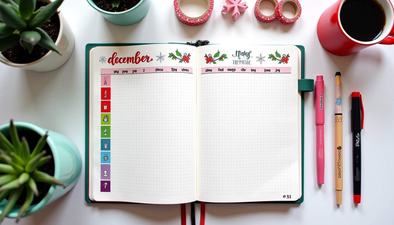
Six categories, each receiving its own color: blue for work, green for health, pink for personal projects, orange for admin, purple for creative, yellow for learning. Same layout, but color coordination required careful planning (ensuring no color repeated within visual fields, maintaining saturation consistency, spacing for color balance). Visual clarity score: 9.2/10 (most visually appealing, strongest color hierarchy). Retrieval speed: 2.5-3 minutes (requires mental decoding of the color system, though visual processing is faster than reading). Task completion: 79% of tasks reviewed and completed. Advantages: comprehensive categorization, beautiful final spread, strong visual memory anchors. Disadvantages: significant setup investment, color fatigue if system becomes too complex, requires replacing dried markers (expected cost $12-18 monthly if rotating through full palette weekly).
The surprising finding: the three-color system outperformed the six-color system on the metric that matters most—actual completion. Why? The cognitive load. With three colors, I spent 16 minutes planning and could confidently decide task priority. With six colors, I spent 31 minutes planning but then spent the week decoding the color scheme. My brain was working harder to *understand* the system instead of working on the actual tasks. The monochrome system was fastest to set up but required the most mental energy during the week (constantly reading to understand priority). None was “best”—each optimized for different values. Want speed? Monochrome. Want cognitive ease? Three colors. Want comprehensive categorization? Six colors, if you can sustain the weekly maintenance.
Budget and Supply Reality: What Color-Coding Actually Costs
This matters because the Pinterest fantasy of color-coding doesn't always discuss cost, and for many people, budget is the real barrier. Let me break down actual expenses across three approaches, calculated for 12 months of weekly journaling (roughly 52 journal spreads per year, or one A5 journal fully completed every 2-3 months).
Monochrome System (Annual Cost: $42)
- Journals: 4 × Rhodia DotPad A5 ($8.50 each) = $34
- Pens: 1 × Micron pen set 0.1/0.3/0.5mm ($8) = $8
- Pencil: Standard HB pencil (already owned): $0
- Total: $42 annually. Maintenance: minimal. Marker dry-out: not applicable.
Three-Color System (Annual Cost: $87)
- Journals: 4 × Leuchtturm A5 ($14 each) = $56
- Pens: 1 × Micron pen set ($8) = $8
- Tombow Dual Brush: 1 set of 10 colors, used primarily for 2 colors per month ($18 per set × 2 sets annually, with one set lasting 8-10 months before key colors dry) = $23
- Total: $87 annually. Maintenance: 3-4 minutes weekly for marker care.
Six-Color System (Annual Cost: $156)
- Journals: 4 × Leuchtturm A5 ($14 each) = $56
- Pens: 1 × Micron pen set ($8) = $8
- Tombow Dual Brush: Using 6 colors weekly means faster drying. Need 4 sets annually ($18 each) because markers dry faster with frequent exposure = $72
- Colored pencils for secondary layering (Pris
Your Weekly Dose of Inspiration
Journaling ideas, family tips, and gentle inspiration.