- Understanding Color Psychology Basics
- Color Theory and the Color Wheel
- Practical Tip: Creating a Color Palette
- Using Emotions to Choose Colors
- Experimenting with Color Combinations
- Adding Texture and Pattern
- Frequently Asked Questions
- Q: How do I know which colors to choose for my journal?
- Q: Can I use any colors I want in my journal?
- Q: How do I create a color palette for my journal?
- Related Posts
- Related Posts
- Related Posts
Disclosure: This post contains affiliate links. If you click through and make a purchase, we may earn a small commission at no extra cost to you. Thank you for supporting this site!
Are you ready to unlock the power of color in your bullet journal? Color psychology is a fascinating field that can help you create a more effective and visually appealing layout. By choosing the right colors for your journal, you can evoke emotions, convey meaning, and even influence your mood. In this article, we'll explore the basics of color psychology and provide you with practical tips on how to choose the right colors for your bullet journal design.
Understanding Color Psychology Basics
Color psychology is the study of how colors affect human behavior and emotions. It's based on the idea that colors can influence our mood, energy levels, and even our decision-making process. By understanding the basics of color psychology, you can make informed choices about the colors you use in your journal.
Color Theory and the Color Wheel
The color wheel is a circular representation of colors, showing how they relate to each other. Understanding the color wheel is essential for creating harmonious color combinations. We'll take a closer look at the different color families and how to use them in your journal.
Practical Tip: Creating a Color Palette
One of the simplest ways to choose colors for your journal is to create a color palette. Choose 3-5 colors that you love and that evoke the emotions you want to experience while using your journal. Consider colors that complement each other and create a cohesive look.
Using Emotions to Choose Colors
When choosing colors for your journal, consider the emotions you want to evoke. Do you want to feel calm and relaxed, or energized and motivated? Different colors can help you achieve these emotions. For example, blue is often associated with feelings of calmness, while red is associated with energy and motivation.
Experimenting with Color Combinations
Don't be afraid to experiment with different color combinations. Try pairing colors that you think might not work together, and see what happens. You might be surprised at the beautiful results you can achieve.
Adding Texture and Pattern
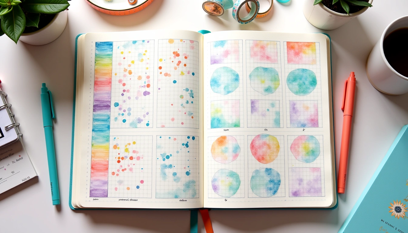
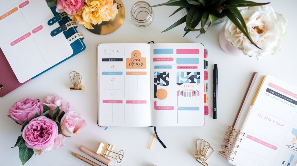
Don't forget to add texture and pattern to your journal design. Mixing different textures and patterns can create a visually interesting and engaging layout. Consider using stamps, stickers, or even hand-drawn doodles to add depth and interest.
Frequently Asked Questions
Q: How do I know which colors to choose for my journal?
A: Start by considering the emotions you want to experience while using your journal. Choose colors that evoke those emotions and create a cohesive look. Experiment with different color combinations to find what works best for you.
Q: Can I use any colors I want in my journal?
A: While you can use any colors you want, it's essential to consider the overall aesthetic and how colors will interact with each other. Choose colors that complement each other and create a harmonious look.
Q: How do I create a color palette for my journal?
A: Choose 3-5 colors that you love and that evoke the emotions you want to experience. Consider colors that complement each other and create a cohesive look. You can use online color palette generators or create your own using a color wheel.
Related Posts
Unlock 2026 with Our Complete Printable Bullet Journal Pages Bundle
Bullet Journal Pen Recommendations Ideas That Actually Stick (2026)
A Real-World Guide to Bullet journal for work productivity- Digital vs Paper Bullet Journals: Which Is Right for You?


Related Posts
Unlock 2026 with Our Complete Printable Bullet Journal Pages Bundle
Bullet Journal Pen Recommendations Ideas That Actually Stick (2026)
A Real-World Guide to Bullet journal for work productivity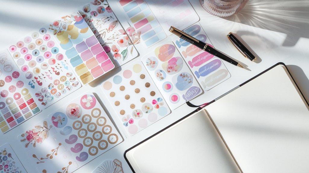
Digital vs Paper Bullet Journals: Which Is Right for You?
Related Posts
Unlock 2026 with Our Complete Printable Bullet Journal Pages Bundle
Bullet Journal Pen Recommendations Ideas That Actually Stick (2026)
A Real-World Guide to Bullet journal for work productivity
Digital vs Paper Bullet Journals: Which Is Right for You?
🔍 Our Top Pick
Editor's Pick: Vibrant blending marker set for creative spreads – elevate your layouts with colors that inspire!
Your Weekly Dose of Inspiration
Journaling ideas, family tips, and gentle inspiration.
Love this content?
Join the BulletJournals.net community for exclusive tips, guides, and updates.
Subscribe Free