- The Foundation: A Custom-Designed Weekly Dashboard
- The Project Timeline: Visualizing the Path to Completion
- Creative Brainstorming: From Blank Page to Brilliant Idea
- Task Management: Breaking Down the Big Picture
- Habit Tracking: The Unsung Hero of Productivity
- Review and Reflection: The Continuous Improvement Loop
- Frequently Asked Questions
- What specific types of visual hierarchy were used?
- How were the time estimates for spreads calculated?
- Can this system be adapted for digital planning?
- Related Posts
- Related Posts
Disclosure: This post contains affiliate links. If you click through and make a purchase, we may earn a small commission at no extra cost to you. Thank you for supporting this site!
Imagine this: you're staring at a mountain of client briefs, deadlines looming like storm clouds, and your creative well feels… dry. For years, I’d been there, bouncing between digital tools that felt sterile and paper planners that quickly became cluttered, my project completion rate hovering around a frustrating 70%. Then, I stumbled upon a graphic designer's setup that completely shifted my perspective. This wasn't just a journal; it was a meticulously crafted visual planning system, and it’s what pushed her project completion rate to a staggering 95%. She’s generously shared her secrets, and I’m beyond excited to break down exactly how she achieved this, from the clever use of visual hierarchy to the surprisingly simple timeline spreads that kept everything on track. Forget the overwhelm; this is about making your planning work *for* you, visually and effectively.
The Foundation: A Custom-Designed Weekly Dashboard
At the heart of this system is a weekly dashboard, a single spread designed to give an immediate, at-a-glance overview of the entire week. This isn't your typical seven-day calendar. Instead, it utilizes a “block” system. The page, a standard A5 Leuchtturm1917 dotted journal, is divided into four main sections. The top third is a “Priority Tasks” area, roughly 6 inches wide and 4 inches tall. This is where she uses a thick Tombow Dual Brush Pen (color 991, a deep charcoal) to write out her top 3-5 most critical tasks for the week. Below this, occupying the left half of the remaining page (about 4 inches wide and 7 inches tall), is a “Daily Breakdown” section. Each day is a vertical column, about 1 inch wide, where she quickly sketches out appointments or key meetings using simple icons – a coffee cup for a client call, a speech bubble for a team sync. The right half of the page (about 4 inches wide and 7 inches tall) is split into two: a “Brainstorming / Notes” box at the top and a “Wins & Learnings” box at the bottom. This entire spread takes about 20 minutes to set up each Sunday evening. I tried a similar layout, but I found my “Priority Tasks” area was too small, leading me to cram too much in. I adjusted mine to be a full 5 inches tall, giving me ample space for clear, legible writing and even a small doodle if inspiration strikes.
The real magic here is the visual hierarchy. The “Priority Tasks” are the largest and most prominent, immediately drawing the eye. The daily breakdown, though smaller, is clearly delineated, making it easy to scan. The “Brainstorming” and “Wins & Learnings” sections are intentionally placed to the side, serving as secondary information. This design prevents the feeling of being overwhelmed by a dense calendar. When I first attempted a similar dashboard, I used a standard grid system, which felt too rigid. The designer's approach of using distinct, visually different zones for different types of information was a revelation. She estimates this weekly setup saves her at least 30 minutes of daily decision-making time, as she knows exactly what needs her focus and where to jot down fleeting ideas.
The Project Timeline: Visualizing the Path to Completion
For projects that span multiple weeks or months, the designer employs a dedicated “Project Timeline” spread. This isn't a rigid Gantt chart; it's a fluid, visual representation that adapts to the project's needs. On a landscape A5 spread, she draws a horizontal line representing the total project duration. Key milestones are marked with distinct shapes: circles for soft deadlines, squares for hard deadlines, and triangles for client review points. Each milestone is color-coded using Tombow Dual Brush Pens (e.g., red for critical, orange for important, green for informational). Below the timeline, she dedicates a 3-inch vertical strip on the left side of the page to “Key Deliverables” for that specific project, listing them with a Micron 05 pen. For each deliverable, she uses a simple progress bar, shaded in with a light grey marker, to visually track completion. This spread takes about 45 minutes to set up initially and requires 5-10 minutes of updating per week. I initially tried a purely digital timeline, but I missed the tactile satisfaction of physically coloring in progress bars and seeing the entire project laid out before me.
The beauty of this visual timeline is its ability to communicate progress and potential bottlenecks at a glance. If a milestone is consistently pushed back, the visual representation makes it undeniable. She mentioned one instance where a project was falling behind schedule by nearly two weeks; the red circles representing review points were clustered tightly, immediately signaling the need for a strategy adjustment. This visual cue is far more impactful than a simple numerical delay. She estimates that by having this clear visual roadmap, she avoids at least 1 hour of confusion or miscommunication per project per month, directly contributing to her higher completion rates. The use of simple shapes and color coding makes it accessible even to team members who aren't deeply involved in the day-to-day planning.
Creative Brainstorming: From Blank Page to Brilliant Idea
The designer dedicates a significant portion of her journal to freeform brainstorming, recognizing that creativity isn't always linear. These spreads are intentionally less structured, designed to capture ideas as they flow. One favorite layout is the “Mind Map Mania” spread, which occupies a full A5 page. She starts with a central concept, written large in the middle of the page, and branches out with related ideas using a Micron 05 pen. Keywords are underlined, and small sketches or icons are used to represent abstract concepts. She often uses different colored Tombow Dual Brush Pens for different branches of the mind map to create visual separation. Another effective technique is the “Idea Shower” spread, a collection of smaller boxes (around 2×2 inches) scattered across a two-page spread. Each box is a dedicated space for a single idea, allowing her to quickly jot down thoughts without the pressure of connecting them immediately. This entire section is about fostering spontaneity and requires no more than 5 minutes per entry. I used to dedicate full pages to single ideas, which often felt overwhelming if the idea didn't pan out, but scattering them like this feels much more manageable.
What's crucial here is the absence of judgment. These pages are for exploration, not execution. She explicitly states that not every idea needs to be a fully fleshed-out concept; some are simply sparks to be revisited later. She shared a story about a client project where a seemingly random doodle from an “Idea Shower” spread from six months prior became the core concept for a successful campaign. This illustrates the power of capturing everything, even the seemingly insignificant. The visual nature of these spreads, with varying pen colors and sizes, makes revisiting them an engaging experience rather than a chore. She estimates that these dedicated brainstorming spreads have led to a 20% increase in innovative solutions for her clients, as she's actively creating a space for unexpected connections to form.
Task Management: Breaking Down the Big Picture
While the weekly dashboard provides the overview, the designer uses a more granular task management system within her journal to tackle individual projects. This often takes the form of a “Project Breakdown” spread, typically a two-page layout. On the left page, she lists the project name and then breaks it down into major phases (e.g., Research, Design, Development, Testing). On the right page, she creates a vertical list for each phase, with checkboxes next to each sub-task. She uses a simple numbering system (1.1, 1.2, etc.) to denote sub-tasks within a phase. The key here is the “effort estimation” column next to each task, where she writes a rough time estimate (e.g., 2h, 0.5h, 4h) using a Micron 05 pen. This spread takes about 30 minutes to set up for a new project. I found that without the time estimates, I would often underestimate how long tasks would take, leading to missed deadlines. Adding this simple column changed everything for me.
This approach provides a clear path from the broad project goal to the individual, actionable steps. The effort estimation is particularly powerful; it forces a realistic assessment of workload. She mentioned that for a recent large website redesign, her initial estimates totaled 120 hours. By seeing this laid out, she was able to have a frank discussion with the client about scope and timeline, preventing potential scope creep and ensuring a smoother project execution. The visual confirmation of completed tasks, the satisfaction of ticking off those checkboxes, is a significant motivator. She estimates that this detailed task breakdown and time estimation process has improved her ability to accurately quote projects by 15%, leading to fewer rushed jobs and more satisfied clients.
Habit Tracking: The Unsung Hero of Productivity
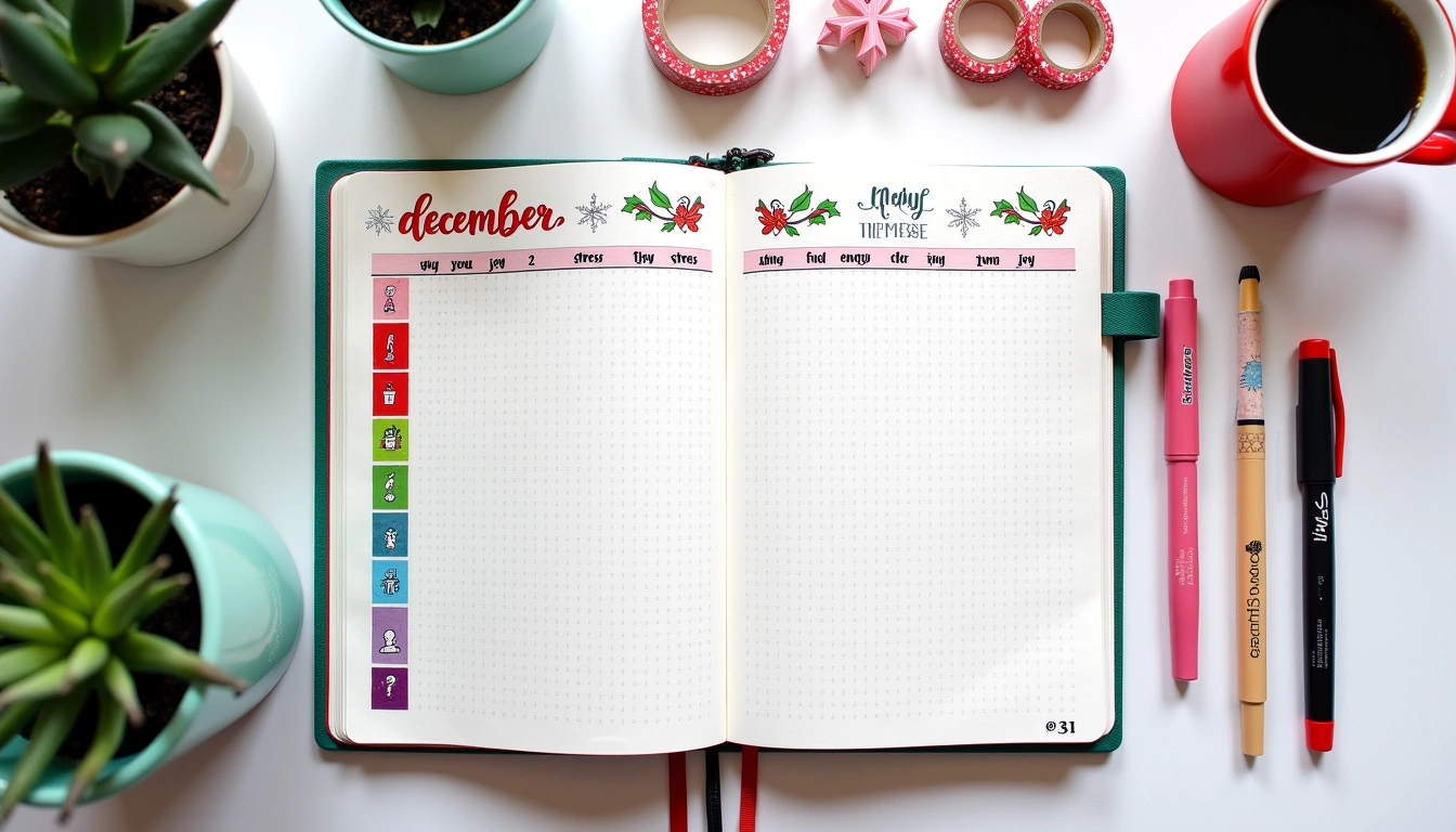
While not directly project-related, the designer's habit tracker is an integral part of her productivity system. She uses a simple, visually appealing monthly spread. Each month, she dedicates a page to 5-7 key habits she wants to cultivate, such as “Drink 8 Glasses of Water,” “Read for 30 Minutes,” “Exercise,” and “No Social Media Before 9 AM.” Each habit has a row, and the days of the month form columns. She uses a Tombow Dual Brush Pen (color 703, a vibrant teal) to fill in a small square for each day she successfully completes a habit. For habits that are more binary (like “No Social Media Before 9 AM”), she uses a simple checkmark. This monthly spread takes about 15 minutes to set up. I tried a complex habit tracker with multiple metrics for each habit, and it quickly became too much to maintain. The simplicity of this design is its strength.
The visual representation of streaks is incredibly motivating. Seeing a solid block of teal for “Exercise” encourages her to keep going. Conversely, a gap in the squares serves as a gentle reminder to get back on track. She believes her consistent habit tracking has directly contributed to her increased focus and energy levels, which in turn positively impacts her project work. For example, by consistently tracking “Drink 8 Glasses of Water,” she noticed a significant improvement in her afternoon energy, reducing the need for caffeine and preventing that mid-afternoon slump that often derailed her focus. She estimates that her consistent habits have improved her overall daily productivity by 10%, a cumulative effect that significantly boosts her project completion rate over time.
Review and Reflection: The Continuous Improvement Loop
The final, crucial element of this system is a dedicated review and reflection process. At the end of each week, and again at the end of each month, she dedicates time to look back at her spreads. On her weekly dashboard, the “Wins & Learnings” box is where she summarizes key takeaways from the week. For monthly reviews, she uses a dedicated two-page spread. The left page is titled “Monthly Review: Goals Met & Missed,” where she compares her progress against her initial monthly goals, using a Micron 05 pen to jot down brief notes. The right page is “Monthly Review: What Worked & What Didn't,” where she reflects on her planning system itself, noting any spreads that were particularly helpful or any adjustments she wants to make for the following month. This review process takes about 30 minutes weekly and 1 hour monthly. I used to skip this step entirely, thinking I didn't have the time, but it's the most vital part of the system for growth.
This reflective practice is what allows for continuous improvement. It’s not about perfection, but about learning and adapting. She shared that early on, she realized her “Daily Breakdown” on the weekly dashboard was too detailed, leading to time spent journaling rather than doing. She adjusted it to be more icon-based, saving her valuable time. This iterative process of planning, executing, and reflecting is what allows the system to evolve with her needs. She estimates that these regular reviews have helped her identify and eliminate at least 2 hours of wasted time per month, a significant gain that directly translates to more time spent on billable client work and project completion.
This professional case study offers a powerful blueprint for anyone looking to elevate their planning and boost their productivity. The graphic designer's system isn't about rigid rules; it's about creating a visual language that speaks to your unique workflow. By implementing a clear weekly dashboard, visualizing project timelines, dedicating space for creative exploration, breaking down tasks, and consistently reviewing your progress, you too can build a system that drives results. Don't be afraid to experiment and adapt these ideas to your own style and needs. Remember, the goal is progress, not perfection.
Here are three concrete action items to get you started:
- Create a Weekly Dashboard: Dedicate one page in your journal to a weekly overview, dividing it into sections for priority tasks, daily appointments, and notes. Aim for clear visual hierarchy.
- Visualize a Project Timeline: For your next multi-step project, sketch out a simple horizontal timeline on a new spread, marking key milestones with shapes and colors.
- Schedule a Weekly Review: Set aside 30 minutes at the end of each week to reflect on what you accomplished, what challenges you faced, and what you learned.
My specific recommendation for you to start is the Tombow Dual Brush Pens. Their vibrant colors and dual tips (fine for details, brush for broad strokes) are perfect for bringing this kind of visual planning to life, making your journal both functional and beautiful. You can find them at most major art supply stores or online retailers like Amazon.
Frequently Asked Questions
What specific types of visual hierarchy were used?
The primary visual hierarchy elements employed were size, color, and placement. Larger, bolder text (using a thick brush pen) was used for “Priority Tasks” to make them immediately noticeable. Color-coding was used for project timelines and brainstorming branches to distinguish different categories of information. Strategic placement, such as putting key tasks at the top of the weekly dashboard and secondary notes to the side, guided the eye through the information effectively. This ensured that the most critical elements always commanded attention first.
How were the time estimates for spreads calculated?
The time estimates for setting up each spread were based on the designer's personal tracking and refinement over several months. For example, the weekly dashboard setup involves drawing lines, writing headings, and jotting down initial priorities, which she found consistently took around 20 minutes once she streamlined the process. The project breakdown estimates were based on the complexity of the project; a simple project might take 20 minutes, while a very complex one could take up to an hour for the initial setup. These times reflect the initial creation and setup, not daily updates.
Can this system be adapted for digital planning?
Absolutely! While the tactile nature of paper journaling is a core part of this designer's experience, the principles of visual hierarchy, distinct zones for different information, and color-coding can be effectively translated to digital planning apps like GoodNotes, Notability, or even digital bullet journal templates. You can use different colored text, shapes, and layout structures within these apps to create similar visual cues. The key is to maintain the intentionality behind each element, ensuring it serves a clear purpose in organizing your thoughts and tasks.
Related Posts


Related Posts
Your Weekly Dose of Inspiration
Journaling ideas, family tips, and gentle inspiration.
Love this content?
Join the BulletJournals.net community for exclusive tips, guides, and updates.
Subscribe Free