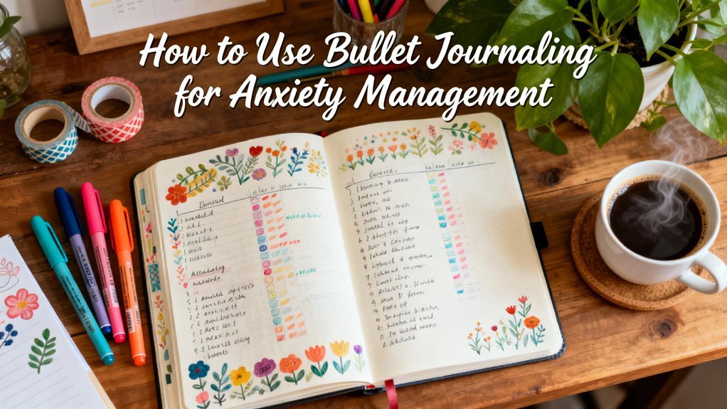
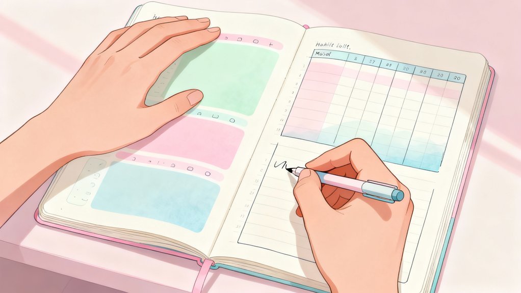
Start with just three colors representing distinct life domains—blue for work, green for personal, and orange for health. Test this system for two weeks using quality pens like Pilot G2 on your specific journal paper to prevent bleeding. Keep your color meanings fixed across all spreads so blue always means work, never switching randomly. If you're hesitating before choosing a pen or constantly checking a legend, you've overcomplicated things. The framework below breaks down exactly how to build a system that actually sticks.
Key Takeaways


- Start with 3-5 core colors representing distinct life domains like work, health, and personal tasks to avoid cognitive overload.
- Maintain consistent color meanings across all spreads: blue for work, green for personal, orange for health, purple for finance.
- Test your color system on single spreads for two weeks before full commitment, monitoring speed and visual fatigue.
- Choose high-contrast color combinations and quality tools like Pilot G2 pens with Leuchtturm1917 journals for clarity and longevity.
- Avoid overcomplication by limiting categories to seven or fewer and combining color with icons or text for accessibility.
The Psychology Behind Why Color Coding Actually Works
Your brain processes color 60,000 times faster than text. This efficiency creates a powerful framework for organizing information and reducing cognitive load in your bullet journal system.
Color perception triggers distinct emotional associations that improve memory retention. When you assign specific colors to categories, you're building neural pathways that strengthen visual learning and expedite information retrieval.
The system reduces decision fatigue by eliminating constant mental categorization. You'll instantly recognize task types without reading every entry, creating organizational clarity that optimizes your workflow.
Color coding directly impacts stress reduction. Your brain doesn't struggle to decode mixed information—it processes organized visual data automatically. This automated recognition frees mental energy for innovation and creative problem-solving.
Implement a consistent color system to enhance these cognitive benefits. Each color becomes a trigger that activates specific mental frameworks, altering your bullet journal into an efficient external processing system that boosts your brain's natural capabilities.
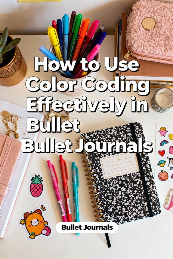
Establishing Your Core Color Categories and What They Should Represent
Before selecting colors, identify the fundamental life domains that require tracking in your journal. Start by listing your primary responsibilities: work projects, personal development, health metrics, financial goals, and social commitments. These become your core categories.
Next, assign colors that align with both universal color meanings and your personal preferences. Blue typically signals productivity and focus—ideal for work tasks. Green connects to growth and wellness, making it perfect for health tracking. Red creates urgency for deadlines and priorities. Yellow improves creativity and learning activities.
However, don't let traditional emotional associations override what resonates with you. If purple energizes your workout motivation better than green, use it. The system only works when it feels intuitive.
Limit yourself to 4-6 core categories initially. Category examples that prove most effective include: professional, personal, health, finance, and relationships. You'll refine these as your tracking needs evolve.
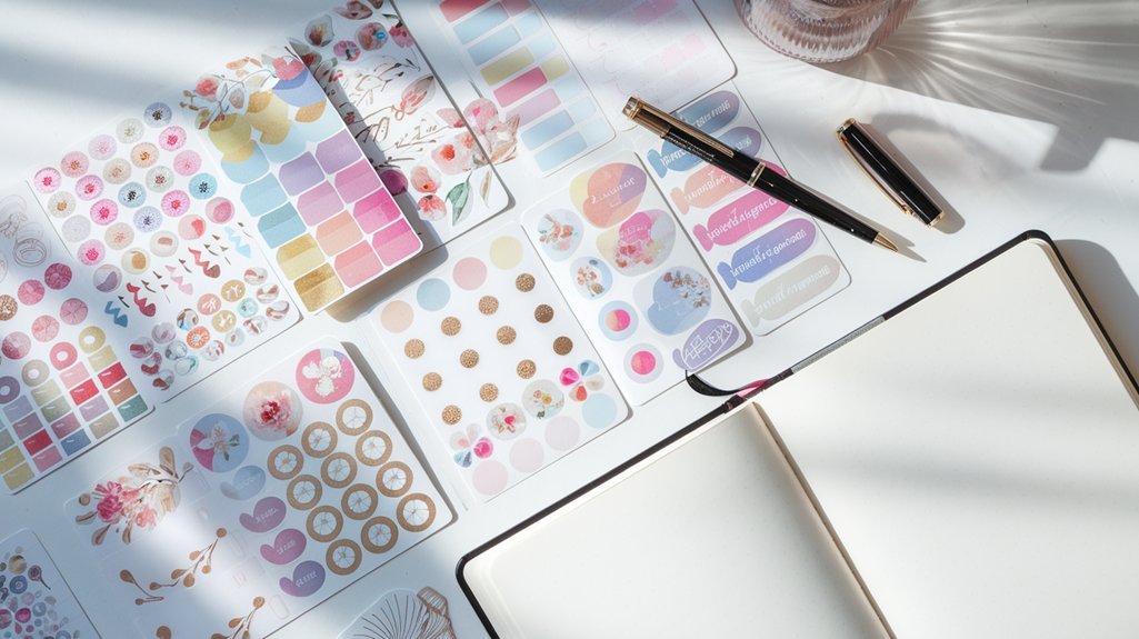
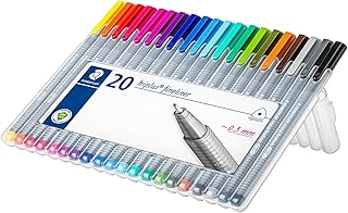
Choosing the Right Tools: Pens, Highlighters, and Markers That Won't Bleed

You've chosen your color categories—now you need tools that'll execute your system without ruining your pages.
The quality of your pen ink directly affects whether your color-coding stays crisp or turns into a bleeding mess, so you must test how your tools perform on your specific journal paper before committing to them.
Let's examine which brands consistently deliver bleed-free results and how to verify compatibility with your setup.
If you're looking to test multiple options at once, consider starting with a waterproof drawing pen sampler that lets you compare performance across different brands without committing to full-size purchases.
Pen Ink Quality Matters
Ink quality determines whether your color-coded system stays crisp or becomes a smudged mess.
You'll need to evaluate ink viscosity and color saturation before committing to any pen system. High-quality inks deliver consistent flow while maintaining vibrant hues that don't fade over time.
Test your pens using these critical metrics:
- Dry time: Quality ink sets within 3-5 seconds, preventing transfer to opposing pages
- Pigment density: Superior saturation guarantees your categories remain visually distinct
- Water resistance: Protects your system from accidental spills and humidity damage
- Archival properties: Prevents yellowing and degradation over months of use
- Feathering control: Maintains clean lines without spreading into paper fibers
You're building a productivity tool that'll serve you for years.
Invest in inks that match your ambition—not bargain options that compromise your organizational infrastructure. For fountain pen enthusiasts, Sailor Shikiori ink cartridges offer convenient, high-quality color options that maintain consistency across your entire journaling system.
Paper Compatibility Testing Tips
Even premium pens fail spectacularly when paired with incompatible paper. You'll enhance your color-coding system by implementing systematic compatibility testing before committing to any tool-paper combination.
Create a dedicated test page featuring all your pens, highlighters, and markers. Draw swatches on various paper types you're considering—dot grid, ruled, or blank. Label each sample with the brand and specific model. Wait 24 hours to assess ink absorption patterns and bleed-through potential.
Test aggressive conditions: layer multiple colors, create dense fills, and overlap highlighter strokes. Document which combinations produce crisp lines versus ghosting or feathering.
This methodical approach prevents workflow disruptions and wasted supplies. You're not just selecting tools—you're engineering a reliable color-coding infrastructure that performs consistently throughout your journaling practice.
Best Brands for Journaling
While testing methodology reveals compatibility patterns, specific brand selections determine your system's long-term reliability.
You'll enhance performance with proven combinations: Leuchtturm1917 dot grid pairs fluidly with Pilot G2 gel and Muji gel pens for zero-bleed execution. Archer and Olive handles Tombow dual brush markers without ghosting, while Moleskine notebooks work effectively with Faber Castell pens for precise color coding.
Deploy these premium tool combinations:
- Rhodia paper + Zebra Mildliners for highlight-intensive systems
- Stalogy notebooks + Tombow dual brush for artistic layouts
- Leuchtturm1917 + Pilot G2 gel for rapid logging
- Archer and Olive + Faber Castell pens for detailed tracking
- Moleskine + Muji gel pens for minimalist approaches
These partnerships eliminate troubleshooting cycles and accelerate implementation.
You're building infrastructure, not experimenting—select combinations that deliver consistent results across daily operations.
Building a Sustainable System You'll Actually Stick With Long-Term
You'll abandon an overly complex color system within weeks, so start with just three colors that serve distinct functions.
Match your color choices to the supplies you already own or can reliably replace—exotic markers you can't restock will derail your system.
Test your three-color framework for two weeks before expanding it, tracking whether you consistently use each color and whether the system saves you time.
Start With Three Colors
Three colors form the foundation of an effective bullet journal system—one that won't overwhelm you or gather dust after two weeks.
Your starter palette needs strategic color meanings assigned from day one. Pick three distinct hues that serve different cognitive purposes in your workflow:
- Blue for tasks – triggers focus and productivity associations
- Red for deadlines – creates urgency without requiring thought
- Green for completed items – reinforces achievement patterns
- Orange for events – distinguishes time-bound commitments
- Purple for ideas – separates brainstorming from execution
Choose color combinations with high contrast so you'll process information instantly during quick reviews.
Test your trio by coding one week's entries. If you're hesitating about which color to grab, your system needs refinement.
The right three-color framework becomes automatic, eliminating decision fatigue while maximizing visual clarity.
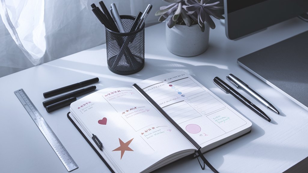
Match Habits to Supplies
Your color system fails when your supplies fight against your natural routines. If you're a desktop planner, mount your markers within arm's reach. Mobile journalers need portable cases that prevent cap loss and ink damage.
Match your tools to where you actually work, not where you imagine working. Analyze your habit tracking patterns before investing in supplies. Daily spreads demand quick-access colors—think Clicker Pens or uncapped markers.
Weekly reviews tolerate elaborate palettes stored in drawers. Your supply organization should eliminate friction, not create it. Test your system for three weeks.
If you're bypassing colors or abandoning entries, your tools aren't supporting your workflow. Swap supplies ruthlessly until reaching becomes automatic. The right match alters color coding from aspirational to operational.
Test Before Full Commitment
Why commit to an entire notebook when one experimental page reveals whether a system actually works?
You'll save time and resources through strategic color testing before scaling up.
Dedicate single spreads to trial periods—typically two weeks—where you'll stress-test your proposed color scheme against real daily demands.
Document what works and what creates friction.
Your testing protocol should include:
- Speed checks: Time how quickly you locate information using your colors
- Consistency tracking: Note when you forget which color means what
- Supply performance: Test pens and highlighters under actual use conditions
- Visual fatigue assessment: Monitor if certain combinations strain your eyes
- Cross-reference efficiency: Verify colors work across different spread types
Analyze results objectively.
If you're consistently reaching for wrong colors or feeling confused, redesign before committing.
Iteration beats perfection.
Common Color Coding Mistakes That Sabotage Your Productivity
While color coding promises improved organization, most bullet journal users unknowingly implement systems that create more confusion than clarity. You're sabotaging your productivity when you ignore color blindness considerations or create overcomplicated systems that demand constant mental translation.
| Mistake | Productivity Impact | Fix |
|---|---|---|
| Using 8+ colors | Cognitive overload, decision fatigue | Limit to 4-5 core colors |
| Random color assignments | Inconsistent retrieval, wasted time | Create logical categories |
| Ignoring accessibility | Excludes colorblind users from shared systems | Use patterns with colors |
| Changing schemes monthly | Breaks pattern recognition | Maintain consistency quarterly |
| Color-only differentiation | Reduces scanning efficiency | Add icons or symbols |
Your system fails when colors multiply without purpose. Each additional hue increases mental processing time rather than reducing it. Strip your palette down to essential categories. Design for speed, not aesthetics. Test your system's efficiency by tracking how quickly you locate information.
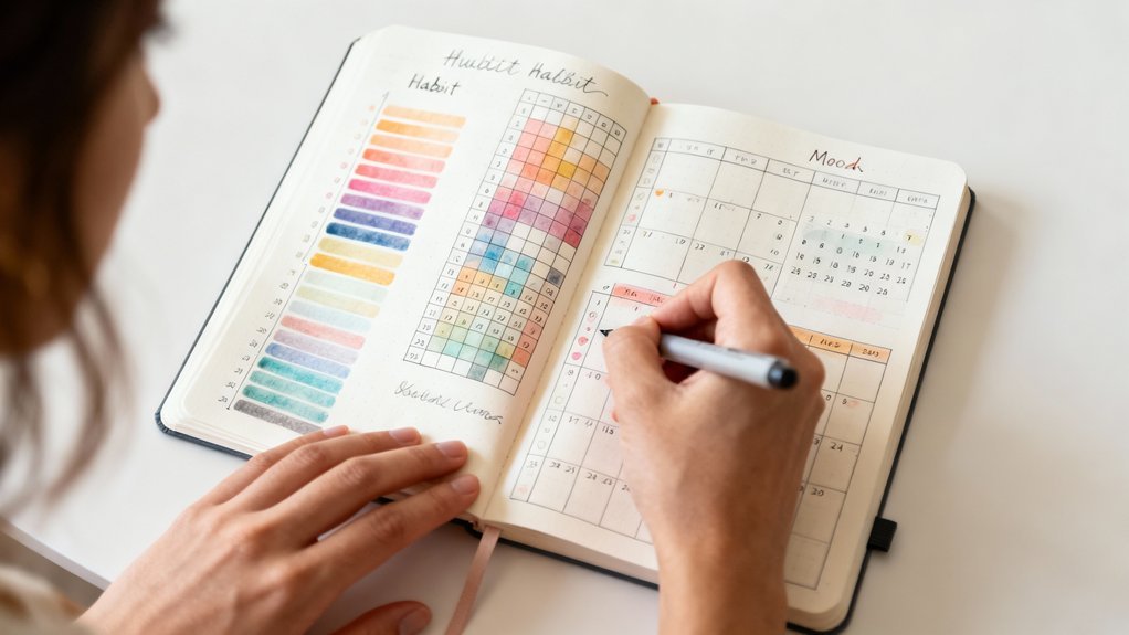
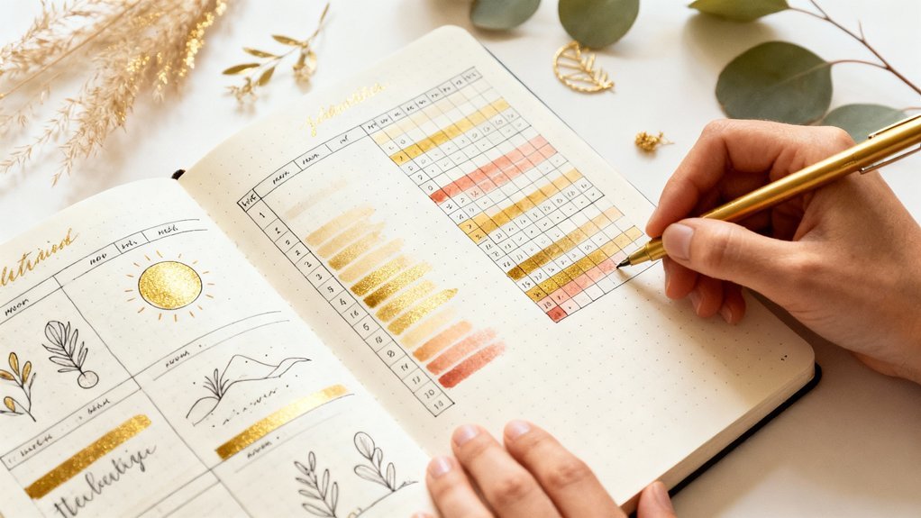
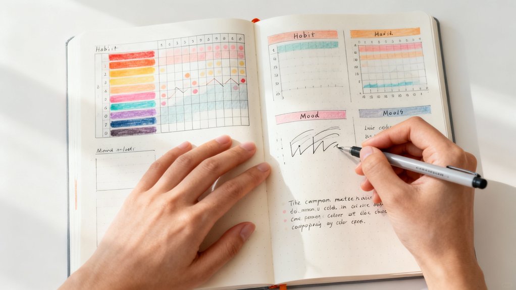
Adapting Your Color System Across Different Spreads and Collections
When your color system shifts meaning between your daily log, habit tracker, and project pages, you're forcing your brain to maintain multiple translation keys simultaneously. This cognitive overhead defeats the purpose of visual organization.
Instead, establish color consistency as your foundation while building spread adaptability into your framework.
Your core color meanings should remain fixed across all spreads:
- Work tasks stay blue whether they're in your weekly spread, project tracker, or master task list
- Personal commitments use green from your daily log through your year-at-a-glance
- Health activities maintain orange across habit trackers, meal logs, and workout spreads
- Financial entries stay purple in budget trackers, expense logs, and savings goals
- Social events use pink throughout calendars, event planning, and contact collections
You'll achieve spread adaptability by varying intensity, patterns, or secondary colors while preserving your primary meaning structure.
This approach maintains instant recognition while allowing creative expression across different collection types.
When to Simplify: Signs Your Color System Has Become Too Complex
Even with consistent color meanings across spreads, your system can spiral into dysfunction. Watch for these critical indicators that demand immediate simplification.
You're experiencing color overload when you hesitate before choosing a pen or need to reference a legend repeatedly. If you've created more than seven distinct categories, you've exceeded cognitive processing limits. Your system fails when tracking becomes more time-consuming than the tasks themselves.
When choosing a pen requires mental effort or constant reference checks, your color-coding system has become the obstacle instead of the solution.
Mental fatigue manifests as avoidance behavior. You'll skip journaling sessions or revert to single-color entries because maneuvering your rainbow framework feels overwhelming.
Decision paralysis indicates you're sacrificing efficiency for unnecessary complexity.
Simplify by consolidating overlapping categories and eliminating rarely-used colors. Strip your system down to three or four essential distinctions.
Test this efficient approach for two weeks, measuring completion rates and setup time. Your color system should accelerate productivity, not obstruct it. If implementation requires constant thought, you've engineered a barrier rather than a tool.
Frequently Asked Questions
Can Colorblind People Effectively Use Color Coding in Their Bullet Journals?
Yes, you'll thrive using color coding with strategic adaptations.
Implement color selection strategies like high-contrast combinations and distinct saturation levels that bypass typical colorblind limitations. You can also integrate alternative coding methods—try symbols, patterns, underlining styles, or shapes alongside colors.
These dual-coding systems actually enhance your journal's efficiency beyond traditional methods. Test your combinations using colorblind simulation tools to refine your system.
You're not limited; you're innovating a more resilient organizational framework that works specifically for your visual processing.
How Do I Color Code When I Only Have Basic Supplies?
Like a chef creating gourmet meals with three ingredients, you'll enhance basic supplies through strategic systems.
Assign each pen a distinct function—one for tasks, another for events, third for notes. Your limited color choices become powerful when you're consistent.
Add symbols (stars, dots, boxes) to multiply categories without buying more tools. This constraint-driven approach actually boosts efficiency—you'll spend less time choosing colors and more time executing.
Innovation thrives within boundaries.
Should I Use the Same Colors as Popular Bullet Journal Influencers?
You shouldn't copy influencer color schemes—they're tailored for their workflows, not yours.
Instead, develop your personal style by testing colors against your actual tasks. Apply color psychology principles: blue for focus work, red for urgency, green for wellness goals.
Run a two-week trial system, track what works, then iterate. You'll create a more efficient coding method that matches your cognitive patterns and productivity needs, rather than following someone else's aesthetic preferences.
Can Digital Bullet Journals Achieve the Same Color Coding Benefits?
Yes, you'll discover digital tools deliver dynamic color coding advantages—often surpassing paper.
You can instantly switch your color palette, search by color tags, and sync across devices for smooth tracking.
Digital platforms let you standardize hues precisely, apply batch changes with ease, and integrate automated color-based filtering.
You're not sacrificing effectiveness; you're amplifying it through improved flexibility and speed.
The key is choosing apps with strong customization features that match your workflow requirements.
How Often Should I Review and Change My Color Coding System?
You'll want to evaluate your system monthly, though quarterly explorations work better for system adaptability.
Don't let rigid review frequency hold you back—reassess whenever your workflow shifts or colors lose meaning.
Track which codes you're actually using versus those gathering dust. If you're constantly second-guessing your colors, that's your cue to pivot.
Smart systems evolve with your needs, so treat your color coding as a living framework, not a permanent fixture.
Conclusion
You've built a color-coding framework that converts chaos into clarity. Studies show people who use visual organizational systems save an average of one hour daily—that's 365 hours yearly you'll reclaim. Now implement your system immediately. Test it for two weeks, measure what's working, and eliminate what isn't. Your bullet journal should serve you, not slow you down. Start with three colors tomorrow, track your efficiency gains, and refine ruthlessly. Action beats perfection.
Color Coding Supplies
Disclosure: Affiliate links below. We earn from qualifying purchases.
The best tools for an effective color coding system:


Related Resources
- Best Supplies Buying Guide
- Beginner's Guide to Bullet Journaling
- Browse All Spreads
- Browse All Trackers
- Free Templates