- In This Article
- Key Takeaways
- The “Hybrid” Spread Concept: Bridging Analog and Digital
- Designing Your Grid: Measurements and Layouts
- Recurring Event Markers: Smart Placement Strategies
- Adding Clickable Annotations: Dates with Depth
- Choosing Your Digital Tools and Workflow
- Time Estimates and Budget-Friendly Alternatives
- Enhancing Your Spread: Beyond Basic Calendars
- Frequently Asked Questions
- How do I make the interactive elements truly “clickable” if I'm just scanning my physical journal?
- What if I make a mistake on my physical spread? Can I still digitize it?
- Can I use this for multiple years or past planning?
- What's the best way to handle dates that have both a recurring event and a one-off annotation?
- Related Posts
Disclosure: This post contains affiliate links. If you click through and make a purchase, we may earn a small commission at no extra cost to you. Thank you for supporting this site!
Have you ever felt that disconnect between the tactile joy of a physical bullet journal and the dynamic functionality of your digital planner? I certainly have! For years, I’ve cherished the feel of my favorite pens on paper, the satisfaction of sketching out a new monthly spread, and the quiet ritual of marking appointments with a flourish. Yet, as life got busier, I found myself wishing I could tap on a date in my journal and have it instantly sync with my Google Calendar, or easily duplicate recurring events without redrawing them every month. It felt like I had to choose between analog charm and digital efficiency. But what if you didn't have to? What if you could create bullet journal spreads that are not only beautiful and functional on paper but also possess a hidden layer of digital interactivity? I’ve spent the last eighteen months experimenting, and I’m thrilled to share how I’ve designed monthly calendar grids that bridge this gap, allowing for clickable annotations and smart recurring event placement, all within the familiar bullet journal framework. This isn't about abandoning your beloved notebook; it's about enhancing it, making your planning system work harder and smarter for you, just like it does for me.
15 min read
In This Article
- The “Hybrid” Spread Concept: Bridging Analog and Digital
- Designing Your Grid: Measurements and Layouts
- Recurring Event Markers: Smart Placement Strategies
- Adding Clickable Annotations: Dates with Depth
- Choosing Your Digital Tools and Workflow
- Time Estimates and Budget-Friendly Alternatives
- Enhancing Your Spread: Beyond Basic Calendars
- Frequently Asked Questions
Key Takeaways
- The “Hybrid” Spread Concept: Bridging Analog and Digital
- Designing Your Grid: Measurements and Layouts
- Recurring Event Markers: Smart Placement Strategies
- Adding Clickable Annotations: Dates with Depth
The “Hybrid” Spread Concept: Bridging Analog and Digital
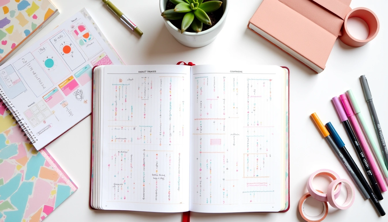
The core idea behind these interactive calendar grids is to create a physical spread that serves as a visual blueprint for your digital planning. Think of it as a beautifully designed template that you can then translate into your preferred digital planning app (like GoodNotes, Notability, or even a simple PDF annotation tool) with added interactive elements. The magic happens when you design your physical spread with digital functionality in mind. This means strategically leaving space, using consistent symbols, and thinking about how certain elements will translate to tappable links or easily editable text boxes on a screen. My initial attempts were too focused on pure aesthetics, resulting in spreads that looked stunning but were a nightmare to digitize. I learned quickly that function had to lead form, at least in the planning phase. For example, I once spent three hours meticulously hand-drawing every single recurring event for a month, only to realize that trying to make those tiny, hand-drawn circles tappable in GoodNotes was an exercise in futility. The key is to create a structure that’s easily replicable and adaptable digitally.
When I first started exploring this hybrid approach, I was inspired by early digital planners that mimicked paper layouts but lacked the tactile satisfaction. My goal was to flip that: take the best of paper planning and inject a dose of digital convenience. This hybrid concept isn't about perfect replication; it's about intelligent integration. We're not aiming for a 1:1 digital copy of your physical journal, but rather a system where your physical spread informs and enhances your digital one. For instance, a small, neatly drawn icon next to a date in your journal could correspond to a hyperlink in your digital version that opens a detailed project page or a specific note. This requires a shift in perspective, viewing your paper spread not just as a static record but as a dynamic launchpad for digital actions. It’s about intentional design choices that serve both worlds, and I’ve found that dedicating about 20-30 minutes to planning the layout before diving into the ink makes a world of difference.
This requires a shift in perspective, viewing your paper spread not just as a static record but as a dynamic launchpad for digital actions.
Designing Your Grid: Measurements and Layouts
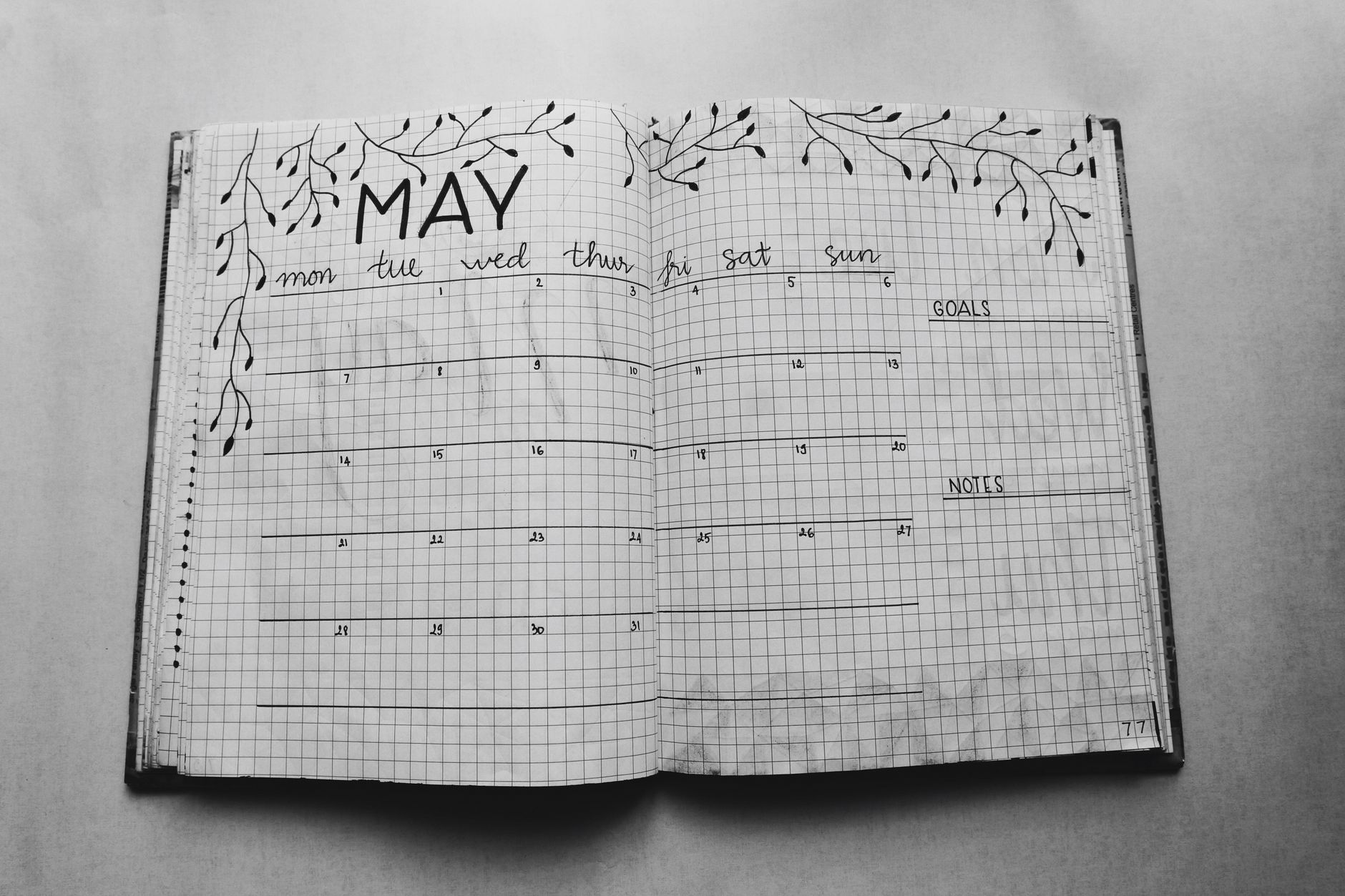
Let's get down to the nitty-gritty of designing the physical spread that will be your digital planner's best friend. I typically use an A5-sized journal, and for a monthly calendar grid, I dedicate a full two-page spread. This gives me ample space to work with. The standard layout involves dividing the two pages into seven columns (for days of the week) and five or six rows (for the weeks of the month). For an A5 journal (approximately 5.8 inches wide by 8.3 inches tall), I measure out each day's box. I find that a grid of 1.2 inches wide by 1 inch tall for each day works wonderfully. This leaves enough room for writing events and drawing small symbols, and critically, it translates well when scaled down or used as a template for digital boxes.
To achieve these measurements consistently, I use a ruler and a light pencil sketch first. I mark the vertical lines every 1.2 inches across the 5.8-inch width of each page. For the horizontal lines, I start about 1 inch down from the top margin and draw lines every 1 inch, creating those 1-inch tall boxes. This typically results in five rows, sometimes six if the month requires it. I always leave a 0.5-inch margin around the entire grid. At the top of the left page, I reserve a 2-inch by 5.8-inch space for the month's title and any overarching notes or goals for the month. This space is crucial because in the digital version, this is where I'll often place a larger text box for the month's name and potentially a hyperlink to a monthly goals page. This initial planning phase, including measuring and sketching, usually takes me about 45 minutes to an hour, ensuring precision before I commit with ink.
I’ve experimented with different box sizes. When I tried making the boxes too small, say 0.8 inches wide, I found it incredibly difficult to write more than a couple of words, and any attempt at adding symbols for digital links looked messy. Conversely, making them too large, like 1.5 inches, meant I could fit fewer months on a single spread if I wanted to track multiple months at once, which I sometimes do. The 1.2 x 1 inch ratio for A5 has proven to be the sweet spot for readability, space for annotations, and effective digitization. It's also worth noting that the paper type in your journal matters. Thicker paper, like that found in many premium journals (often 100gsm or higher), handles pencil lines and ink better, preventing bleed-through and ghosting, which is essential when you're layering information for hybrid use.
It's also worth noting that the paper type in your journal matters.
Recurring Event Markers: Smart Placement Strategies
This is where the “interactive” part really begins to shine. Recurring events – think weekly meetings, birthdays, bill payment dates – are the backbone of any planner. In a purely digital planner, you simply set them to repeat. In our hybrid system, we need a visual cue that signifies a recurring event and can be easily translated into a digital reminder or link. My strategy involves using a small, consistent symbol in the corner of the date box. For example, I use a tiny, filled-in circle (about 2mm in diameter) in the bottom-right corner of a date box to indicate a recurring event. This symbol is small enough not to clutter the box but distinct enough to be noticed.
When I’m setting up the spread, I’ll pencil in these symbols on all the dates that have recurring events *before* I start writing the actual events. For instance, if I have a weekly team meeting every Tuesday, I’ll put a small pencil circle in the bottom-right corner of every Tuesday box. This takes about 10-15 minutes once you have your recurring schedule mapped out. After the pencil marks are in place, I go over them with a fine-tipped black pen, like a Sakura Pigma Micron 05. This pen is fantastic because it’s waterproof and fade-resistant, perfect for a permanent marker. In my digital version, this tiny circle becomes a trigger. I’ll create a digital “hotspot” or link over that specific area on the digital calendar. Tapping it might bring up a pop-up note with details about the recurring event, or it could link to a dedicated page for that recurring task or meeting. I learned this the hard way; initially, I tried writing “Meeting” in tiny letters, but it was illegible digitally. The symbol is a universal language for the digital layer.
I’ve also developed a color-coding system for these recurring events to add another layer of information. For instance, a blue circle might mean a work-related recurring event, while a green circle signifies a personal recurring event. This is incredibly easy to implement physically – just use a colored Micron pen or even a small dot from a Tombow Dual Brush Pen (using the fine tip). Digitally, these color-coded circles can trigger different actions or simply serve as a visual differentiator. For example, tapping a blue circle might open my work-related task list, while tapping a green circle could lead to my family's shared calendar. The key here is consistency. If you decide a filled-in circle means recurring, stick with it. If you decide blue means work, always use blue for work. This consistency is what makes the system efficient and truly interactive when you transition to digital.
This consistency is what makes the system efficient and truly interactive when you transition to digital.
Adding Clickable Annotations: Dates with Depth
Beyond recurring events, we can add “clickable annotations” to specific dates. These are for one-off events, important notes, or reminders that deserve a bit more digital real estate. Think of a doctor's appointment, a friend's birthday, or a reminder to pay a specific bill. In your physical journal, you might write the event and then add a small, distinct symbol next to it – perhaps a star symbol (*) or a small square (□). I typically use a small star. This symbol acts as a visual flag, indicating that this particular entry has a digital counterpart.
When designing the physical spread, I'll write the event clearly in the date box. If it's something that needs a digital link, I'll add that small star symbol in the top-left corner of the date box, using my Micron 05 pen. This is a deliberate choice to differentiate it from the recurring event markers. The symbol should be small, no more than 3mm x 3mm. The beauty of this is that it doesn't detract from the visual appeal of your handwritten entry. In your digital planner, you would then create a hyperlink or a tappable area over that date box, specifically around the star symbol. Tapping this area could then reveal more detailed information. For example, for a doctor's appointment, tapping the star might open a note containing the doctor's name, address, phone number, and any preparation instructions. For a birthday, it could link to a gift idea list or a digital card.
I experimented with different symbols. A simple checkmark seemed too generic, and a question mark could be confusing. The star felt universally recognizable as something “special” or “important.” Another approach I’ve seen work well is using a small, numbered circle. If you have multiple annotations for a single date, you can number them (e.g., ①, ②) and then have corresponding numbered notes digitally. This requires a bit more organization but can be very effective for dates packed with information. When I first tried this, I used a simple underline beneath the event, but it looked too much like a standard underline and didn't stand out as a digital trigger. The distinct symbol is key. This entire process of adding symbols and planning annotations for a full month usually takes me about 30-45 minutes, depending on how many unique events I have.
This requires a bit more organization but can be very effective for dates packed with information.
Choosing Your Digital Tools and Workflow
The success of this hybrid system hinges on your digital tools. My personal preference is using an iPad with an Apple Pencil and the GoodNotes app. GoodNotes allows for robust PDF annotation, easy creation of hyperlinks, and the ability to import templates. When I create my physical spread, I then take a high-quality photo or scan of it. I’ll often use a simple photo editing app like Snapseed to enhance the brightness and contrast, making it look clean and crisp. Then, I import this image into GoodNotes as a PDF.
Within GoodNotes, I use the lasso tool to select areas around my date boxes or symbols and then use the “Add Link” function. This allows me to link one page to another within the notebook, or even to external websites or documents. For recurring events, I might create a separate page with a list of all recurring events and link the corresponding symbols on the calendar grid to that list. For one-off annotations, I’ll create a small text box or a note directly on the same page, linked to the annotation symbol. This workflow typically takes me about 1-2 hours to set up the digital layer for a full month, after the physical spread is complete. The initial setup might feel a bit time-consuming, but the payoff in terms of efficiency throughout the month is immense.
If you're not using an iPad, don't worry! Many Android tablets with stylus support work well with apps like Notability or Xodo. Even on a computer, you could use PDF editing software to add interactive elements, though it's less intuitive than a stylus. The crucial part is choosing a tool that allows you to import an image or PDF and add clickable links or annotations. I tried using a basic PDF viewer on my laptop once, and the lack of stylus integration made it incredibly clunky. The tactile feedback of drawing and writing on a tablet with a stylus is what really makes the hybrid system feel natural and intuitive, mirroring the experience of a physical journal while adding digital power.
I tried using a basic PDF viewer on my laptop once, and the lack of stylus integration made it incredibly clunky.
Time Estimates and Budget-Friendly Alternatives
Let's break down the time commitment. Designing and creating the physical monthly calendar grid, including measuring, sketching, inking, and adding recurring event symbols and annotation flags, typically takes me about 1.5 to 2 hours. This includes the time spent planning the layout and ensuring precision. The subsequent digital setup in an app like GoodNotes, importing the image, and creating the hyperlinks or interactive elements, usually adds another 1 to 2 hours. So, for a fully functional, interactive monthly spread, you're looking at a total investment of roughly 2.5 to 4 hours per month. This might sound like a lot, but consider that this setup then saves you time throughout the entire month with quick access to information and automated reminders.
For those on a budget, you don't need the latest tech. A simple scanner app on your smartphone (like Adobe Scan or Microsoft Lens) can create clean digital copies of your physical spreads. Free PDF annotation apps are available for most platforms, though they might lack the advanced linking features of paid options. Instead of complex hyperlinks, you could simply use your annotation symbols to trigger a manual search within your digital notes. For example, if you see a star symbol next to an event, you know to search your digital notes for that event's details. This still provides a functional link, albeit a less automated one. The key is to adapt the system to your available resources. You can also print out pre-made calendar grids from free online templates and then add your symbols and annotations by hand, before scanning and digitizing those. This saves the initial layout design time. I started my journey with a basic spiral notebook and a cheap ballpoint pen, and even then, the concept of marking dates for digital reference was achievable.
Enhancing Your Spread: Beyond Basic Calendars
The interactive calendar grid concept isn't limited to just the monthly view. You can extend this to weekly spreads, daily logs, or even project planning pages. For a weekly spread, you might have interactive elements linked to specific tasks or goals for that week. On a daily log, a clickable icon could link to a detailed journal entry or a photo from that day. I’ve also found this incredibly useful for tracking habits. I create a small, tappable box next to each day in my habit tracker. When tapped digitally, it reveals a note detailing what the habit entails or a motivational quote related to it. This adds a layer of context that static checkboxes often lack.
Another powerful application is for goal planning. Imagine a yearly overview spread where each month is a tappable area. Tapping a month could link you directly to that month's interactive calendar grid. Or, on a project planning page, you could have dates linked to specific project milestones, documents, or team member contact information. The possibilities are truly vast once you start thinking about your physical planner as a gateway to digital information. I recently designed a “Vacation Planner” spread where each day of my trip had a small icon. Tapping these icons in the digital version would bring up flight details, hotel confirmations, or restaurant reservations. It made navigating my trip plans on the go incredibly simple. The initial investment of time pays dividends in organization and reduced mental load.
When I first started digitizing parts of my journal, I was concerned about losing the “analog feel.” However, by keeping the core design and writing physical, and only adding digital layers for functionality, I’ve managed to retain that beloved tactile experience. The digital additions are there when I need them, but they don't overwhelm the primary purpose of my journal: to be a space for reflection, creativity, and organized thought. It’s about finding that perfect balance that works for your unique planning style and lifestyle. My goal is always to make planning feel less like a chore and more like a creative expression of my life.
Ready to bring your planning into the future? Start by sketching out a simple two-page monthly calendar in your current journal. Don't worry about perfection; focus on the measurements we discussed (1.2 inches wide by 1 inch tall boxes for A5) and marking your recurring events and special dates with simple symbols. Then, choose one or two of those symbols to represent interactive elements in your digital planner. If you're using an iPad, import a photo of your spread into GoodNotes and try adding a simple hyperlink. If you're on a different device, experiment with free annotation apps to see what works best. The most important step is to simply begin experimenting. Share your creations and your process in our community forum – we love seeing how you bring your own unique spin to these ideas!
Small changes, real momentum
Get practical guides and templates you'll actually use — a few thoughtful emails a month.
Frequently Asked Questions
How do I make the interactive elements truly “clickable” if I'm just scanning my physical journal?
The “clickability” comes from the digital layer you create *after* scanning. When you import your scanned physical spread into a digital app like GoodNotes, you then use the app's tools to draw links or create tappable areas over your symbols. The physical symbol acts as a visual cue for you to know *where* to place the digital link. So, you’re not making the ink on the paper clickable; you’re using the scanned image as a background and adding interactive features on top of it in your digital environment. This hybrid approach ensures both the tactile feel of writing and the functionality of digital links.
What if I make a mistake on my physical spread? Can I still digitize it?
Absolutely! Mistakes are part of the process, and that's why we use pencil for the initial layout. If you make a mistake with ink, you can often either carefully use correction tape or fluid to cover it, or simply embrace it as part of the handmade charm. When you scan your spread, minor imperfections can often be minimized with photo editing. More importantly, the digital layer you add can sometimes “correct” or clarify things. For example, if an ink smudge obscures a date, you can create a clean digital text box over it in your app to make the event legible. The goal is functionality, not absolute perfection on paper.
Can I use this for multiple years or past planning?
Yes, this system is excellent for archiving and referencing past plans. Once you've created a physical spread, scanned it, and added digital links, you can save that digital file indefinitely. This means you can easily access past monthly overviews, recurring event schedules, or specific annotations from previous years. For future planning, you can create template spreads that you reuse each month, adapting the recurring event symbols and annotation placeholders. This makes setting up subsequent months much faster, often reducing the setup time for the physical spread to under an hour.
What's the best way to handle dates that have both a recurring event and a one-off annotation?
Great question! This is where strategic symbol placement comes in. I typically prioritize the annotation symbol. For example, if a Tuesday has a recurring meeting (marked with a small circle) *and* a specific appointment (marked with a star), I would likely place the star symbol in the top-left corner and the circle in the bottom-right. Digitally, I would create a link on the star symbol that brings up the appointment details. If the user needs to know about the recurring meeting, they can then click on the circle symbol (if I've made that clickable too) or refer to a separate legend. Alternatively, you can combine information in the digital pop-up. When the star is tapped, the digital note could say: “Appointment at 2 PM – also recurring Team Meeting.” This keeps the physical spread cleaner while providing all necessary digital information.
Related Posts


Your Weekly Dose of Inspiration
Journaling ideas, family tips, and gentle inspiration.
Love this content?
Join the BulletJournals.net community for exclusive tips, guides, and updates.
Subscribe Free